- Ebooks & Courses
- Practice Tests

How To Write an IELTS Bar Chart Essay
There are 5 steps to writing a good IELTS bar chart essay:
1) Analyse the question
2) Identify the main features
3) Write an introduction
4) Write an overview
5) Write the details paragraphs
Use this simple planning process as you practice writing IELTS bar chart essays and you’ll have no problem remembering it in the exam.
Steps 1 and 2 of the planning process should take around 5 minutes. It is essential that you don’t miss these out as they are the key to writing a high-scoring essay.
On this page, I’m going to take you through the whole planning process step-by-step as we work on a practice question.
Before we begin, here’s a model essay structure that you can use as a guideline for all IELTS Academic Task 1 questions.
Ideally, your essay should have 4 paragraphs:
Paragraph 1 – Introduction
Paragraph 2 – Overview
Paragraph 3 – 1 st main feature
Paragraph 4 – 2 nd main feature
Now that we have all these tools we need, we’re ready to begin planning and writing our IELTS bar chart essay.
Here’s our practice question:
The bar chart below shows the sector contributions to India’s gross domestic product from 1960 to 2000.
Summarise the information by selecting and reporting the main features, and make comparisons where relevant.
Write at least 150 words.
Contribution as % of India's GDP

Source: EPW Research Foundation
Step 1 – Analyse the question
The format of every Academic Task 1 question is the same. Here is our practice question again with the words that will be included in all questions highlighted .
The bar chart below shows the sector contributions to India’s gross domestic product from 1960 to 2000.
Every question consists of:
- Sentence 1 – A brief description of the graphic
- Sentence 2 – The instructions
- The graphic – chart, graph, table, etc.
Sentence 2 tells you what you have to do.
You must do 3 things:
1. Select the main features.
2. Write about the main features.
3. Compare the main features.
All three tasks refer to the ‘ main features ’ of the graphic. You do not have to write about everything. Just pick out 2 or 3 key features and you’ll have plenty to write about.
Our practice graphic is a dynamic bar chart. That is, it includes a timeline giving data from several different points in time.
So, for this question, we need to identify the main trends (that is, the general developments or changes in situation) in the three key sectors of the Indian economy – agriculture, industry and service – between 1960 and 2000.
Alternatively, a bar chart may be static with the data coming from one point in time, as in the example below. For this graphic, we would need to compare the different variables, that is, the different leisure activities favoured by Canadian boys and girls.

Step 2 – Identify the Main Features
The graphic in IELTS bar chart questions should not be difficult to interpret. Each question has been created to test your language skills, not your mathematics ability.
All you are looking for are the main features. These will usually be the easiest things to spot. As we’ve just seen, the type of key features will depend on whether the bar chart is dynamic or static.
There will be lots of information in the graphic to help you identify them. Here are some useful questions to ask?
- What information do the 2 axes give?
- Is it dynamic or static?
- What are the units of measurements?
- What are the time periods?
- What can you learn from the title and any labels?
- What is the most obvious trend?
- Are there any notable similarities?
(I give more detail on how to use these questions, plus downloadable checklists for identifying the main features of all 7 different types of IELTS Academic Writing Task 1 questions, in the lesson on How To Understand & Analyse Task 1 Questions .)
So, what main features stand out in our practice graphic?
Here's our practice IELTS bar chart again.
There are 3 main features/trends in this IELTS bar chart:
Main feature 1: The contribution of the agricultural sector dropped steadily.
Main feature 2: The contribution of the service sector increased each decade.
Main feature 3: Industry remained static from 1980 to 2000.
The general trends you select will be the starting point for your essay. You will then go on to add more detail.
With just 20 minutes allowed for Task 1, and a requirement of only 150 words, you won't be able to include many details.
We’re now ready to begin writing our essay. Here’s a reminder of the 4 part structure we’re going to use.
Step 3 – Write an Introduction
In the introduction, you should simply paraphrase the question, that is, say the same thing in a different way. You can do this by using synonyms and changing the sentence structure. For example:
Introduction (Paragraph 1):
The bar graph illustrates the relative percentage contributions made by the agricultural, industrial and service sectors to the Indian economy between 1960 and 2000.
This is all you need to do for the introduction.
Ideally, key words such as ‘sector’ and ‘contributions’ should be replaced by synonyms but there aren’t any obvious words that could be used instead so it’s fine to repeat them. It’s important that your language sounds natural so never try to force in synonyms that don’t quite fit.
Step 4 – Write an Overview (Paragraph 2)
In the second paragraph, you should report the main features you can see in the graph, giving only general information. The detail comes later in the essay. You should also make any clear comparisons you spot.
This is where we write about the general trends. Here are the ones we picked out above.
Now form these ideas into two or three sentences with a total of around 40 words. State the information simply using synonyms where possible. No elaborate vocabulary or grammar structures are required, just the appropriate words and correct verb tenses.
For example:
Overview (Paragraph 2) :
Over the whole time period, the significance of agriculture declined steadily while services grew in importance decade by decade. A different patterned emerged for industry, which initially showed a slowly increasing percentage but then plateaued from 1980 onwards.
Step 5 – Write the 1st Detail Paragraph
Paragraphs 3 and 4 of your IELTS bar chart essay are where you include more detailed information about the data in the graphic. In paragraph 3, you should give evidence to support your first 1 or 2 key features. Don’t forget to make comparisons when relevant.
Here are our first 2 main features again:
And this is an example of what you could write:
Paragraph 3 :
In 1960, agriculture contributed by far the highest percentage of GDP, peaking at 62%, but it then dropped in steady increments to a low of 12% in 2000. The service sector, on the other hand, had a relatively minor impact on the economy in 1960. This situation changed gradually at first, then its percentage contribution jumped from 28% to 43% between 1980 and 1990. By 2000 it matched the high point reached by agriculture in 1960, showing a reversal in the overall trend.
Step 6 – Write the 2nd Detail Paragraph
For the fourth and final paragraph, you do the same thing for your remaining feature/s. We have one main feature left to write about.
Here’s an example of what you could write:
Paragraph 4 :
Industry remained a steady contributor to India’s wealth throughout the period. As a sector, it grew marginally from 16% in 1960 to exactly a quarter in 1980 then remained static for the next two decades, maintaining a constant share of the overall GDP.
Here are the four paragraphs brought together to create our finished essay.
Finished IELTS Bar Chart Essay
(188 words)
This sample IELTS bar chart essay is well over the minimum word limit so you can see that you don’t have space to include very much detail at all. That’s why it is essential to select just a couple of main features to write about.
Now use what you’ve learnt in this lesson to practice answering other IELTS bar chart questions. Start slowly at first and keep practicing until you can plan and write a complete essay in around 20 minutes.
Want to watch and listen to this lesson?
Click on this video.
Would you prefer to share this page with others by linking to it?
- Click on the HTML link code below.
- Copy and paste it, adding a note of your own, into your blog, a Web page, forums, a blog comment, your Facebook account, or anywhere that someone would find this page valuable.
Like this page?
Ielts academic writing task 1 – all lessons.
IELTS Academic Writing – A summary of the test including important facts, test format & assessment.
Academic Writing Task 1 – The format, the 7 question types & sample questions, assessment & marking criteria. All the key information you need to know.
Understanding Task 1 Questions – How to quickly and easily analyse and understand IELTS Writing Task 2 questions.
How To Plan a Task 1 Essay – Discover 3 reasons why you must plan, the 4 simple steps of essay planning and learn a simple 4 part essay structure.
Vocabulary for Task 1 Essays – Learn key vocabulary for a high-scoring essay. Word lists & a downloadable PDF.
Grammar for Task 1 Essays – Essential grammar for Task 1 Academic essays including, verb tenses, key sentence structures, articles & prepositions.
The 7 Question Types:
Click the links below for a step-by-step lesson on each type of Task 1 question.
- Table Chart
- Process Diagram
- Multiple Graphs
- IELTS Writing
- IELTS Bar Chart
- Back To Top
* New * Grammar For IELTS Ebooks

$9.99 each Full Set Just $ 23.97
Find Out More >>
IELTS Courses

Full details...

IELTS Writing Ebook

Discount Offer
$7 each Full Set Just $ 21

Find out more >>
Testimonials
“I am very excited to have found such fabulous and detailed content. I commend your good work.” Jose M.
“Thanks for the amazing videos. These are ‘to the point’, short videos, beautifully explained with practical examples." Adari J.
"Hi Jacky, I bought a listening book from you this morning. You know what? I’m 100% satisfied. It’s super helpful. If I’d had the chance to read this book 7 years ago, my job would be very different now." Loi H.
"Hi Jacky, I recently got my IELTS results and I was pleased to discover that I got an 8.5 score. I'm firmly convinced your website and your videos played a strategic role in my preparation. I was able to improve my writing skills thanks to the effective method you provide. I also only relied on your tips regarding the reading section and I was able to get a 9! Thank you very much." Giano
“After listening to your videos, I knew I had to ditch every other IELTS tutor I'd been listening to. Your explanations are clear and easy to understand. Anyways, I took the test a few weeks ago and my result came back: Speaking 7, listening 9, Reading 8.5 and Writing 7 with an average band score of 8. Thanks, IELTS Jacky." Laide Z.
Contact
About Me
Site Map
Privacy Policy
Disclaimer
IELTS changes lives.
Let's work together so it changes yours too.
Copyright © 2024 IELT Jacky
All Right Reserved
IELTS is a registered trademark of the University of Cambridge, the British Council, and IDP Education Australia. This site and its owners are not affiliated, approved or endorsed by the University of Cambridge ESOL, the British Council, and IDP Education Australia.
- A Beginner’s Guide to IELTS
- Common Grammar Mistakes [for IELTS Writing Candidates]
Writing Correction Service
- Free IELTS Resources
- Practice Speaking Test
Select Page
How to Describe a Bar Chart [IELTS Writing Task 1]
Posted by David S. Wills | Apr 13, 2020 | IELTS Tips , Writing | 5
![How to Describe a Bar Chart [IELTS Writing Task 1]](https://cdn.shortpixel.ai/spai/q_lossy+ret_img+to_webp/ted-ielts.com/wp-content/uploads/2020/04/Describe-Bar-Charts-for-IELTS-1280x640.png "how to write an ielts bar chart essay")
There are various kinds of diagrams and charts that you may be asked to describe in the IELTS writing test, and one of those is the bar chart . In today’s lesson, I want to share some important advice that can help you improve your writing performance in your next IELTS test.
Describing data for task 1 of the IELTS writing exam is quite difficult and it will vary according to what you actually see. In other words, it is hard to simply teach some language for describing bar charts… Instead, your language will vary according to what the bar chart shows.
However, in this article I am going to break the process down and show you some examples so that you can understand it fully. At the end, I will give you a sample band 9 answer for a really difficult bar chart about people’s weight.
What are Bar Charts?
First of all, let’s start with the most basic question. You can feel free to skip this if you are already totally familiar with it. 😁 What is a bar chart? Basically, it is a visual representation of data using bars, like these:

Bar charts are used to show the difference between volumes or quantities of things because it is easy for the human eye to interpret. Let’s take a look at this example bar chart. I just found it on Google and will use it because it is simple. This is not a real IELTS chart. 🤪

You can easily see what this means. The most common excuse is “I forgot to set my alarm” and the least common is “It was still too dark; I thought it was still night-time.”
That is the purpose of a bar chart. It shows data in a way that is really easy for people to understand. As such, you may encounter it in your IELTS test. In that case, you will have to pick out the most important data and describe it.
Bar Charts for IELTS Writing
As we have seen, a bar chart is just another way of expressing data. For task 1 of the IELTS writing test, you may be asked to write about a bar chart. You will have to write more than 150 words and it is recommended that you do this in 20 minutes or less. (You will have a total of 1 hour for 2 tasks.)
It is important to note that you do not have to describe everything in the chart . Part of the task is picking out and describing only the relevant details. That usually means:
- The highest
- Major differences
- Anything interesting
What does that mean? This is very subjective, and so it is certainly open to debate. Let’s look at an example in order to understand it better:

In this bar chart, our eyes are naturally drawn towards the highest and lowest figures. The highest was in Sweden in 2012 and the lowest was in Finland in 2012. Therefore, both the highest and lowest figures occurred in the same year. That’s interesting!😅
Another interesting factor is that, in every year except one, Sweden had a higher divorce rate than Finland. It was only in 2015 that Finland’s divorce rate was higher than Sweden’s.
The Process
When you need to describe a bar chart for IELTS, you should take the same basic process as for describing anything else:
- Take time to read the question carefully.
- Look at the data and make sure you understand it.
- Find important data to describe.
- Plan your essay structure.
- Write your essay carefully.
- Check your answer for mistakes.
If you follow this basic routine, you will have a good chance of providing a strong answer to the question.
Language for Describing Bar Charts
In the past, I have talked about the language required to describe the following IELTS writing task 1 assignments:
- Process diagram
Bar charts are a little different because the language you would use depends on what is being described and there is no common set language that you would use just to talk about bar charts in general.
In the previous example, we can see that the bar chart features changing data over time. In such cases, we can use relatively similar language to that which we used for line graphs. You could say, for example:
Divorce rates in Sweden peaked in 2012 at a little under 50%, but fell in each of the subsequent years.
However, you can see that in the first bar chart there was no progression of time, so you cannot use language that shows changes in data. This brings us to the next stage…
Common Problems in Describing Bar Charts for IELTS
I used to teach writing skills at a university in China, and one of the most common problems I would have was teaching my students to write about bar charts. They could describe line graphs really easily, but the problem was that they would use the same expressions and structures for bar charts, when in fact something different was needed. Let’s look at two example charts. These contain similar data but there is an essential difference:

You can see that the line graph talks about changing phone prices over time, whereas the bar chart shows the different prices of phones. These prices are all taken from the same point in time .
Therefore, in order to adequately describe these, you must show that you understand the data.
For the line graph, you can say:
The price of Phone A rose from £380 to £410 between December and January.
However, you cannot use this language for the bar chart:
INCORRECT: The price rose from £380 for Phone B to £410 for Phone C. CORRECT: Phone C cost £30 more than Phone B, which cost £380.
This may seem easy to some people, but it is an important distinction and a common mistake. You should practice often to make sure that you know the difference.
Task 1 Essay Structure
There is no single perfect essay structure for IELTS, but there are some that are better than others. For task 1, I generally recommend writing an essay like this:
Let me explain what I mean by that.
It is really important to group your data appropriately. This can be quite difficult, so you should read this article first.
Essentially, you need to choose how to put groups of data together. Let’s take another example:
The chart below shows the total number of minutes (in billions) of telephone call in the UK, divided into three categories, from 1995-2002. Summarise the information by selecting a reporting the main features, and make comparisons where relevant.

For this sort of bar chart, you might choose to write two or three body paragraphs. Perhaps you would describe local fixed line phones first, then start a new paragraph for national and international ones, with another paragraph for mobiles.
Another way would be to break the data in half – one paragraph for 1995 to 1998 and another paragraph for 1999 to 2002.
There are lots of different ways. The only really important thing is that you make it clear to your reader why you have chosen to group the data this way. In other words, it must be logical .
Sample Answer
My answer to this question would look something like this:
The bar chart shows the time spent on three different kinds of phone calls in the United Kingdom over a period of eight years, starting in 1995 and ending in 2002. Local calls were the most common type of phone call made during the entire period, although both national/international and mobile calls grew in popularity to narrow the gap between these three types of call by 2002. In 1995, local calls were by far the most common type of phone call in the UK, with more than 70 billion minutes recorded on this chart. This is about double the amount of time spent on national and international calls, and more than ten times as much as was spent on mobile phone calls. All three types of phone calls grew in popularity until 1999, after which local calls decreased year-on-year until they ended the period at around the same figure as they began it – 70 billion minutes. National and international calls grew steadily over the recorded eight years, from about half the popularity of local calls to only slightly less in 2002. Mobile phone calls, however, grew ten-fold from about four billion minutes to more than forty billion.
A Really Difficult Bar Chart
Finally, let’s look at a difficult bar chart in order to show how we can tackle challenging problems.

As you can see, the first problem is that there are two charts! Already, that will prove more difficult than describing just one chart.
Another issue is that these bars look strange. They are all the same size… Why? Well, these represent the population. Each one is 100%, with the colours making up the different weight categories. The total can never be more than 100% because that it is the full population.
Now, you should try to interpret the data. What are the main changes?
- In 1955, there are lots of people at an ideal weight and very few people are obese.
- In 2015, many older people are obese. Fewer people are at an ideal weight.
- The weight distribution was similar regardless of age in 1955, but in 2015 it is very different.
Once you have picked out the important data, you should figure out how to structure your answer. I will use this structure:
However, I will make sure that there are clear comparisons between the 1955 and 2015 data. It is not enough to describe them in isolation.
Language for Talking about Age and Weight
To be honest, the hardest part of this bar chart is not that data but the terminology around age and weight. You can see from the chart that were are looking at age groups and weight groups. Many native speakers find this really difficult to talk about.
When we talk about age and weight, we usually say some form of “to be” rather than “to have.” For example:
- INCORRECT: In 2015, a higher percentage of people had overweight or obesity than in any other group.
- CORRECT: In 2015, a higher percentage of people were overweight or obese than in any other group.
- INCORRECT: In both years, the people who were most likely to be an ideal weight had 20 to 29 years.
- CORRECT: In both years, the people who were most likely to be an ideal weight were aged 20 to 29 years.
You can see how I explained this to one of the students on my writing correction service :

There are also problems with grouping people according to age. We can just say “people in the ___ age group/category” but this becomes repetitive after a while, so we need to use different language.
Talking about age is difficult, especially when describing groups of people who fall into different age categories. One thing to know is that, when you say use numbers, it is a sort of adjective and thus you need a noun to follow it or else it is meaningless:
- The criminals arrested were all 16 to 25 years old.
- I saw a 15-year-old boy running away.
You can turn the “old” into a noun by adding an “-s”:
- There was an increase of 25% in the unemployment rate for 20-29-year olds.
You can also put “aged” before the numbers:
- Most of the recipients were aged 18-22.
Sample Band 9 Answer
Here is my description of the bar chart above:
There are two bar charts showing the distribution of weight categories for people living in Charlestown. The first one is from 1955 and the second is from 2015. It is clear that vast changes have occurred in people’s health during this sixty year period. In 1955, very few people were overweight or obese, and most were healthy or even underweight. In each of the age groups, at least half of people were classified as in the ideal weight range, but towards the ends of the spectrum – the youngest and the oldest people – there were more people who fell into the underweight bracket. Being overweight or obese was a problem primarily affecting middle aged people, but not the most elderly ones. However, this distribution had completely changed by 2015. Although some young adults and elderly people remained underweight, a very slim number in the middle of the age groups did. Being overweight had become increasingly common, and obesity had become a huge issue, affecting people more and more as they got older. For people aged fifty and older, more than half suffered from obesity, and very few fell into a healthy weight range.
Useful Language
I will excerpt some of the useful phrases that appeared in this answer so that you can see how I have managed to describe ages and weights:
- very few people were overweight or obese
- most were healthy or even underweight
- at least half of people were classified as in the ideal weight range
- people who fell into the underweight bracket
- Being overweight or obese was a problem
- elderly people remained underweight
- Being overweight had become increasingly common
- obesity had become a huge issue
- more than half suffered from obesity
- very few fell into a healthy weight range
This was a really difficult bar chart to describe, but using this language I have managed to do it accurately and comprehensively.
Improve your Writing
If you want to get better at IELTS writing, the only way to ensure constant progress is by having an expert give you feedback. Most of the writing correction services that you find online are rubbish. They are run by people do not speak much English or do not understand IELTS. My writing correction service is one of the few that is truly worthwhile. I can tell you all your problems and help you to fix them.
Here is my feedback to someone who wrote an essay about the Charlestown weight distribution bar charts:

Let me know in the comment section if you have any questions. 🙂
About The Author

David S. Wills
David S. Wills is the author of Scientologist! William S. Burroughs and the 'Weird Cult' and the founder/editor of Beatdom literary journal. He lives and works in rural Cambodia and loves to travel. He has worked as an IELTS tutor since 2010, has completed both TEFL and CELTA courses, and has a certificate from Cambridge for Teaching Writing. David has worked in many different countries, and for several years designed a writing course for the University of Worcester. In 2018, he wrote the popular IELTS handbook, Grammar for IELTS Writing and he has since written two other books about IELTS. His other IELTS website is called IELTS Teaching.
Related Posts
![[Listening] Summary Completion Practice](https://cdn.shortpixel.ai/spai/q_lossy+ret_img+to_webp/ted-ielts.com/wp-content/uploads/2019/04/happiness-and-contentment_lxiebe-440x264.jpg "how to write an ielts bar chart essay")
[Listening] Summary Completion Practice
December 18, 2017
![Two Difficult IELTS Letters [Useful Advice]](https://cdn.shortpixel.ai/spai/q_lossy+ret_img+to_webp/ted-ielts.com/wp-content/uploads/2022/01/2-Difficult-IELTS-Letters-How-to-Answer-them-Effectively-440x264.png "how to write an ielts bar chart essay")
Two Difficult IELTS Letters [Useful Advice]
January 3, 2022

Talking About Music for IELTS
February 27, 2018

Describing a Tourist Attraction
September 12, 2017

Hi, David. I noticed that you didn’t include any figures at all in your sample answer for the weight assessment. Is that acceptable? This is because I have seen some IETLS teacher who taught us to include most of important figures. Thank you.
The important thing about IELTS is that it is an English test, so you should use your language to describe the data. Most candidates attempt to cram lots of numbers in so that they can use fewer words. The fewer numbers you use, the better. Sure, you can have one or two, but if you are able to use words to describe trends, reflect important data, or make comparisons, then it is much better. If you read my essay carefully, you will notice that I said things like “at least half of people” rather than just repeating numbers. This is a good strategy, although you can certainly put in a few numbers if you want.

Hi David. Thank you for your explanation. I have a question! for describing a chart what verb tens we should use? It depends on something or it has a rule! Thank you.
It depends on the situation. Pay attention to any time frame that is given or the origin of the data. If none is given, then present simple is fine.

Asalam O Alakum David
Can we explain only things in overview except figures, percentage and time trend? I mean only what they have mentioned in the picture.
Secondly, in last 2 paragraphs only should we write those things which they have showed in the graph, chart or map in a simple way.\
Please, confirm me.
With regards
Leave a reply Cancel reply
Your email address will not be published. Required fields are marked *
This site uses Akismet to reduce spam. Learn how your comment data is processed .
Download my IELTS Books

Recent Posts
- How to Improve your IELTS Writing Score
- Past Simple vs Past Perfect
- Complex Sentences
- How to Score Band 9 [Video Lesson]
- Taxing Fast Food: Model IELTS Essay

Recent Comments
- David S. Wills on How to Describe Tables for IELTS Writing Task 1
- anonymous on How to Describe Tables for IELTS Writing Task 1
- David S. Wills on Writing Correction Service
- James Oluwasegun on Writing Correction Service
- Daisey Lachut on IELTS Discussion Essays [Discuss Both Views/Sides]
- Lesson Plans
- Model Essays
- TED Video Lessons
- Weekly Roundup
Welcome Guest!
- IELTS Listening
- IELTS Reading
- IELTS Writing
- IELTS Writing Task 1
- IELTS Writing Task 2
- IELTS Speaking
- IELTS Speaking Part 1
- IELTS Speaking Part 2
- IELTS Speaking Part 3
- IELTS Practice Tests
- IELTS Listening Practice Tests
- IELTS Reading Practice Tests
- IELTS Writing Practice Tests
- IELTS Speaking Practice Tests
- All Courses
- IELTS Online Classes
- OET Online Classes
- PTE Online Classes
- CELPIP Online Classes
- Free Live Classes
- Australia PR
- Germany Job Seeker Visa
- Austria Job Seeker Visa
- Sweden Job Seeker Visa
- Study Abroad
- Student Testimonials
- Our Trainers
- IELTS Webinar
- Immigration Webinar
IELTS Bar Chart/Graph – Samples, Tips to Describe Bar Graphs

Updated On Mar 07, 2022
Share on Whatsapp
Share on Email
Share on Linkedin

Limited-Time Offer : Access a FREE 10-Day IELTS Study Plan!
Amidst all the other types of questions, you will also come across a question that will showcase a bar graph. Also known as a bar chart, the bar graph is evaluated similar to a line graph . Such a bar chart also comes with two axes, showing changes and diversifications over a given period of time. Furthermore, the bar graph has rectangular bars that could be either displayed vertically or horizontally, representing two or more values of data.
Types of IELTS Bar Graphs
When preparing for the IELTS exam , you would have to prepare for two different types of bar graphs: vertical and horizontal.
Vertical Bar Graph
Here is how a vertical bar graph looks like:

Horizontal Bar Graph
Here is how a horizontal bar graph looks like:

A Comprehensive Guide to Write IELTS Bar Chart Essay
If you wish to learn more about writing a high-scoring IELTS bar essay, here is a comprehensive process that will help you out.
Evaluating the Question
The first and foremost step is to evaluate and analyze the question. In the question, you will get a brief description of the bar chart along with instructions. Your job here will be to discover the central idea.
Assessing the Given Data
The next step is to assess the data that you have in the question. Find out whether it is dynamic or static. If it is dynamic data, it will show two or more time periods. If it is static data, it will show only one time period. For both these data types, you will have to use different languages to write the description.
Discovering Primary Features
Majorly, bar graph questions are meant to test your mathematical as well as language skills. Hence, you must know how to derive the primary features from the given data and write about it.
Describing a Bar Chart
Here is the complete format that should be used when describing a bar chart or a bar graph.
The Introduction
In the introduction paragraph, you would have to paraphrase the asked question. This can be done by using synonyms and paraphrased words and sentences. Also, ensure that this section is sounding natural.
The Overview
Usually, an overview forms the second paragraph of the essay. In this one, you would have to write down the main features. Also, you must discover available comparisons and talk about general trends occurring in the given data.
The First Body Paragraph
In the first body paragraph, you will have to give detailed information and explain the given data. Here, you must focus more on language instead of facts. Making relevant comparisons is always useful.
The Second Body Paragraph
This second body paragraph will have your explanation of the remaining features. It will be the same as the first body paragraph, but with different information.
Choosing the Information from the Bar Graph
As you would already know, a bar graph question requires a report of 150 words to be written. To help you out with an easier way, you can follow (but not stick to) the below-mentioned guidelines.
Tips to Write IELTS Bar Chart Essay
Jotted down below are some tips that will help you write a relevant, on-point IELTS bar chart essay
1. Is it difficult for you to match the word count?
Most of the time, people find it difficult to match the word count. Hence, they start using complicated words to unnecessarily extend the sentences. While using high-end vocabulary is a pro, writing sentences that are difficult to be understood is a con.
2. Be straightforward in your writing
When describing the bar graph, try not to complicate the description. Be straightforward and on-point.
3. Do you only practise with one type?
While practising, do you only try working on one type of chart or graph, or do you expand your horizons as well?
4. Practise as much as possible
While practising, work on varying bar charts or graphs so as to enhance your ability to explain whatever comes in the examination.
5. Are you always in a hurry for submission?
One of the common mistakes that people commit is not reviewing their answers before submission. This could lead to you missing out on errors and issues that can impact your marking.
6. Review your writings before submitting
Once written, double-check for grammatical errors . Review important details and superlatives to make sure you didn’t miss anything.
Here are 10 bar graph IELTS practice test examples:
Also check :
- IELTS Writing tips
- IELTS Writing recent actual test
- IELTS Writing Answer sheet
- IELTS map vocabulary
- IELTS Writing Task 1 Connectors
Frequently Asked Questions
What is a bar chart?
What is the structure of a bar graph?
What is the difference between introduction and overview? Can I skip the overview because I feel introduction is enough?
Can I have just one body paragraph where I give almost all the information?
What is the expected word count for describing a bar chart?
Practice IELTS Writing Task 1 based on report types

Start Preparing for IELTS: Get Your 10-Day Study Plan Today!
Janet had been an IELTS Trainer before she dived into the field of Content Writing. During her days of being a Trainer, Janet had written essays and sample answers which got her students an 8+ band in the IELTS Test. Her contributions to our articles have been engaging and simple to help the students understand and grasp the information with ease. Janet, born and brought up in California, had no idea about the IELTS until she moved to study in Canada. Her peers leaned to her for help as her first language was English.
Explore other sample Bar Charts

Janice Thompson

Post your Comments
Recent articles.

Nehasri Ravishenbagam

Raajdeep Saha

Our Offices
Gurgaon city scape, gurgaon bptp.
Step 1 of 3
Great going .
Get a free session from trainer
Have you taken test before?
Please select any option
Get free eBook to excel in test
Please enter Email ID
Get support from an Band 9 trainer
Please enter phone number
Already Registered?
Select a date
Please select a date
Select a time (IST Time Zone)
Please select a time
Mark Your Calendar: Free Session with Expert on
Which exam are you preparing?
Great Going!
- Skip to primary navigation
- Skip to main content
- Skip to primary sidebar
- Skip to footer
IELTS Advantage
IELTS Preparation Courses
IELTS Bar Chart Sample Essay
Static or Dynamic?
Before writing an IELTS task 1 bar chart or line graph answer it is important that we analyse the question correctly. Taking a few minutes to do this will help us write a clear answer that fully responds to the question. Just what the examiner wants us to do.
The first thing we need to do is decide if the bar chart is static or dynamic. Static means that the data comes from one point in time. Dynamic means the data comes from more than one point in time.
Whether a chart is static or dynamic will affect the information we choose to include in our answer and the kind of language (tense, grammar etc.) we use.
If it is dynamic we will have to compare the different times and comment on the general trends over the time period.
If it is static we will have to compare the different variables, in this case countries, car price, GDP and time it takes for one person to buy a car.
Main Features
Every IELTS academic task 1 question asks us to ‘select and report the main features’.
This means that we have to not only pick the most significant information from the graph and include it in our essay, but also decide which information is not important and should therefore not be included in our essay. One of the biggest mistakes you can make in task 1 is including all the information you see.
So which information should you choose?
You should look for:
- highest/lowest values
- biggest differences
- similarities
- significant exceptions
- anything else that really stands out
There are 3 main features in this graph
1) It takes over 26 years for a Vietnamese person to buy a car.
2) Vietnam has the second highest average costs but the second lowest wages.
3) Cost of a car in Singapore is nearly 3 times the next most expensive.
I advise my students to follow a basic four paragraph structure for these kinds of questions.
Paragraph 1
Paraphrase the question using synonyms.
Paragraph 2
Provide an overview of the main features. No need to include any data in this paragraph, just tell the examiner what is happening in general terms. If you had to describe the main features in two sentences, what would you say?
Paragraph 3
This is where we get more specific and use data. Take 2 of the main features (from your overview) and describe them in detail using data from the chart.
Paragraph 4
Simply do the same thing as you did in paragraph 3, but with two other main features (from your overview).
Sample Answer

The graph compares the GDP per capita, cost of a Toyota Camry and approximate length of time it takes for 1 citizen to purchase that mode of transport in eight Asian countries.
Despite having the second lowest average yearly income, it costs more to buy this car in Vietnam than in all but one other Asian nation. It also takes significantly longer for a standard person to buy an automobile in Vietnam than in any other state in Asia. On the other end of the scale, Singaporeans have to pay nearly three times more for their cars than the Vietnamese and it takes them the least amount of time to afford a motor vehicle.
It costs $49,944 to buy a Toyota Camry in Vietnam, but this dwarfs the average yearly income per person at just $1,910. It would therefore take a normal man or woman 26.1 years to save up for that particular car.
This is in contrast to Singapore where it costs $126,245 for that model of motorcar, however the average salary is much greater at $55,182. This means that it generally takes just over 2 years for a typical individual from Singapore to acquire this vehicle.
(200 words) Band 9.
It should be noted that this is not a real IELTS task 1 question. This is just a chart that I saw on the internet, but it allowed me to make a very important point- you don’t have to mention everything on the graph. I only talked about 2 out of the 8 countries and I still wrote 200 words and answer the question fully. The key is finding the most significant data and not talking about anything else. Don’t worry, you won’t lose marks for not talking about everything, quite the opposite.
This graph is also good for demonstrating how important it is to vary your vocabulary. There were four words that could have been overused in this essay- car, average, country and people. Instead of repeating them over and over again I used synonyms to show the examiner I have a wide vocabulary and gain extra marks. Here are the synonyms:
Car- Toyota Camry- automobile- vehicle- motor vehicle- motorcar
Average- approximate- normal- typical- standard
Country- countries- nation- state
People- citizen- man or woman- individual
Next time you see a chart or graph in a newspaper, in a textbook or on the internet, think about what the main features are and what common words would you have to vary with synonyms.
I hope you have found these tips useful. If you have any questions, let me know below.
For more band 9 sample essays check out our task 1 sample essay page.

About Christopher Pell
My name is Christopher Pell and I'm the Managing Director of IELTS Advantage.
I started IELTS Advantage as a simple blog to help 16 students in my class. Several years later, I am very humbled that my VIP Course has been able to help thousands of people around the world to score a Band 7+ in their IELTS tests.
If you need my help with your IELTS preparation, you can send me an email using the contact us page.
- Skip to main content
IELTS Podcast
Pass IELTS with expert help.
How to score high on a bar graph question in writing task 1
The bar graph task 1 essay accounts for a third of your marks in the writing test so we recommend spending around 20 minutes on it, as this is a third of your time. There are a couple of different structures you can follow when describing an IELTS bar chart .
A strategy for bar graph questions
Essay structure, or how you organise your answer, is very important in academic writing. Today we will teach you a new method – a structure where you assign each sentence of your text to a topic – kind of the opposite of what you usually do when writing task 2 . It may look a little confusing, but this method really works! Just follow our lead for IELTS task 1.
Remember that bar chart and bar graph are synonyms and you can use the phrases interchangeably. Although each bar graph will be different, you are not required to be an expert on the information it shows, just to summarise the information, identify trends and make comparisons. Each bar graph IELTS question is different, so look at as many bar graph examples as you can and practice this strategy until you feel really confident.
How to choose information from the bar graph?
Assuming one sentence contains around 10 to 15 words, we can estimate that your description of the bar chart will consist of about 10 to 12 sentences. Now we can assign each sentence a specific task:
- One sentence for the introduction.
- Two sentences using superlatives.
- A sentence with a comparison. Make comparisons where relevant.
- A sentence grouping two data points to show similarity (for example, you might include a brief description showing a gradual decrease in two different areas).
- A sentence noting an exception to an overall trend.
- A sentence describing some data in an advanced manner, using complex sentence structure.
- A sentence describing relevant data using a simple structure.
- Two sentences for summary and conclusion.
Note that this method is quite flexible and these sentences don’t necessarily need to go in this particular order. You must write them in a way that makes your bar chart description flow naturally. Think about which sentences go together in each body paragraph as well as the introduction paragraph and conclusion. You may also have to repeat a few sentences using different data if you find your graphic contains more information or find a way to mention different groups in one sentence. The structure above is a rough guide to get you started. Once you have looked at the example and are comfortable with this structure, you can use this example as a model to describe different bar charts and answer as many bar graph questions as you can. Just remember to get feedback while you are testing your ideas otherwise, it’s quite difficult to improve.
A bar graph sample question and answer
Now that we have figured out what we want to write about in the description of the bar graph, it’s time to put our data selection skills to use and make comparisons where relevant. It is easy to get lost in all of the information provided by a bar chart as there can be so much data. That’s why it’s important to keep in mind what you are looking for when you are analyzing the chart.
The task achievement score for task 1 makes it clear that you need to answer all parts of the question – in other words, describe the main features AND compare them, in order to get a good score. Task achievement is 25% of your total marks so don’t forget to make comparisons! The first thing you should do is identify key features. Once you have decided on the main points, make note of any secondary features that will support the main features.
Ready for a high-level bar chart task 1 answer? Let’s begin with the analysis of this bar chart, and pick out the information that is relevant to our structure. See the model answer of a bar chart below.
Sample Answer Bar Graph Essay
The bar chart shows the caloric intake of UK males in three distinct age groups of 0-24, 25-49, and over 50 years old. The data is shown as percentages. Dairy for the 0-24 age group was the highest source of calories, whilst the other categories each represented about 20% each. In the next age group dairy fell to around a quarter, and meat became the main source of calories, reaching half of the total intake. Pulses and vegetables reached 10% and 15% respectively. Pulses in the final age group increased sixfold to over 60%, whereas calories obtained from vegetables was 10%, half that of meat (20%), and even slightly less than dairy (15%). The 50+ group shows the most marked preference out of all the groups. It also confirms the gradual decline in vegetable consumption as males become older. Overall it is clear that each age group has a clear favourite which varies depending on age. However, vegetables are consistently amongst the least popular, regardless of age.
Sample Answer Analysis
In this essay, the introduction paragraph restates the writing prompt. It is not the overview paragraph, which can be either the first or the last paragraph. In this case, the overview appears at the end in which the writer states the overall trends of the bar graph. While the horizontal axis contains information relating to the question keywords, it’s important not to overlook the vertical axis and state clearly how the data is given (for example, is it as percentages, in kilos, or tonnes, or hours?) Make sure you have included this information in the first part of the essay.
You will also notice that the body paragraphs consist of a breakdown of the main features in order of age group to show and compare the difference in amounts of each food category consumed as people grew older, placing the final age group into its own body paragraph. This is because the data showed that there was a fairly significant upward trend in one food type (pulses) that the writer wanted to highlight. And finally, as previously mentioned, the conclusion part of this essay includes the overview, which should consist of a sentence or two about general trends.
Some notes on structure
Notice how the sentence is structured. How many complex sentences can you identify? When preparing for your IELTS academic writing task, you will want to show some sophisticated writing. When you sit for your IELTS writing test, you might feel pressured for time and it may be a bit difficult to think of complex sentence structures while considering the main features. Take note on the following important tips on structure:
- Make sure you have mentioned all the categories in your answer – in this example, there are four categories.
- Make sure you have also included the correct values when you summarise the data, in this case, percentages.
- It is often tempting to write too much for a task 1 essay but by following the method shown you will stay focused. Concentrate on the most important information.
- Compare the highest and lowest values, for example, rather than all the differences.
- Write what comes naturally at first, even if you write in correct simple sentences.
- Allow yourself some time at the end to go back and adjust some of your structures to complex sentences.
- If you are aiming for a high score on the IELTS test, you should aim for structures that are complex and accurate.
- It is important to be sure of the tense you are using. This example requires the present tense but many bar charts illustrate data from the past. In that case, you need to write the introduction in the present tense (the bar chart illustrates…) and then switch to writing mostly in the past tense (the number of people choosing this option dropped after the first year).
Click here for more free IELTS bar chart sample essays . You can also find sample IELTS task 1 questions here .
Tips on describing a bar graph in IELTS
- Avoid listing every single data point; instead, use your own words to describe the key information from the chart/graph.
- Avoid mixing formats: for example, don’t mix decimals with estimations in the same sentence.
- Check whether there is a date on the bar chart – you may need to use the past tense.
- Make note of general trends, particularly upward or downward trends that can be highlighted in your own words.
- After you have successfully written out your description with all of the information you want to include, go over it and replace some simpler words with more academic vocabulary – this will help you achieve a high score . For example, try replacing “big” with “most significant”.
- Check that your text is error-free. Review carefully to see if all your sentences are grammatically correct.
- Make sure that the data you have described is correct – that you have not made a mistake with a category or labels.
- Review for the correct use of connectors and linking words .
- Practise with different bar graphs/pie charts to improve especially with a range of values (percentages, kilos, miles, dollars).
- Review the superlatives – highest, lowest, most expensive, biggest difference – these are essential if you want to effectively describe bar charts.
- The fastest way to improve is to get feedback on your work. You can also check another model bar graph answer for comparison.
- Don’t forget to check your word count. Make sure your piece is another too brief nor too wordy and detailed. Most model answers come in at around 200 words. You’ll use a similar writing model for pie charts and tables so you don’t need to memorise completely different models for each.
Bonus tips to score high on IELTS Bar Graph Questions
- To improve your task 1 bar graph skills try copying out a sample bar graph with pen and paper. You will start to understand how to locate key points and choose the most relevant information. It doesn’t matter what the topic is, remember it could be anything from the gross domestic product of different countries to comparing the highest expenditure on housing. You don’t need to be an expert on gross domestic product or the Japanese rental market, you just describe the data and make comparisons.
- Practice describing a bar chart out loud. It will help you remember vocabulary to describe data under pressure, decide point by point what to include in your answer and make sure you have mentioned every category at least once. Your confidence will improve when it comes to your next IELTS writing task.
- Make sure you practice ‘two type’ questions – you might see an IELTS question with one bar chart or two so it is a good idea to look at a model answer for each type. You might see one bar chart and a table, or other types of graphs such as line graphs. Some questions might have a mix, for example, one or more pie charts and a bar chart. However the data is displayed, it’s important to stay calm and focus on finding the major differences and similarities, compare categories and identify trends. Describing a table or line graph is very similar to describing bar charts and the more you practice the more confident you will feel.
Check out one of our free lessons here by clicking on the following link !
Video: How to describe a bar graph
Click here to subscribe to the Youtube channel.
Frequently Asked Questions (FAQs)
How to describe bar graph in ielts task 1.
Divide the information into two or three groups, focus on trends and exceptions to help you. You don’t need to describe everything. Think of synonyms for key words and most important numbers – for example, 52% is just over half.
How to write task 1 bar graph?
Follow a model, the 4 paragraph diagram model is easiest. That’s rephrasing the question, one main trend, another main trend and an overview. Overall have 10 sentences with specific tasks as we explain in this article.
How do you write a description of a bar graph?
Remember that the important thing is to describe the main features AND make comparisons. Use superlatives and the phrase ‘which means that…’ to help you. For example, Portugal’s spending was between 20 and 27% which means that it had the highest spending of all 4 countries studied.
Audio tutorial: How to describe a bar chart for the IELTS exam
| Download | Stitcher | iTunes | Android | RSS
Podcast: Play in new window
Sample Bar Chart Questions and Model Answers
Take a look at these bar chart model answers to help you prepare
- Bar chart of international student enrolment in British universities 2009-2014
- Bar chart of average monthly revenue from retail telecommunication subscribers
- Bar chart of increase in total consumption
- Bar chart of life expectancy (2006)
- Bar chart of percentage of eligible voters registered for each race by state and year
- Bar chart of average weekly attacks
- Bar chart of pet Owners
- IELTS Task 1 Sample Answer 2 Double Graph Pie Chart and Bar Chart
Podcast: Play in new window | Download
- TOEFL Writing Correction Topics
- OET Course & Mock Test
- Writing Correction
- Speaking Mock Test
- Reading Course
- Listening Practice Tests
- FREE Practice Tests
- OET Writing Correction
- OET Reading Course
- OET Speaking Mock Test
- TOEFL Writing Correction
- PTE Writing Correction
- OET Listening Practice Tests
- OET (Occupational English Test)
- PTE (Pearson Test of English)
- Academic Task 1
Bar Charts IELTS Writing Task 1 Guide & Practice
- Task 1 Guide
- Table & Bar
- Bar & Pie
- Table & Pie
- Compare Contrast
- Identifying Trends

Bar charts are a very common type of question on the IELTS writing task 1 academic paper. Read below for helpful tips and tricks, as well as example questions and a model answer.
Table of Contents
1.1 objective, 1.2 skills used, 2.1 sample question 1- horizontal bar chart, 2.2 sample question 2- vertical bar chart, 2.3 sample question 3- two bar charts presented, 3.1 introduction, 3.2 overview, 3.3 main body paragraphs.
- 4.1 Task Achievement
- 4.2 Coherence and Cohesion
- 4.3 Lexical Resource
- 4.4 Grammatical Range and Accuracy
5.1 Vocabulary for Accuracy
5.2 linking devices, 5.3 language for reference, 6.1 comparatives.
- 6.2 Advanced Comparative Forms
7.1 Model Answer Commentary
8.1 problem 1, 8.2 problem 2.
- Quiz- Check Your Understanding of IELTS Bar Charts
1. Question Overview
An IELTS writing bar chart, also known as a bar graph, is something you may encounter in writing task 1 of the IELTS academic exam . The writing section of the test lasts for 60 minutes in total, and you should dedicate 20 minutes of your time to task 1 . Writing task 1 is worth 40% of your overall score for the writing component.
IELTS External links
Also, read the following IELTS Report Writing Guides
- IELTS Bar Chart
- Line Graph IELTS
- Pie Chart for IELTS
- IELTS Academic Table
- IELTS Academic Process Diagram
- Maps for IELTS
- Combined - Table and Bar Chart
- Combined - Bar Chart and Pie Chart
- Combined - Table and Pie Chart
- IELTS Writing Task 1 Guide

The main aim of this task is to produce a minimum of 150-word report that interprets the data presented in a given chart. You need to summarise the main features of the chart, add relevant data/figures and make valid comparisons where relevant.
This part of this exam will test your ability to:
- Select and summarise the key features of a chart
- Identify trends in information
- Describe and compare data
- Produce a report using a formal register
2. IELTS Bar Chart Sample Questions
A bar chart presents data visually using rectangular bars. These bars can either occur horizontally or vertically. You may also be given two charts to summarise and contrast in one task. In writing task 1 of the IELTS academic exam, you will always be given a description of the chart as well as key information you need to understand the chart such as:
- A title and/or statement explaining the chart
- A key/legend that explains the colour coding of the chart
- A labelled vertical Y axis
- A labelled horizontal X axis
You should spend about 20 minutes on this task.
The graph below shows the number of international graduates from UK universities in 2000 and 2015.
Summarise the information by selecting and reporting the main features and make comparisons where relevant.
Write at least 150 words.

The graph below shows the changes in the maximum number of gorillas in the wild between 1990 and 2015.

You should spend 20 minutes on this task.
The graphs below give information about computer ownership as a percentage of the population between 2000 and 2010, and by level of education for the years 2000 and 2010.

3. Structure for Bar Chart Reports
A good writing task 1 report will follow a very clear and logical structure with an introduction, an overview, and two main body paragraphs. Even though writing a conclusion is a good idea, it’s acceptable if you do not include a conclusion as the overview paragraph should suffice.
You can follow the same structure each time you practise writing reports. Follow the advice below for each paragraph below to start writing successful reports!
Your introduction should always paraphrase the given statement, meaning you should write it again in your own words. Memorising some good phrases to start a bar graph should help as well, but make sure the phrase you use is relevant to the given IELTS bar graph in the real exam. Let’s have a look at some examples below:
- The bar chart shows / presents
- The bar graph compares
Paraphrasing demonstrates to the examiner that you have fully understood the meaning of the writing task 1 statement and that you have the knowledge and understanding to be flexible with the language. The aim is to change the words and structure of the original statement whilst maintaining the meaning of the text. Successful paraphrasing may involve some of the following:
- Using synonyms/parallel expressions
- Changing the word order of the sentence
- Changing the phrase from active to passive
- Changing the form of words (e.g., noun to verb)
Example of paraphrasing
Original statement: The chart shows consumer spending on luxury goods in the UK in 2010 and 2020.
Paraphrased statement: The chart illustrates the amount of money spent on luxury goods (foreign holidays, high-end vehicles, designer clothes and spa services) by consumers in the United Kingdom in the years 2010 and 2020. Other things to consider when writing your introduction of a bar chart:
- You do not need to change every word to paraphrase a text successfully
- You may list given categories ( if the list is not too long). Use the word For instance, The bar graph presents wine production data in liters in three countries, namely Australia, New Zealand and Canada.
- Include any dates as this is important for tense
- Use brackets to put data and information inside
- Write 1-2 sentences maximum
- Look at the chart itself to see if there is any additional information to introduce not given in the statement
- This should be your most straightforward paragraph to write. Don’t spend too much time here and move onto your overview and main body paragraphs
Your aim in academic writing task 1 is to produce a ‘clear overview’ where you select and describe the main features/ trends from the bar chart. It is very important to include an overview paragraph for your writing task 1 response. The examiner will be looking for this and candidates who do not include an overview paragraph will be extremely difficult to score above a band score 5.0 in task achievement. More on IELTS Writing Band descriptors here.
You do not need to write a conclusion for task 1. A conclusion summarises the main ideas of a text. Your report is too short to do this, and you will end up repeating yourself which is something you want to avoid.
Typically, your overview should come directly after your introduction (recommended). However, you may find some sample reports where the overview comes at the end of the report.
Here are some key things to consider when writing your overview:
- Start your overview with ‘Overall’ to make it easy for the examiner to locate your overview paragraph. Other possible words / phrases are:
- It is clear from the graph that….
- Broadly, it can be seen that..
- There could be 2, 3, 4 or even 5 key features in your chart (we recommend you focus on 2-3)
- Your key features should stand out as the highest or overall figures in some way
- Make sure to use
- You should not give precise figures for your overview, save this for your main body paragraphs
You should have two main body paragraphs in your report to meet coherence and cohesion. Besides, this approach is logical and easy to follow for the reader.
There are different ways you could choose to organise your paragraphs depending on the data. For example:
Main Body Paragraph 1 – Compare the highest and lowest categories in the dataset
Main body paragraph 2 – Summarise and compare the other categories
The content of your body paragraphs will depend on the chart, but here are some general points to consider:
- Make sure to use the correct tense (look carefully at the given dates, are they in the past, present, future, or perhaps they range from the past to the predicted future)
- Determine if the chart is comparative or
- Always provide data and support your sentences with numbers
- Do not just provide a long list of numbers; the examiner will check every number and they need to be accurate and clear for the reader
- Use symbols given to you on the axis for currency, percentage etc. (e.g., £, $, %)
- Avoid repetition
4. IELTS Writing Task 1 Band Descriptors Explained
4.1 task achievement (25%).
To achieve a high band score in task achievement, you must:
- Produce a factual report (use a formal register; do not give your opinion; avoid the first person ‘I’)
- Write at least 150 words (you need to be able to sufficiently develop your ideas)
- Report and compare the key features of the chart (do not try to describe every detail of the chart)
- Provide an overview that clearly highlights the key features of the chart (this is essential to scoring above a band score 5 in task achievement)
- Accurately describe the data
4.2 Coherence and Cohesion (25%)
To achieve a high band score in Coherence and Cohesion of your bar chart task 1, you must:
- Organise your report logically
- Use paragraphs (include an introduction, an overview, and two main body paragraphs)
- Use a range of linking devices accurately and appropriately
- Use referencing effectively to avoid repetition (e.g., using ‘this’ to refer to refer back in your text to a noun/noun phrase)
4.3 Lexical Resource (25%)
To achieve a high band score in Lexical Resource of task 1 bar graph, you must:
- Use a range of vocabulary appropriate to describe data from bar charts
- Show understanding of collocations
- Avoid making spelling mistakes
- Use an appropriate register throughout the report (e.g., avoid slang/ phrasal verbs/ idioms)
4.4 Grammatical Range and Accuracy (25%)
To achieve a high band score in Grammatical Range and Accuracy, you must:
- Use the correct tense according to your data set (confirm if your data is taken from the past, present, future, or a combination, and use the corresponding tense in your report)
- Use a range of simple and complex sentences (e.g., compound, relative, or subordinate sentences)
- Avoid grammatical errors
- Use punctuation accurately
5. Vocabulary for IELTS Bar Charts
When describing bar graph IELTS task 1, you will often find that a figure cannot be precisely determined and you have to estimate the number. To show flexibility with your language, you can use words and phrases to estimate the figures. Here is some useful language to help you write about numbers that are above, below or approximate figures:
In order to create cohesion throughout your report, you should use a range of linking devices appropriately. Here are some useful linkers to create contrast when writing about bar charts:
- as opposed to
- compared to
Examples 80% of people owned a computer in 1990, whereas/while only 30% owned one in 1980.
Only 30% of people owned a computer in 1980 as opposed to/compared to 80% in 1990.
Using the words ‘ respectively ’ or ‘ in turn ’ is an efficient and accurate way to refer back to specific figures in your writing task 1 report. It will also help to avoid unnecessary repetition and improve your lexical resource score.
When using these terms, the order of the numbers follows the order in the sentence. You can also use brackets to contain the figures.
Examples The price of oil and gas in 1990 was almost the same (about $100 and $110, respectively ).
Espressos were considerably less popular than espressos , at 4 and 8 sales per week in turn .
6. Grammar for Bar Charts IELTS Task 1
You can use comparative structures to improve your range of grammar and compare the data in the bar chart/s. For example:
You can also use words together with comparative forms to indicate a small or a big difference:
- considerably
Examples: Americanos were considerably more popular than espressos.
Cappuccinos were slightly more popular than caramel lattes.
6.2 Superlatives
Superlatives are a useful way to rank or order information.
- Travelling by plane is the most expensive way to travel, at an average of £100 per ticket.
- The second most expensive is by train, where it costs around £30.
- The least expensive form of transport is by bus, coming in at £20 per ticket.
6.3 Advanced Comparisons
- X is not as + adjective + as y e.g., Coffee in Brazil is not as expensive as in America.
- Not + verb + as + noun phrase + as e.g., Coffee in Brazil does not cost as much as in America, at $2 and $2.90, respectively.
- Three times/ half/ twice as much/less as e.g., Coffee in America costs twice as much as in Brazil.
- The number of X is ___ times higher than Y e.g., The number of people buying coffee in Brazil is three times higher than in America.
7. IELTS Bar Graph Sample Answer
The chart shows data about the average weekly sales of two coffee shops in New York in 2015.

The bar chart compares the most popular types of coffee sold by two coffee shops in New York in a typical week in 2015. The chart shows average sales of eight items, including iced coffees, Americanos and espressos, in Club Coffee and Espresso Express.
Overall , it can be seen that Club Coffee is generally the busiest coffee shop, outselling Espresso Express in six out of eight coffee items. On the whole , stronger coffees such as espressos and flat whites were not as popular as weaker coffees like café lattes or cappuccinos.
In terms of sales at Club Coffee, café lattes came top of the list, with an average of around 135 sold each week. Cappuccinos and Americanos were the next best sellers, with around 115 and 100 of these drinks sold respectively. Club coffee sold slightly more decaf coffees than iced coffees, with roughly 75 of each in total being sold per week on average. Espressos and caramel lattes were not nearly as popular, with just 25 and 18 sold in turn.
Café lattes were also the number-one purchase in Espresso Express, with just over 120 average items sold in a week. Cappuccinos were third, at around 65 sales. Caramel lattes came next, with just over 60, three times as many as are sold in Club Coffee. Decaf coffees and flat whites were joint fifth, with 50 sales apiece, followed by iced coffees at approximately 45 sales a week. The least popular item in Espresso Express was espressos with around 25 sales.
The report above would receive an estimated 9.0 overall in the IELTS writing task 1 Academic paper.
It has been organised into four logical paragraphs that are clearly divided into an introduction, overview, and two separate body paragraphs.
The overview paragraph has been clearly signposted using ‘overall’ and a further linker ‘on the whole’. These key features have been compared concisely using phrases such as ‘stronger coffees… were not as popular as weaker coffees…’.
Further details have been given in the main body paragraphs. The data has been presented accurately using vocabulary to express when the figure cannot be exactly determined, such as ‘around’, ‘just over’ and ‘roughly’.
Comparative language has been used throughout the report through the use of comparatives and superlatives, for example, ‘the least popular item…’
Reference has been employed to reduce repetition , for instance ‘with just 25 and 18 sold in turn’ and ‘with around 115 and 100 of these drinks sold respectively’.
8. Common Errors and How to Avoid Them
Not understanding what information to include in your bar chart report.
Solution 1 Take a short amount of time, before you even start writing, to identify the key features of the chart. It will be worth investing this time in finding the highest, lowest or most interesting key features instead of wasting time trying to write about every detail
It is not common that you will be asked to describe a bar chart with a trend, this is more common with a line graph . Candidates often use language to describe trends when it is not appropriate. For example, the sentence ‘the price of X rose from £ ______ to £______ between 2000 and 2010’ is more suitable for a line graph with a trend, not a bar chart.
Solution 2 Ensure you understand the data clearly so you can use the appropriate grammar and vocabulary.
It is likely that a comparative form would be more appropriate instead of describing a change (rise/fall).
Incorrect for bar chart: The price of X rose from £ ______ to £______ between 2000 and 2010.
Correct for bar chart: X cost £____ more than Y, which cost £_____.
9. Quiz- Check Your Understanding
Take this short quiz to test your understanding of writing task 1 and bar charts:
Bar Charts- IELTS Writing Task 1
- The key/legend
- The IELTS statement
- The horizontal and vertical axis
- All of the above Answer: D.
Explanation: You must include an overview paragraph if you want to score higher than a band 5.0 in task achievement.
Explanation: You may see a vertical horizontal bar chart, or even two types of bar chart may be presented. You are likely to see a comparative bar chart, but occasionally IELTS do set bar charts that ask you to describe a trend (as you would with a line graph).
Explanation: To create a well organised report you should use four paragraphs: an introduction, an overview, and two main body paragraphs
Explanation: True, each section of the marking criteria is work 25% of your overall score
Explanation: Using the words ‘respectively’ or ‘in turn’ is an efficient and accurate way to refer back to specific figures in your report in the order they are mentioned. It will also help to avoid unnecessary repetition and improve your lexical resource score.
- The price of oil and gas in 1990 was almost the same ($100 and $110)
Explanation: Superlatives can help to create order, for example, travelling by plane is the most expensive way to travel, at an average of £100 per ticket. The second most expensive is by train, where it costs around £30.
- Comparatives
- Referring expressions
- Coffee in Brazil as expensive as in America.
- Coffee in Brazil is not expensive as in America.
Explanation: ‘not as _____ as ____’ is a useful comparative sentence that can broaden your grammatical range.
One thought on “Bar Charts IELTS Writing Task 1 Guide & Practice”
Leave a reply cancel reply.
Your email address will not be published. Required fields are marked *

- ielts writing
- ielts listening
- ielts speaking
- ielts reading
- ielts practice test
- IELTS Sample Reports
- IELTS Sample Essays
- IELTS Sample Letters
- IELTS Vocabulary
Exam Updates & Tips!
Signup for preparation and special offers!
You have successfully joined our subscriber list.

How to Write IELTS Bar Chart Essay?-Step-By-Step Guide
An IELTS writing task 1 is about writing a report. As it is known that various Types of illustrations are asked in task one. So in this article, a detailed explanation of writing a bar chart essay will be discussed.
What is a Bar Chart?
A bar chart is a type of illustration in which the data is represented in the form of rectangular horizontal and vertical bars on the X-axis and Y-axis. One variable is shown on the X axis and another one is on Y-axis. The data can be of two or more components over some years or in some quantity etc.
How to Write a Bar Chart Essay?
There are particularly three stages in writing a bar chart:-
- Planning stage
- Writing stage
- Re-reading stage
Stage 1 ( Take 2 to 3 minutes)
Planning stage.
Two tasks have to be done in the planning stage. As we know, a report of 150 words is to be written in approximately a time period of 20 minutes and it should not take more than 20 minutes. The planning stage requires at least two to three minutes of planning. One work that has to be done in the planning stage is analyzing the question and the other work is to identify the main features .
- Analyzing the question -It means the question has to be read and it should be understood. Analyze the two components given which can be anything like years or sales, companies or sales, etc.
For example-
The graph below shows the percentage of part-time workers in each country of the United Kingdom in 1980 and 2010.
Summarise the information by selecting and reporting the main features, and make comparisons where relevant.

So here, in this question, two components are percentages and countries. The data is represented for two years. The green-colored bars are for 1980 and a blue one for 2010.
The percentage is of part-time workers. (Part-time workers can also be written as spare time workers)
- Identifying the key features- Key means important or regarding majors or minors of the graph. After reading and understanding the question, recognize the special characteristics of the components. For example- in the above graph
1. Wales had the highest count of part-time workers in both years.
2. The proportion of part-time workers in Scotland almost doubled over the time period of 3 decades.
3. The rate of working capital as part-time in the UK increased over the period except for the country of Northern Ireland.
Stage 2 (Take 15 to 16 minutes)
Writing stage.
The writing part is divided into paragraphs which are an introduction, overview, Body paragraphs 1 and 2.
- Introduction- The question is to be rewritten in starting of the report but in a rephrased manner using synonyms. It is highly required to write
Name of the illustration that is, a bar graph or bar chart
What it shows , is, the percentage of workers
Years that is, 1980 and 2010
- Overview- The overview is a conclusion paragraph which can be after the introduction or at the end of the report. It should include one key feature of the whole report. For example- in the above graph, Wales had the highest count of part-time workers in both years.
The rate of working capital as part-time in the UK increased over the period except for the country of Northern Ireland.
- Body paragraphs 1 and 2- These paragraphs from the body of the report. Each and every figure is needed to be presented here along with the mentioned years and countries. All the identified key features are to be explained here, depending upon the need of the paragraphs. It can be one or two but not more than two.
1. Remember that it is not essential to write about each and every bar. You can just write it by mentioning the key features only.
2. Don’t forget to mention the percentages which is an important variable of the graph here.
3. Take care of the years mentioned and write the correct one against the correct country name.
Final Sample Answer of Above Example
The bar chart shows the percentage of people who have part-time jobs in the countries of the United Kingdom, both in 1980 and in 2010.
Overall, The rate of working capital as part-time in the UK increased over the period except for the country of Northern Ireland.
In 1980, 25% of people in England worked part-time. The only country with a greater percentage of part-time workers was Wales, with around 33% working part-time. Both countries saw an increase in the percentage of people working part-time in 2010. In England, the percentage rose to over 30%, and in Wales, the percentage rose to just over 35%.
Scotland had the smallest percentage of part-time workers in 1980, with just over ten percent. However, this rose to almost 20% in 2010 which is a large increase. Lastly, Northern Ireland was the only country that had a decreasing percentage of part-time workers. In 1980, it had around 15% of people in part-time work. This decreased by a couple of percent in 2010.
Stage 3 (Take 2 minutes)
Rereading stage.
The proof Reading stage is a very crucial stage and it should take two minutes at least after your writing. In this stage, you have to read and take out the mistakes if any, about what you have written above.
- Take out any of the mistakes In grammar parts or spelling.
- Take out the mistake of tenses if any verb is written in the wrong tense.
- Ensure that all the key features have been responded to and the task is complete.
- Check out the word limit also which is 150 words.
So in the above discussion, it is clear that identification of the key features is very important here. Once you have identified what you have to write, it makes it easier for you to write. The writing of the overview part and the body paragraphs get simpler after this recognition of the important key features. Following are some example questions in which the key features are mentioned for your reference.
The chart shows components of GDP in the UK from 1992 to 2000.
Summarize the information by selecting and reporting the main features and making comparisons where relevant.

Key features
- Overall, the GDP rate of the service industry Escalated throughout the time whereas it showed fluctuations for the IT industry..
- The GDP rate from the IT industry had always been more than the GDP rate of the service industry.
- The GDP contribution of the IT industry escalated at a higher rate than an increase in the GDP rates of the service industry.
- Both the industries showed a peak GDP rate in the year 2000.
The graph gives information about the age of the population of Iceland between 1990 and 2020.

- The percentage of the young population aged 25 to 54 is highest And increasing in all the years.
- The population aged 0 to 24 had Declined over the period of three decades.
- The middle-aged population of Iceland has remained constant in all the years, that is, approximately 10% to 13%.
The chart below shows the proportion of male and female students studying six art-related subjects at a UK university in 2011.

- Interest in the subject of English language and literature was highest among both genders in the year 2011.
- The least count of Females had opted for philosophy subject whereas, among males, history and archaeology subject was least likable.
- A high difference in the count of boys and girls can be seen in philosophy subject.
- Approximately the same count of men and women opted for communication and media subjects.
The chart below gives the distribution of worldwide car sharing schemes (%) in 2008 and 2016.
Summarise the information by selecting and reporting the main features, and make comparisons where necessary.

Here, for different years, two different Body paragraphs can be formed.
- The highest percentage of Europeans opted for the worldwide car-sharing scheme in the year 2008 whereas South Americans showed the least interest which was almost negligible.
- After a period of 8 years, North America had the highest count of people opting for a worldwide car-sharing scheme.
- But the situation was constant in the case of South America which had the least percentage of car sharers in 2016 too.
I hope the above article brings the clarity of identification of the key features in detail and it makes you feel confident of writing bar graph in an appropriate manner.
Dr. Roma Online Complete IELTS Training Course
Students can also enroll now in BDS Online IELTS Preparation Course today where you will get access to anytime/anywhere IELTS classes, with 400+ detailed video lectures, sample papers, and live classes by Dr. Roma. Candidates can also sign up for IELTS Dr. Roma Writing Templates + Cue Cards Course to get ready essay templates and solutions latest IELTS essay topics. So let's get started with IELTS writing practice.
Features of Complete IELTS Training Course
- All 4 Modules Covered- Speaking, Reading, Writing & Listening
- 400+ Recorded Video Lectures
- 70+ Hours Content
- Daily Live Classes & Doubt Sessions by Dr. Roma
- Practice Test and Mock Test Included
- Regular WhatsApp Group Updates regarding Latest exams Topics
- One Time Payment-No Monthly Fees
- One Year Validity
- Anytime Anywhere Classes
- All PDFs, Notes & Practices Material are provided
- Affordable Course Fees
Content Writer
Sign Up Complete your profile
Must contain atleast 1 uppercase, 1 lowercase and 1 numeric characters. Minimum 8 characters.
You may also be interested in

IELTS bar chart writing task 1 overview and tips
1. introduction to ielts bar chart writing task 1.
Bar chart or Bar graph, in IELTS Writing Task 1, share several similar features with Line chart which has two axes (x-axe and y-axe). This feature helps people see how a trend has changed over time. On the other hand, instead of lines, IELTS Bar chart Writing Task 1 contains rectangular bars in horizontal or vertical orientation that illustrate the ratio of each category.
Being a visual representation of data using bars, bar graphs aim to simplify the data and show the difference between volumes and things of categories more easily.
These are some examples for IELTS Bar chart Writing Task 1 :

2. Structure of IELTS Bar Chart Writing Task 1
To write an IELTS Bar Chart Writing Task 1 , you need to get to know the structure to stick to. To be specific, there are four different parts:
2.1. Introduction
In this very first part, you need to take theses criteria into account:
- Topic (e.g. frequency of eating at fast food restaurant)
- Place (e.g. the USA)
- Time period (e.g. 2003-2013)
- Unit of measurement (% of people)
Then, you have to paraphrase the information given in your own words in about one or two sentences.
e.g. The bar chart compares the proportion of Americans who had meals at fast food eateries in three separate years (2003, 2006 and 2013).
2.2. Overview
You need to look at the general trend of the graph as well as some highlighted features (highest, lowest, equal figures, etc.). This part should be also described in approximately 1 to 3 sentences.
e.g. Overall, most Americans went to fast food restaurants once a week, between 2003 and 2006, and once or twice a month in 2013. People eating fast food daily accounted for the lowest percentage in all three years.
As usual, you should separate this part into two different paragraphs that describe details of the bar chart. Each paragraph should consist of 3 to 4 sentences.
You can refer to 2 ways to split up the body:
- Group comparison items together and divide into two paragraphs (e.g. paragraph 1 – increasing trend; paragraph 2 – fluctuating trend)
- Each body paragraph describes the data of each category (e.g. country, males and females, city, etc.)
>>> Read more: IELTS writing task 1 line graph
3. Steps to write an IELTS Bar Chart Writing Tasks 1 essay effectively

3.1. Step 1: Analyse the question
When reading the question, identify these features and highlight or underline those:
- Brief description of the chart
(e.g. The bar chart below shows the expenditure that people in two different countries spent on consumer goods in 2010 .)
- Type of the chart:
bar chart, line chart, table, pie chart, etc. dynamic or static chart
- Requirements: Summarise the information by selecting and reporting the main features, and make comparisons where relevant.
The task asks you to select and report main features, and compare those features. Remember that you do not need to list all the features, just pick out key features that are outstanding. Also, the word limit and time alloted should be noticed: you should spend 20 minutes to complete Task 1 with at least 150 words.
3.2. Step 2: Point out main features of the bar graph
You need to answer these questions:
- What information do both horizontal and vertical bars give?
- What is the period of time?
- What are the most outstanding features?
- Are there any similarities among categories?
- How to group the data? (for Body part)
Now, you’re about to begin your essay.
3.3. Step 3: Write the essay
Remember that the structure includes 4 paragraphs:
- Paragraph 1: Introduction
- Paragraph 2: Overview
- Paragraph 3: 1st detailed features
- Paragraph 4: 2nd detailed features
3.4. Step 4: Re-check your essay
Make sure that you won’t lose any point for incorrect spellings or ungrammatical structures. So, don’t forget to double check your IELTS Bar Chart Writing Task 1 before moving to Task 2.
➡️➡️ See more: IELTS Writing Practice Test
4. IELTS Bar Chart Writing Tasks 1 Tips

4.1. Making the most of transition words
Throughout the essay, you need to continuously use linking words to maintain the connection among ideas. Use those words properly, suitably and your score will be higher.
Apart from some linking words like Next, Besides, In addition, etc., you should use other in-between linking words such as compared to, in comparison with, opposing, whereas, while, etc.
4.2. Be careful with word and time limit
You will have a total of 60 minutes for the IELTS Writing test, so try to spend around 20 minutes for the IELTS Writing Task 1. Also, with the requirement of at least 150 words, you need to write the task with three parts (Introduction, Overview, and Body).
4.3. Don’t express your point of view
IELTS Bar Chart Writing Task 1, as well as other types of Academic Writing Task 1, will be a task of describing or illustrating a graph, so there will be no personal opinions given on the task.
4.4. Use proper vocabulary and grammar
A wide range of vocabulary and sentence structures will be an advantage for your IELTS Bar chart Writing Task 1 essay, which can boost your lexical score. To consult more vocabulary for IELTS Task 1, please visit this article IELTS Academic Writing Task 1 on our web.
IELTS Bar Chart Writing Task 1 will no longer be a barrier for you if you prepare enough for the test and practice as much as possible. With IELTS TEST PRO , you can refer to a variety of model samples and useful tips for you to deal with this type of chart in IELTS Writing Task 1.
- Skip to primary navigation
- Skip to main content
- Skip to primary sidebar
IELTS Training with Jonathan
Helping Busy People Succeed in IELTS.

How to describe Bar Charts in IELTS Task 1 Writing
By ielts-jonathan.com on 18 June 2022 0
Learning to write about IELTS Bar Charts
Before learning how to describe bar charts in IELTS Task 1, it would be useful for you to study these articles first.
If you are familiar with the content, you can continue to the next section.
IELTS TASK 1 Describing changes and trends
IELTS TASK 1 Working correctly with numbers
IELTS TASK 1 Increase your band score with Adjectives/Adverbs
IELTS TASK 1 Using Compare and Contrast language

Bar charts usually have two main features that you need to notice – the comparison of two or more units or numbers in the same year, or charts that show changes over a period of time

For this type of essay it is standard to write a four paragraph essay, namely An Introduction, An Overview and Two Bodies
Have a look at these articles if you are unsure about the paragraphs of an IELTS report.
How to write an Introduction
How to write an Overview
How to write the Main Bodies
Writing about Bar Charts
Share Pin 522 Share Tweet 522 Shares
Bar charts are common questions in IELTS.
This format of question is very visual and can seem easy to answer.
This is often a mistake.
It is really important to be prepared for all types of IELTS questions. But, the good news is that the preparation won’t take as long as you might think.
There are different types of Bar Chart. All will require you to notice differences and trends.
In many ways the question is a similar task to Line Graphs except the information is presented in a different way.
Values may be presented as measurements, costs or numbers against units of time, cities, countries, months or types of people among others. A bar chart typically represents a period in the past.
It’s important to use specific vocabulary related to this task and the grammar needed here would be prepositions and the past tense to describe trends.
You would also need to use specific language that shows numbers and amount as well as the language required for Line Graphs.
Bar Chart Questions follow the same format as any IELTS Task 1:
- Introduce the map
- Give an overview of the main point/s (necessary for Band 6 and above)
- And provide the detail
This post will explain:
- The two types of Bar Chart question
- The tried and tested method for answering any map question
- How to write the introduction
- How to write about the detail showing trends and time.
- How to finish with a great overview
- The common mistakes IELTS students make
What is an IELTS bar Chart Question?
These questions can be divided into two types: past and present charts and show trends in one direction over time.
Official IELTS practice questions have featured information related to education, population, climate, exchange or school for example. In fact anything where the highest and lowest can be compared.
More good news is that the same skills and principles can be applied to any bar chart, whether in the past or present.
Let’s consider a typical question first.
The chart below shows the number of men and women in further education in Britain in three periods and whether they were studying full-time or part-time.
Summarise the information by selecting and reporting the main features, and make comparisons where relevant.
Write at least 150 words
A Good Teacher’s Guide to IELTS Planning.
Any good teacher will tell you that to be effective in Task 1 you need to understand the task quickly and plan an answer quickly too. You can do this like so:
Get an overall visual understanding of the map.
- Paraphrase the question
- Consider an overview
- Divide the process into past and present
- Include time to proofread your writing
Gaining an overall understanding of the Bar Chart
A bar chart has a number of features that require vocabulary related to time or number. So, you should start at the beginning, and look for and compare the obvious differences or trends.
In the example above, this differences are fairly obvious. Noticeable features are there were increases in enrollment for both men and women in full-time education and while there were increases in enrollment for women in part-time education this was not the same for men.
However, bar charts are not always as clear as this, and you may need to look more carefully to notice changes.
It’s quite a challenge to write about something you have never seen, so it is important that you look at other sample bar charts to get a good understanding of how they might vary.
Don’t worry , it doesn’t need to be perfect, you only have 15 minutes and just need to notice the main features and report them in an accurate way.
- Identify the obvious trend/s
- Is the trend increasing, decreasing or is it stable?
- Is the an exception to general trend ?
- Is it past situation or present?
- Units are often about time, are they days, months, years or decades?
- If they are not about time, what are they?
- If there is a key, what information is provided on the bar chart?
By answering these questions you will have already started planning your essay
Good News – Remember the IELTS task is not there to trick you, and you won’t be given a complicated process to describe. Your task is to report effectively and accurately.

As with any Task 1, you can begin by paraphrasing sentence (1)
This is the rubric or instructions.
Paraphrasing is a task that is worth learning to do well, and a good knowledge of paraphrasing will also help you in the Reading, Listening and Speaking part of the test.
Simply put, paraphrasing for IELTS means using different words and/or word order so the original meaning remains the same.
In order to remain the same, different words need to be synonyms, so man, male and person have a similar meaning, they are synonymous, but man, male, person and girl are not all synonymous.

As you can see, all the information in the three sentences has been taken from the question, but it has not been copied.
If you do copy directly then those words are not used towards the word count and you will fail on TASK ACHIEVEMENT.
You need to write it in your own words.

In any Academic Task 1 question you can rewrite (paraphrase) the questions and this will be the first paragraph. Excellent!
You can then move on further and consider the next section, the Overview.
Overview of the Bar Chart
The ‘ public band descriptors ’ state that to achieve a Band 6 or above for ‘ task response ’ the student must provide an overview in a Task 1. Without one, you are less likely to get a high score.
If you started planning at the beginning then writing a good overview will be a lot easier near the end.
Remember, the questions I asked you to consider. These should be sufficient to provide the 2 sentences you need to construct the basic overview.
- Identify the obvious trend
- Is the trend increasing decreasing, stable?
- Is there an exception?
- How are units measured?
An IELTS bar chart is different to a chart or table as there aren’t usually any key differences to identify.
So, as there are no differences to comment on, you should mention, for example, the obvious trend/s AND exception if there is one.
Providing the Detail
Now that you have completed paraphrasing the question and given the overview, the next stage is to explain the IELTS bar chart in detail.
You can do this by:
- Stating the significant trends
- Use verbs and nouns to show an increase, decrease or exception.
- Use prepositions to describe time and trend
Before you do this you need to consider the most suitable language that reflects the sophistication of the task.
In order to describe the process well there are three key aspects of language to be considered. These are vocabulary, prepositions and choice of grammar.
- Key vocabulary for describing Bar Charts
Numbers and Amounts

Vocabulary to describe time

Vocabulary to describe changes over time
Trends that go up

Trends that go down
Language to describe no changes

Language to describe multiple changes

2) Structure for describing trends over time The Overview
When we describe change, the present perfect and the present perfect passive is often used. Also time phrases are used such as: over the 20 year period, from 1990 to 2000, over the years, in the last 10 years, in the years after 1990 and so on.
The Overview
The overview comes just after the introduction and makes a general statement about the main differences between the bar chart. The overview is quite short, maybe about 2 or 3 sentences. Do not go into detail in the overview.

Now I can add the two Body Paragraphs using the language and vocabulary from above.
The Body Paragraphs

Varying your language for Task 1
One final tip for a higher score is variation in language.
It’s a good idea to avoid repetition when writing Task 1.
According to the information, the production of cars doubled .
According to the chart, twice as many cars were produced.
Sales increased to. Sales went up to.
The same can apply to nouns too,
For example, the number of cars produced , the total production of cars.
Common errors
A very basic error seen in Task 1 introduction is basic verb agreement.
Look at the two genuine examples below
The bar chart show The bar charts shows
In both examples it is unclear about the number of nouns discussed
Here is the correction:

- Make sure you practise the passive so you know exactly how to use it.
Common errors using the Present Simple Passive
You will see from the description, it is more unusual to comment on who or what is doing the action so the ‘by….” phrase is often excluded.
- Singular or Plural
Notice these examples are incorrect.
There were an increase in rainfall. There was a declines in visitors. The number of sales gone up.
This is a really common mistake In Task 1 writing!
Here are the corrections:
There was an increase in rainfall. There was a decline in visitors. The number of sales has gone down.
Finally, check your Essay
Ideally, you need to allow 3 to 4 minutes at the end of the test to check and improve your writing. Often students don’t do this because they spend 2o minutes writing, but it is far better to write for about 15 minutes and allow 5 minutes to check and improve your writing.
From my experience the points you should check for are:
- Are there any obvious spelling or punctuation errors?
- Are the verbs the correct tense?
Additionally, you should consider these questions, but if you followed my planning advice you should be ok.
- Do the verbs agree with the subject?
- Does the description make sense? Does it follow the visual?
- Is there any repetition in vocabulary?
- Could this be improved with synonyms?
- Have I written over 150 words?
- Have I organised the text into at least 3 paragraphs?
- Have I noticed only the obvious features from the map?
- Have I included the prominent features in the overview?
- Have I NOT included my personal opinion?
Once you have done this, be proud of the final product!
Here’s my sample answer.
What do you think?
Sample Answer Adult Education Bar Chart
The bar chart presents information on male and female full and part-time enrolment in further education at the beginning of three decades, 1970, 1980 and 1990.
Overall, it is noticeable that the number of people in both full and part-time education increased over the three periods. In addition, the numbers of women increased more sharply resulting in the number of women in some form of education outnumbering men by 1990.
In 1970, there were 1 million men in part-time education. This figure dropped to around 875,00 in 1980 before rising slightly to 900,00 in 1990. Noticeably, the numbers of men in full-time education consistently increased from 100,000 in 1970 to 200,000 by 1990.
As for women, there were roughly 700,000 in part-time education in 1970, this then grew to 800,000 in 1980 and then jumped sharply to 1.1 million in 1990. In comparison, part-time education enrolment increased sharply from below 100,000 in 1970 to 200,000 in 1980 and then increased very little by 1990. With respect to part-time education overall, the number of men declined while it increased for women.
Word count (180)
Official Band Score Examples Task 1
If you’d like to see official examples of student’s work you can do so here .
All the Best, Jonathan
I’m Jonathan
I’ve taught IELTS and University English in more than a dozen universities and schools around the world.
I’m a parent, traveller and passionate about language teaching and helping students achieve their dreams.
Whilst living in Austria or working in Asia, I run IELTS courses to help students get to where they want to be.
If you are serious about IELTS, connect with me to see how I can help you.

Share this:
- Click to share on Twitter (Opens in new window)
- Click to share on Facebook (Opens in new window)
- Click to share on Pinterest (Opens in new window)
- Click to share on WhatsApp (Opens in new window)
- Click to share on Telegram (Opens in new window)
- Click to share on Tumblr (Opens in new window)
- Click to share on LinkedIn (Opens in new window)
- Click to print (Opens in new window)
Reader Interactions
Was this helpful leave a comment :) cancel reply, let me help you get the ielts result you need.

JUST WRITING FEEDBACK

Speaking Feedback
IELTS TRAINING
IELTS FEEDBACK
YOUR PRIVACY
TERMS AND CONDITIONS
IELTS Academic Writing Task 1: Bar Chart With Model Answer

Wondering what to expect when it comes to bar charts on IELTS Academic Writing Task 1? Let’s examine a practice bar chart question with a model band 9 essay .
To see why this essay is band 9, and check out the official IELTS rubric for Task 1 (PDF) . Then take a look at the scorer commentary that appears right underneath the model essay itself.
This particular prompt is a bar chart . Your approach to this chart should be the same as your approach to any other Task 1 infographic. Take a look at the information and think carefully. What is the best way to summarize the way the information is structured and the main points? From there, how can you best compare the most relevant pieces of information? Finally, how should you structure that summary and comparison?
For more advice on how to approach this, see our article on IELTS Academic Task 1 paragraph structure , as well as our main page for IELTS sample questions and practice resources .
Try to do this prompt yourself. Then check out our band 9 model essay below the prompt and compare it to your own work to see how you did.
Model IELTS Academic Writing Task 1 Prompt: Bar Chart
The chart below gives information about the ratio of income to spending (in dollars) by Americans by age range in 2013.
Summarise the information by selecting and reporting the main features and make comparisons where relevant.

Model Essay
This graph compares how much Americans spent to how much income they made in 2013, by age group.
The data shows an overall rise and fall in both income and spending between young, middle-aged, and older Americans. Income rises and falls more sharply than spending.
Those under 25 and over 75 actually spent slightly more than they earned. In contrast, between the ages of 25 and 64, Americans earned 10,000 to 20,000 dollars more than they spent. This difference shrinks in the 65-74 age group, where spending was just a few thousand dollars less.
In terms of actual numbers, those under 25 or over 75 earned and spent around 30,000 and 35,000 dollars, respectively. 25-34 year-olds and 65-74 year-olds both earned in the 50,000s and spent in the 40,000s. In the middle, between ages 35 and 64, income was 70,000-80,000 dollars, and spending ranged from roughly 55 to 60 thousand.
Scorer Commentary (Bar Chart, Band 9)
The score report below is based on the official IELTS Writing Task 1 rubric . This report also looks very similar to the Magoosh IELTS essay scoring service .
Overall Band Score: 9
What was done well in the essay:
- This essay is borderline risky when it comes to word count. But it still manages to sit at 158 words, just above the exact 150 word minimum. So the writer has managed to avoid the IELTS Writing word count penalty .
- The response includes all important details listed in the instructions. The basic topic of the grpah (debt to income for different age groups) is stated, followed by an overview of the tends, and some detailed comparisons of specific age groups and income levels.
- Each aspect of the essay gets its own paragraph, with a paragraph for the basic purpose of the graph, a paragraph for overall trends, and so on. This helps to clearly divide each different type of important information.
- Transitions and referential phrases are used effectively to show how ideas are interlinked. Examples include “in contrast,” “this difference” and “in terms of actual numbers.”
- Vocabulary and grammar are both excellent. No errors here, and some nice variety of sentence structure and word choice too. This makes the essay both easy and interesting to read.
More Practice IELTS Academic Writing Task 1 Sample Questions and Model Essays
- IELTS Academic Writing Task 1: Process Diagram with Model Answer
- IELTS Academic Writing Task 1: Map With Model Answer
- IELTS Academic Writing Task 1: Line Graph with Model Answer
- IELTS Academic Writing Task 1: Pie Chart with Model Answer
- IELTS Academic Writing Task 1: Comparing two Graphics with Model Answer
From there, you can study the “big picture” with Magoosh’s comprehensive guide to the entire IELTS Writing section .

David is a Test Prep Expert for Magoosh TOEFL and IELTS. Additionally, he’s helped students with TOEIC, PET, FCE, BULATS, Eiken, SAT, ACT, GRE, and GMAT. David has a BS from the University of Wisconsin-Eau Claire and an MA from the University of Wisconsin-River Falls. His work at Magoosh has been cited in many scholarly articles , his Master’s Thesis is featured on the Reading with Pictures website, and he’s presented at the WITESOL (link to PDF) and NAFSA conferences. David has taught K-12 ESL in South Korea as well as undergraduate English and MBA-level business English at American universities. He has also trained English teachers in America, Italy, and Peru. Come join David and the Magoosh team on Youtube , Facebook , and Instagram , or connect with him via LinkedIn !
View all posts
More from Magoosh

6 responses to “IELTS Academic Writing Task 1: Bar Chart With Model Answer”
The bar chart compares the amount of money American citizens from different age categories earned and spent in 2013. We can see that the pattern of distribution of both values has a bell shape, with the lowest figures for the youngest and the oldest groups, and the highest in the centre. It is also notable that except the youngest and the oldest age categories American people earned more than they spent. The income and spending for people younger than 25 were around $30000 and $28000 respectively, these figures were the lowest in the chart. However, next category (25-34) earned almost twice as much as the youngest group and spent just under $50000. Americans from the following two age groups, 35-44 and 45-54, were the highest earners and spenders. Their income scaled up to just under $80000 and expenditure amounted to £60000. In the next older age groups, the amounts of money Americans earned and spent decreases. While those from 65-74 age group earned approximately $53000, they spent about $47000. Finally, the oldest group ( 75+) spent all their income which was around $34000.
woooow i like it so much, can you help me for the writing task 1
The bar chart illustrates the proportion of earning and expenditure of the US nationals by seven different age groups in the year 2013. Overall, there were almost no gap between the income and expenditure noticed for people aged below 25 and 75 or above, whereas, people age ranges 35-44, 45-54, and 55-64 spent less than their earnings, however, they earned more and, thus, spent more than the rest of the four groups. People of 34-44, 45-54, and 55-64 years old spent around $20000 less than their earning (approximately $80000, $78000, and $75000, respectively), who had recorded the most earnings and expenses among the seven age groups. The ratio of expense and earning was not so high among the nationals aged 25-34 and 65-74 which were about $10000 and $5000, respectively. People aged 75 or above earned almost $35000 and spend the same amount of money while the young people aged below 25 earned around $28000 and spent $30000, a slightly more than their earnings. Both the young adults and old people had less income and expenditure than the rest of the people.
I think there is no penalty for less word count. The trend has changed recently as per my knowledge. Thank you.
The difference is that previously there was a FIXED penalty for writing under the word count. You would automatically get a band 5 or lower score in the Task Response category for writing under the word count. This automatic penalty has been removed, but the IELTS still clearly states that students “will be penalized if their answer is too short.” They do not specify by the exact amount any more, but in order to get the highest marks possible, I’d suggest writing a little more than the word minimum for each essay.
I hope this helps! 🙂
The chart illustrates that the proportionate of income to utilization of that by various age groups in America such as more than 25 year,25-34, 35-44,45-54,55-64,65-74 and more than 75 years in 2013. Overall, only less than 25 years old people disburse more money than the earnings, they spend 2000 dollars higher than the actual income. From 25-74 years age range peoples expenditure were less than the income but in the case of more than 75 years old citizen the ratio of their earnings and the spending is neutral. Moreover, by the comparison of less than 25 years old as well as 25-34 years old people their percentage of spending were decreased drastically by the means of yield, which means their income were 28000 and dissipated amount was 30000 but when comes to the case of 25-34 aged people that became 59000 and 49000 that is they started to made profit on the other hand in terms of profit 35-44 years age range were got more conscious about their spending which was 79000 as earnings and utilized amount were 59000 so their profit were 20000 more. In addition that, 45-54 years of American peoples also were made higher income just like 35-44 years people perhaps there were only slight difference in utilization of that income. The yield was 79000 and the expenditure was 60000. The age range 55-64 their expense were 10000 less than their income. In 65-74 aged peoples earning capacity became 53000 and the spending was 48000. The more than 75 years old American peoples both earnings and utilization were 33000 dollars.
Leave a Reply Cancel reply
Your email address will not be published. Required fields are marked *
IELTS Preparation with Liz: Free IELTS Tips and Lessons, 2024

- Test Information FAQ
- Band Scores
- IELTS Candidate Success Tips
- Computer IELTS: Pros & Cons
- How to Prepare
- Useful Links & Resources
- Recommended Books
- Writing Task 1
- Writing Task 2
- Speaking Part 1 Topics
- Speaking Part 2 Topics
- Speaking Part 3 Topics
- 100 Essay Questions
- On The Day Tips
- Top Results
- Advanced IELTS
Introduction and Overview for an IELTS Bar Chart
An introduction and overview for an IELTS chart is given below. The introduction is the easiest paragraph to write and the overview is the most important paragraph in your report. Look at the sample paragraphs below for the IELTS chart given and fill in the gaps. This lesson will help you understand introduction and overview content as well as improve your language skills.
The chart below shows the average monthly expenditure by British households in three years.

Introduction and Overview for an IELTS Chart
Fill in the gaps with no more than two words in order to complete the introduction and overview for the above chart. Remember this is about paraphrasing and ensuring information is stated correctly.
Introduction
The (1) ……………………… illustrates the typical (2) ……………………….. of money spent each month on utility bills, transport, rent, entertainment (3) …………..groceries by households in Britain in three years (1990, 2000 and 2010). Units are (4) …………………. in pounds sterling.
(5) …………………., the largest expenditure by far was on rent in all three years, (6) ………………. the least amount of money spent was on utility bills and entertainment. Although there was a significant (7) …………………. in spending on rent, transport and utility bills, there was little change in the amount spent on the two other items.
- chart / bar chart
- Overall (this is the most appropriate linker to use)
- it is not possible to use “in comparison to” or any similar linker due to the grammar structure of the sentence. To use “in comparison to” the sentence must read “…the largest expenditure was on rent in comparison to the least amount of money spent which was on …”
- increase / rise / growth
Here is a full model answer with an alternative introduction:
The bar chart illustrates how much money households in Britain spent in an average month on utility bills, transport, rent, entertainment and groceries in 1990, 2000 and 2010. Units are measured in pounds sterling.
Overall, the largest expenditure by far was on rent, whereas the least amount of money spent was on utility bills and entertainment. Although there was a significant rise in spending on rent, transport and utility bills, there was little change in the amount spent on the two other items.
Expenditure on rent increased from around £450 per month in 1990 to £600 by 2010. Likewise, money spent on transport and utility bills climbed by almost £100 to about £250 and £150 respectively.
On the other hand, the typical amount of money spent on groceries in the UK barely changed, remaining at just over £300 over the three year period. The money spent on entertainment showed marginal change dropping only by approximately £10 to £100 in the final year. Tips & Vocab Paraphrases:
- shows = illustrates
- the average monthly = in a typical month
- expenditure = amount of money spent / how much money was spent
As you can see paraphrases are minimal. Instead of lots of unnecessary paraphrases, alter the structure of the sentence to showcase your language skills. Over paraphrasing can lead to unnecessary errors which can lower your score.
- Either state how many categories there are or list each category in the introduction.
- Always give dates in the introduction.
- Give the units if necessary as a final sentence in the introduction.
- Put key features together in the overview.
- The overview is usually a separate paragraph which starts with the linking word “Overall”. This helps the examiner locate the overview quickly which is considered a good aspect of report writing.
- This IELTS chart is considered a simple chart and all students aiming for band score 6 and above should be able to write this report without many errors.
- See the recommended links below to help you further.
Recommended Lessons
Click below to open the link:
- Diagram Introduction and Overview Bar Chart Model Answer Video: Structure and Paragraphs for Writing Task 1
- ALL WRITING TASK 1 TIPS, LESSONS AND MODEL ANSWERS
…………………………………..
Free Subscribe to get New Posts by Email
Hi Liz, could you please check my title paraphrasing and overview? The bar chart illustrates the typical monthly expenses of British families over three years. The years are 1990, 2000 and 2010. Overall, it is interesting to note that, the highest amounts were utilised on house rent payments and lowest money was spent on entertainment and utility bills.
Remember that the overview is the most important paragraph you can write in your task 1 report. This means it must be more than one line with limited key features. You need more key features if you want a high score. Focus on the overview by reviewing all my model answers so that you do the same as the models I’ve given.
Hello, thanks a lot for your work. I was wondering how you would rate my text :
The presented bar chart describes the average monthly spending among 5 different categories including rent, transport, utility bills, entertainment and groceries by British families in 1990, 2000 and 2010. At first glance, it is apparent that households spent the most money on rent over the three years studied, while utility bills accounted for the smallest proportion of spending in 1990 and 2000. However, in 2010, entertainment was the category with the least expenditure.
Now, getting back to the details, we can see that every category underwent a constant increase in its expenditure except entertainment, which saw a slight decrease in spending from just over 100 pounds to around 100 pounds, and utility bills that underwent a drastic climb in expenditure which jumped from just under 100 pounds to about 150 pounds from the year 2000 to 2010. In all three years, the second largest category of spending was groceries which accounted for over 300 pounds in 1990 and soared up to around 350 pounds in 2010. In addition, transport remained the third spending category throughout the decades with a progression from around 175 pounds in 1990 to about 250 pounds in 2010.
The overview is the most important part of your writing task 1. Always start it with “Overall” so that the examiner can locate it quickly. It will almost always be in a separate paragraph. Also, “Now getting back to the details” is informal and not considered appropriate for writing task 1 reports. Take a look at the language in my model answers and use that language: https://ieltsliz.com/ielts-writing-task-1-lessons-and-tips/
Hi Liz! Thank u so much!! I learnt more from ur website and from u. What do u think about this introduction?
The bar chart illustrates the typical amount of money spent each month on utility bills and entertainment. Average monthly groceries by households Britain in three years. Units are measured in pounds sterling.
There are certain issues with this introduction. Firstly, the bar chart shows more than utility bills and entertainment. It shows transport and rent as well as groceries. You can either list all categories or just state the number “money spent in five areas of monthly life”. However, if there are only five categories, then state all five. Don’t list two categories in one sentence and then another in a different sentence. This isn’t logical organisation of information and you are being marked on logical organisation of information. The second sentence doesn’t contain a verb and repeats the information about being monthly. Your final sentence is correct. So, go back to my model above and make a note of what you need to remember about writing introduction and then make a list of what to avoid doing. This way, you’ll find introductions easier to write.
The bar chart illustrates the average monthly expenditure in 5 types (utility bills, transport, rent, entertainment and groceries) from 1990 to 2010 in England. The cost symbol are using in pounds sterling.
Overall, the amount spent on rent was consistently the highest expenditure. It was almost 450 in 1990 and rose steadily to exactly 600 in 2010. Whereas, the lowest expenditure was changed, from the utility bills about 80 in 1990 turned to the entertainment of exactly 100 in 2010.
Furthermore, both utility bills, transport and groceries climbed gradually except the entertainment. The entertainment’s expenditure was both about 120 in 1990 and 2000, after which it declined to 100 in 2010 and became the lowest monthly expenditure.
This bar chart illustrates the average money spent by British households in 3 years(1990, 2000 and 2010). Overall, the money spent on utility bills, transport, and rent has a significant increase, whereas it is volatile on entertainment and groceries. The highest money spent is on rent, the flip side to that the lowest spent on utility bills and entertainment. The money spent on utility bills, transport, and rent is an upward trend in all 3 decades. In 1990 utility bills, the spent is below $100 and then there is a slight increase but below $100 in 2000, finally in 2010 it reached nearly double to 1990 which is nearly $150. In transport, they spent less quarter to $200 in 1990, then above $200 in 2000 and a slight increase in 2010. In rent, they spent half near to $500 in 1990, then above $500 in 2000 and a large increase in 2010 to $600. In 2000, the money spent on entertainment is equal to that of in 1990 which is above $100 and then there is a slight decrease in 2010 to $100. In groceries, the money spent in all the 3 decades is above $300, there is a slight increase in 2000 when compared to 1990, and a little move in 2010 when compared with 2000.
You have a mistake in it, you must see the minute detail. the amount is not in dollars it is in pounds.
The chart provides information about British families’ monthly average expenses in five different categories (rent, transport, utility bill, groceries and entertainment) in the years 1990, 2000 and 2010.
Overall, throughout the period, most expenses were made for paying rent while the least expenses were made for utility bills. However, expenditure on grocery items remains almost unchanged.
People from British families spent most of their money on paying rent which increased over the period by nearly 250 pounds starling, 510 pounds starling and exactly 600 pounds starling for 1990, 2000 and 2020, respectively. Then for the groceries, they spent around 310 pounds starling in 1990 and later that reached around 320 pounds sterling in the year 200 and that remains unchanged till 2010.
In 1990 and 2000, expenses for their entertainment were just nearly 110 pounds sterling and later on 2010 amount dropped by 10 pounds sterling. Expenditures in the transport category increased over the year gradually where at the beginning they need to spent about 180 pounds starling, later on, in the year 2000 rose by approximately 35 pounds starling and at the ended with around 130 pounds sterling in the year 2010. Utility expenses increased from about 80 pounds to 150 pounds per month from 1990 to 2010 and there was a small change in 2000.
Hi Liz, than you very much for your help and your website! I tried to write the whole report, could you please let me know what do you think about it? Thanks a lot in advance!
“The bar chart illustrates the typical amount of money spent on five categories (utility bills, transport, rent, entertainment, and groceries) by households in Britain in three specific years (1990, 2000, and 2010). Units are measured in pounds sterling.
Overall, the largest spending was on rent whereas the least amount of money spent was on utility bills and entertainment. While there was a considerable increase in the expenditure on rent, utility bills, and transport, the remaining two categories experienced little change.
In terms of rent, the expenditure stood at around £450 in 1990 and consistently increased up to just above £500 in 2000, before peaking at £600 in 2010. Both utility bills and transport experienced similar growth. Whereas the former rose from around £80 in 1990 to just below £100 in 2000 and further climbed up to roughly £150 in 2010, the latter increased from around £180 in 1990 to just more than £200 in 2000 and to roughly £250 in 2010.
On the other hand, spending in the remaining categories experienced little growth, if any. Groceries started at just above £300 in 1990 and sluggishly grew, increasing this figure by roughly £20 in 2000 and reaching around £350 in 2010. Entertainment was the only spending category that decreased over the considered period, with a stable amount of around £110 in both 1990 and 2000 that declined to exactly £100 in 2010.”
The two pie charts provide an information about the various sources of energy namely oil, natural gas, coal, hydroelectricity and nuclear power, in percentage, for USA between 1980 and 1990. Overall, the highest amount of energy was produced by oil, whereas hydroelectric power was the least sources of energy in both years in the USA. Similarly, coal, natural gas produced similar proportion of energy. However, nuclear power doubled the production in 1990. In 1980, 42% of the sources of energy was from oil that declined to almost 10% (33%) coming to the year 1990. Similarly, 26% and 22% of natural gas and coal was another main sources respectively, of which coal showed a slight increase reaching to 27% and natural gases dropping to 25% in the year 1990. Moreover, in 1980 nuclear power was at the 5% that doubled and reached 10% the next year. However, hydroelectric power remained at the lowest at 5% in both years.
The chart illustrates the average amount of money spent on utility bills, transport, rent, entertainment and groceries, by households in Britain over three years (1990, 2000 and 2010). Units are measured in pounds sterling.
Overall, household expenditure is highest in 2010, compared to 1990 and 2000. Families spent the most money on rent, while the least average expenditure was on entertainment in 2010 and utility bills in 1990, as well as 2000.
The chart shows an increase in spending on all categories, except entertainment, with an approximately £10 decrease. This might not be unconnected with the proliferation of free content on the internet by 2010. Utility bills however, saw a quantum jump this year when compared to 2000 (approximately £50) while increase in the amount of money spent on transportation between 2010 and 2000, was not as much as that between 1990 and 2000 (about £10 and £40 respectively). These data perhaps pointing to increase the access, variety and number of home entertainment gadgets available to households.
In terms of rent, families spent £600 on average in 2010 which is about £150 more than the average expenditure at the start of the study, on the other hand, increase in the typical amount of money spent on groceries remained remarkably consistent (about £10).
There shouldn’t be any interpretations in this task.
The bar chart illustrates the typical amount of money spent each month for five different purposes (utility bills, transport, rent, entertainment, and groceries) by households in Britain in 1990, 2000, and 2010. Units are measured in pounds sterling. Overall, it can be clearly seen that there was an increase in the money spent for all purposes over a period, with the exception of entertainment which was decreased slightly during the last decade. In terms of individual items, while they paid the most for rent in all periods, the least for utility bills up to 2000 only. Eventually, this trend was changed and they spent the least on entertainment in 2010. British households spent a significantly larger amount on rent, groceries, and transport over a period. Out of all, rent was the most expensive, which consistently grew from 450 pounds in 1990 to 600 pounds in 2010. Secondly, while groceries showed a very slight rise of only around 50 pounds from 300 to 350 pounds, the expense for transport gradually increased from roughly 150 pounds to approximately 200 pounds in 2000, then climbed up to 250 pounds in 2010. On the other hand, they spent roughly just under 100 pounds on utility bills in 1990 and 2000, but it moderately increased to around 150 pounds in 2010. In contrast, their expenditure was remained stable with just above 100 pounds for entertainment, whereas, in 2010, it slightly declined to just under 100 pounds.
Hey Liz! Why there is no “a” before the word “little” in the last line of the overview “there was little change in the amount spent on the two other items”?
“there was a little change” = there was a small change “there was little change” – there was almost no change So, you see, the article “a” changes the meaning a lot.
Very helpful. Thanks heap. Liz
The bar chart demonstrates the monthly expenses made by households in Britain in 1990, 2000 and 2010.
Overall, the maximum expenditure is made on rent in all three years with dramatic growth in two decades, followed by groceries, with minimal or no expenditure growth in 2 decades. British people spent less on utility bills and entertainment.
In 1990, the British spent almost 450 on rent, increased by 200 in 2010, which was double the money spend on groceries in 2010. Household expenses on groceries were slightly above 300 in 1990, and hiked by around 10 in 2000 but remained constant after a decade.
Although expenses on utility bills and entertainment were the least that people spent in the UK, the utility bills hiked from below 100 in 2000 to nearly 150 in 2010. In opposite to this, expenses on entertainment were slightly above 100 in 1990 and 2000, which declined and reached 100 in 2010.
The household expenses on transport were two-fold less than that of expenses on accommodation in 1990, around 180 which proliferated by nearly 40 after two decades.
The bar chart illustrates the amount of money an average family in the UK spent on five different sectors in 1990, 2000 and 2010. Overall, the amount of money paid out on rent was the highest among all categories in all three years. There was a considerable rise in utility bills, transportation and rent, while the change in other sectors was minimal. Entertainment was the only sector that displayed a downward trend. Rent cost the families approximately $450 in 1990, and this number increased steadily by roughly $75 per decade to exactly $600 by 2010. Likewise, the amount spent on utility bills and transportation grew substantially, from around $90 and $180 to about $150 and $250 respectively. On the other hand, the spending on groceries rose slightly by about $10 to $330 in 2000, and then remained relatively unchanged in the next decade. In contrast, the figure of entertainment remained comparably stable from 1990 to 2000 at around $110 before a dip to exactly $100 in 2010.
Hi Liz! thanks so much for your help. What do you think about this introduction?
“The bar chart illustrates the average money spent by British people on different households’ necessities at the beginning of three different decades; 1990, 2000 and 2010. Units are measured in pounds sterling.”
You have the right approach, but be very careful presenting false information. This does not show the “beginning” of the decades. The beginning of a decade means the first couple of years. This chart show the whole decade, not just the beginning. Use your language carefully. Be precise. Otherwise, all good.
Hi Liz, I try to write the whole report for the chart, can you give me some comments about my writing? thank you — The chart illustrates the typical amount of money that British families spent every month in five categories in 1990, 200 and 2010. Units are measured in pounds sterling. Overall, except for entertainment, the expenditure on all other categories increased over the period in which the largest spending was on house rental while the least amount of money spent was on utility bills and entertainment. Regarding the renting budget, the figure was just around 450 pounds in 1990 then increased significantly to exact 600 pounds in 2010. This trend can also be seen in the expenditure on utility bills and transport where there was a significant increase of nearly 70 pounds after the period of 20 years from about 80 pounds to nearly 150 pounds and from approximately 180 pounds to around 250 pounds respectively. on the other hand, although the second major spending of UK’s families was on groceries, the change on the number was minor which was from about 310 pounds to 320 pounds by the end of the period. In terms of leisure activities, the figure was unchanged at around 110 pounds for the first decade then decreased slightly to shart 100 pounds in the final year.
u will get 7.5 or 8 band score for this
Dear Liz, First, I’d like to thank you for your useful informations and great idea for people preparing for IS exam and I have a little unclear cases. This is about the IELTS examination past paper books ,which are published by Cambridge, with numbers, such as,1,2,3 etc. These numbers demonstrate difficulty when incerase or just show order. When I practice with others IS practice tests books which issued by other organizations , some questions types from those books are considerable different from Cambridge test books.
They are the order the books were published. Book 1 was published years ago, book 14 will be published next month.
The bar chart illustrates how much the money British families spent monthly on utility bills, transport, rent, entertainment and groceries in 1990, 2000 and 2010. The amount spent is measured in pounds sterling. Overall, it is observed that the British household spent the maximum amount on rent each month during these three years. In contrast, they spent relatively less on utility bills and entertainment. The biggest monthly expenditure of British family was to pay rent, which increased from 450 pounds in 1990 to 600 pounds in 2010. The next big spending was on groceries that remain almost constant at 310 pounds in this period. Furthermore, they also spent high amounts on transport which increased from 280 pounds to 350 pounds in these 20 years. However, the monthly expenditure of British people on utility bills was lowest at 80 pounds in 1990, increased a little to 150 pounds in 2010. Similarly, they spent the smallest on entertainment as they spent 110 pounds on entertainment in 1990 and 2000, which slightly decreased to 100 pounds in 2010. Please check my answer
As I remember that she’s already mentioned on her video you shouldn’t indicate the accurate data such as 150 or 280 pounds this means your band score will be affected badly.
You should give accurate precise data if it is possible to see that figure on the graph. If the precise figure can’t be given, you use “about” or “around” or “just under” etc.
Can you please check my Introduction and Overview.
The bar chart illustrates the average amount of money spent by British households on a monthly basis in utility bills, transport, rent, entertainment and groceries in three years (1990, 2000 and 2010). Units are measured in pounds sterling.
Overall, the highest amount of money was spent on rent in three years (1990, 2000 and 2010) while the lowest expenditure was shown in utility bills in the year 1990 and 2000. On the other hand, British households spent the least amount of money on entertainment in 2010. The chart also shows that there was a steady increased in the monthly expenditure of British households on utility bills, rent and groceries for the given period while amount of money spent on entertainment remained unchanged in 1990 and 2000 then slightly dropped in 2010.
You need to understand the meaning of an overview. See all model answers on this page: https://ieltsliz.com/ielts-writing-task-1-lessons-and-tips/
The amazing Liz, this website was established in 2014, but I could not find a better one especially for academic writing !! Hurray
I am very happy because of this website.I have been searching that kind of website for a long time.Thanks a lot
It is one of the most useful website for ielts student thank you so much Liz. It is extremely incredible for any ielts student.
I’m glad my site is useful 🙂
your page helped me get 9.0 band score for my ielts exam
Fantastic!! Very well done to you 🙂
Wow! That’s a great score everyone’s dreaming of! What did you get on writing?
I noticed one more key feature that should be in the overview: more money was totally spent in 2010 compared to the other two years. Is that correct?
You need to decide not just which points to put in the overview but also how many.
The bar chart illustrates the amount of money spent by British household on expenses like utility bills, transport, rent, entertainment and groceries per month for 3 years. Units are measured in pounds sterling. Overall, the cost of living expense is seeing an increasing trend in totality except for entertainment expense. Rent and grocery are the major two expenditure of a British household in comparison to other expenses. In a span of 30 years significant increase in expenses like rent , utility bill and transport is seen. Rent saw consistent rising trend about L450 in 1990 to above L500 in 2000 and finally reached L600 in 2010. Furthermore, the utility bill expense in first two years were more or less the same(little below L100) but shot more than L150 in a span of 10 years. The transport expense in year 1990 was little over L150 then it flung to slightly below 250 and then the increase was gradual (approx. 250 in 2010) The expenses like entertainment and groceries were more or less the same over the years. As seen entertainment ranged from approx. L120 to L100 a downward trend as compared to groceries ranging from little above L300 to L340 showing an upward trend over the years.
PLEASE CHECK MY ANSWER TO THE BAR CHART USED FOR INTRODUCTION AND OVERVIEW.
you are using present sentence form (is, are) in the second body paragraph, which is wrong i guess, it should be written in past because survey was already conducted.
Yes …. Exactly 👍👍
Thank you so much Liz for your useful information
You writing task 1&2 practices and lessons are very helpful!
I just went through your different links of writing task 1. In every writing task that you have written, conclusion comes just after the introduction,but the ielts book which is authenticated by the cambridge and the ielts have the conclusion part at the end of the every task.I’m just concerned about this,why so?
Regards Bharat
See this video lesson: https://ieltsliz.com/writing-task-1-report-structure/
Hi,… Can I use pencil for both tasks of writing section. Plz suggest
https://ieltsliz.com/ielts-pen-or-pencil/
Thank you so much Liz. nd thanks for all the videos..
Can we write all listening answers in capital letter
https://ieltsliz.com/liz-notice-2015-2016/
Is that enough for writing task 1? I mean we have to write at least 150 words for task 1 but there are around 100 words.
This lesson shows the introduction and overview. It doesn’t not give body paragraphs. See my model answers for full writing task 1 reports. Liz
why groceries not included to overview?
Key features are put in an overview, not all categories. You are being marked on your ability to select information. Liz
Ok thank you so much liz.. 🙂
Hi dear liz Can I write (the chart illustrate the medium monthly disbursement. …etc)
No. “medium” is not appropriate as a paraphrase for “average” in this context. Liz
How about the word mean? Is is acceptable?
Hi, Thanks for your valuable informations. Here I would like to ask you about the last sentences is correct or not, because on your explanation states that “little changes in the amount spend on the other two items”. But there are other three items (transport, entertainment and groceries). Am I right or not? Thanks Josna
The other two refers to those which are not stated. Read the sentence more carefully. Liz
can we write atypical British family instead of household
Yes, you can write “a typical British family”. Liz
Hello dear Liz, Can you show us how to discraib 2 charts or 2 lines, because I have seen them many times.
Thank you, Ziyo
See the model for two charts here: https://ieltsliz.com/ielts-writing-task-1-lessons-and-tips/ Liz
thank liz . I just want to know how to make sure that my grammar are correct .
I can only suggest that you find an English teacher to correct your writing. Unfortunately, I don’t offer that service. Liz
I wanted to ask if it is right to use “while” in number 6. Thanks
Yes, you can use that as well. I’ve added it into the lesson. Liz
Hi dear Liz! Thank you for useful source of information! I have a question. What will happen if I do not write overview for task 1? Instead can I just give general information after introduction and continue to write bodies?
Take a look at this page: https://ieltsliz.com/ielts-writing-task-1-band-scores/ . You MUST learn more about how your writing is scored. The band scores show that for one criterion (Task Achievement), you will only get band 5 if there is no clear overview. You need to put key features in an overview statement. All the best Liz
mam some suggest to write conclusion for task 1.is it necessary? what conclusion should contain?
Please look at the videos and tips for your answer: https://ieltsliz.com/ielts-writing-task-1-lessons-and-tips/ Liz
hello mam , thank you so much for your guidance. can we write the approx value in brackets like for example(around $10)
Yes, you can use brackets in writing task 1. All the best Liz
This is a really inlentigelt way to answer the question.
Speak Your Mind Cancel reply
Advanced ielts lessons & e-books.
Click Below to Learn:
- IELTS Test Information
Copyright Notice
Copyright © Elizabeth Ferguson, 2014 – 2024
All rights reserved.
Privacy Policy & Disclaimer
- Click here: Privacy Policy
- Click here: Disclaimer
Return to top of page
Copyright © 2024 · Prose on Genesis Framework · WordPress · Log in
Free IELTS lessons signup

- Academic practice
- General practice
- Task 1 Academic
- Task 1 General
- Task 2 (essay)
Answering IELTS writing task 1: bar chart
In this lesson we’re going to learn how to tackle bar charts in IELTS Writing task 1 questions to get the highest score. To get a band 9 in IELTS Writing task 1, you should follow this answer structure :
- Introduction
- General overview
- Specific features
Let’s look in detail how to apply this structure to an IELTS bar chart question .
IELTS bar chart Question :
The bar chart shows the divorce rates in two European countries from 2011 to 2015. Summarise the information by selecting and reporting the main features, and make comparisons where relevant.

And now let's learn how to answer IELTS bar chart questions .
IELTS bar chart answering strategy :
1. Introduction
You should start your answer by writing an introduction . The introduction is 1 or 2 sentences, where you paraphrase the information from your question. You should mention two things in your introduction:
- what your graph shows
- for what period of time
In our example, the introduction can look like this:
The bar chart provides information about the percentages of divorces in Finland and Sweden between 2011 and 2015.
See how I used synonyms to paraphrase the question :
shows → provides information about divorce rates → percentages of divorces two European countries → Finland and Sweden (it’s good to be more specific) from 2011 to 2015 → between 2011 and 2015.
2. General Overview
The second paragraph of your answer is a general overview , where you briefly describe major trends on your graph. Ideally, you should describe 2-4 key features.
To make major trends easier to notice, you can outline Sweden’s bars and Finland’s bars like this:

Now it’s obvious that:
- Sweden experienced a downward trend
- Finland experienced an upward trend
- both countries showed fluctuations
- Initially Finland had a lower rate, but in 2015 Finland outraced Sweden
Use word overall to start your general overview. In our case, the overview may look as follows:
Overall, Sweden experienced a downward trend, while Finland showed an upward trend throughout the period. Both countries’ divorce rates had some fluctuations. Although Finland initially had a lower rate, it outraced Sweden at the end of the period.
3. Specific details
After we’ve written the introduction and general overview, it’s time to give the specific details . You should describe the specific features in 2 or 3 (sometimes more) paragraphs.
You can group data in such way :
- Details about Sweden
- Details about Finland
When you have two countries (or two cities or any other two things depicted on the graph), the simplest way of grouping data - is to describe each country’s trend in a separate paragraph.
When giving specific features, you have to write exact numbers/percentages and include as much details as you can .
In our case, the specific details may look as follows:
Sweden’s divorce rate was about 45% in 2011, being higher than Finland’s rate by approximately 8%. Then, it rose to almost fifty percent in 2012. However, the figure showed a gradual decrease to about 47% in 2013, and continued to decline steadily to the end of the period, reaching around 45% in 2014 and hitting a low-point of about 37% in 2015. Percentage of divorces in Finland was less than 40% in 2011, and it decreased in 2012, when about one third of marriages in Finland ended with a divorce (as opposed to almost a half in Sweden). However, the figure experienced a steady growth during the next three years. It rose to approximately 30% in 2013, then increased by around 5% in 2014, and reached around 42% in 2015, outracing the rate of Sweden.
- When analyzing a bar-chart, we cannot always give exact details (due to inaccuracies of the chart), so use words around , about and approximately when giving inexact data.
- Give data for each year shown on the chart
The full answer + Practice
It’s the end, we have finally written the answer for IELTS bar chart question. And now, let’s practice: fill in the gaps in this answer with appropriate words .
The provides about the percentages of divorces in Finland and Sweden between 2011 and 2015.
, Sweden experienced a downward trend, while Finland showed an trend throughout the period. Both countries’ divorce rates had some fluctuations. Although Finland initially had a lower rate, it Sweden at the end of the period.
Sweden’s divorce rate was about 45% in 2011, being higher than Finland’s rate by approximately 8%. Then, it rose to fifty percent in 2012. However, the figure showed a gradual decrease to about 47% in 2013, and continued to decline steadily to the end of the period, reaching around 45% in 2014 and hitting a of about 37% in 2015.
Percentage of divorces in Finland was than 40% in 2011, and it decreased in 2012, when about one third of marriages in Finland ended with a divorce (as to almost a half in Sweden). However, the figure experienced a steady growth during the next three years. It rose to approximately 30% in 2013, then increased by around 5% in 2014, and reached around 42% in 2015, outracing the rate of Sweden.
(190 words)
- IELTS Scores
- Life Skills Test
- Find a Test Centre
- Alternatives to IELTS
- General Training
- Academic Word List
- Topic Vocabulary
- Collocation
- Phrasal Verbs
- Writing eBooks
- Reading eBook
- All eBooks & Courses
- Sample Graphs
- Ielts Bar Graph
Sample IELTS Bar Graph
This is a model of an IELTS bar graph. The topic is team scores.
In a bar graph data is organised into columns showing the data. In this case the information is over time so you have to use the language of change to describe the data.
You should spend about 20 minutes on this task.
The bar chart shows the scores of teams A, B and C over four different seasons.
Summarize the information by selecting and reporting the main features and make comparisons where relevant.
Write at least 150 words.

IELTS Bar Graph - Model Answer
The bar chart shows the scores of three teams, A, B and C, in four consecutive seasons. It is evident from the chart that team B scored far higher than the other two teams over the seasons, though their score decreased as a whole over the period.
In 2002, the score of team B far exceeded that of the other two teams, standing at 82 points compared to only 10 for team C and a very low 5 for team A. Over the next two years, the points for team B decreased quite considerably, dropping by around half to 43 by 2004, but they still remained above the points for the other teams.
However, though team A and C's points were lower, they were rising. Team A’s points had increased by 600% from 2002 to reach 35 points by 2004, nearly equal to team B. Team C, meanwhile, had managed only a small increase over this time.
In the final year, team B remained ahead of the others as their points increased again to 55, while team A and C saw their point scores reverse and drop to 8 and 5 respectively.
( Words 164 )
The largest or biggest data is not always the most important but in this case you should see that what stands out above everything else is the size of Team B . It's much higher than the others throughout the period.
So in this case this is likely to be a good piece of information to select for the overview (the main trend of the IELTS bar graph):
It is evident from the chart that team B scored far higher than the other two teams over the seasons, though their score decreased as a whole over the period.
It is then important in your description to pick out the main features and make comparisons as you are told to do in the prompt.
What you should not miss as they are likely to be seen to be key features by the examiner are:
- The relative size of B over the other teams
- It's steep drop over the first three years
- The sudden rise in Team A in 2004 and its steep drop again
The importance of Team B in this IELTS bar graph is highlighted in the first body paragraph, with detail on how it remained high and above the other two teams.
It is then pointed out how Team A and C's points increased, especially A, then fell again, while Team B rose again at the end after falling.
So the IELTS bar graph picks out the key features of the graph and makes comparisons , which are important for a good score.
Learn more about how to respond to a graph over time .
As with all graphs and charts, you will also need to make sure you are comparing and contrasting the data.
<<< Back
Next >>>
More on IELTS Bar Charts:

IELTS Bar Chart Example: Participation in leisure activities
IELTS Bar Chart Example on the participation of 5-14 year old Australians in leisure activities. View a model answer.

Example of a bar chart for IELTS: Comparisons between the categories
This is an example of a bar chart for IELTS with a model answer. The response highlights the importance of making comparisons between categories.

IELTS Bar Graph: British emigration to selected destinations
This IELTS Bar Graph shows British Emigration to selected destinations between 2004 and 2007. Improve your IELTS Score by viewing model task 1 answers.

IELTS Bar Chart: Model answer with comments and tips
This sample IELTS bar chart is a graph over time depicting the changing modes of transport in a European city. There is a model answer.

Writing Task 1 Bar Chart Sample: Organising your response
This writing task 1 bar chart sample provides a model answer that would achieve a high score in the IELTS test. A key to a high score is a well-organised response.

IELTS Bar Chart Sample: Applying the Language of Change
This sample IELTS bar chart shows the components of GDP in the UK. The graph is over time so you have to use the language of change as well as contrasting.

Bar Chart Exercise: Language of comparison, contrast and percentages
Bar Chart Exercise: This is a gap fill to help you answer a question for the IELTS Task 1. In the chart it is essential that you know which language to use and how. This bar chart practice provides you with the skills to do this.
Any comments or questions about this page or about IELTS? Post them here. Your email will not be published or shared.
Before you go...
Check out the ielts buddy band 7+ ebooks & courses.

Would you prefer to share this page with others by linking to it?
- Click on the HTML link code below.
- Copy and paste it, adding a note of your own, into your blog, a Web page, forums, a blog comment, your Facebook account, or anywhere that someone would find this page valuable.
Band 7+ eBooks
"I think these eBooks are FANTASTIC!!! I know that's not academic language, but it's the truth!"
Linda, from Italy, Scored Band 7.5

IELTS Modules:
Other resources:.
- All Lessons
- Band Score Calculator
- Writing Feedback
- Speaking Feedback
- Teacher Resources
- Free Downloads
- Recent Essay Exam Questions
- Books for IELTS Prep
- Useful Links

Recent Articles
Fillers for IELTS Speaking: Avoid 'Eh', Uhm', 'You know'.
Apr 27, 24 05:48 AM
Decreasing House Sizes Essay
Apr 06, 24 10:22 AM

Latest IELTS Writing Topics - Recent Exam Questions
Apr 04, 24 02:36 AM

Important pages
IELTS Writing IELTS Speaking IELTS Listening IELTS Reading All Lessons Vocabulary Academic Task 1 Academic Task 2 Practice Tests
Connect with us
Copyright © 2022- IELTSbuddy All Rights Reserved
IELTS is a registered trademark of University of Cambridge, the British Council, and IDP Education Australia. This site and its owners are not affiliated, approved or endorsed by the University of Cambridge ESOL, the British Council, and IDP Education Australia.
- IELTS Academic Task 1: How to Answer Bar Graph Essay
- IELTS Writing Academics Task 1
IELTS Academic task 1 requires you to write atleast 150 words report about a bar chart.
Describing the bar graph for the IELTS exam is difficult. The language and the answer will vary according to what you see in the graphical representation.
In this article, we will discuss what a Bar graph essay is and how to answer it to get the highest score.
Introduction: Bar Graph Essay
A bar chart uses either horizontal or vertical bars to show the comparisons among two or more categories. One axis of the chart shows the specific categories compared and the other one represents a given value. The bar graph reveals the change in any specific phenomenon over a given time.
This is one example from Google not one from the IELTS question paper. The graph explains the total number of telephone calls in the UK divided into 3 categories, from 1995-2002.
Part 1 - Part one is the introduction of the question and provides the relevant information of the question
Part 2- It summarizes the information by helping you count on the main features and make comparisons where relevant.
Part 3- a graphic representation of the question
Bar-graph for IELTS Writing
As it can be easily deciphered from above, a bar graph is just another way of representing data. In the IELTS Writing Task 1, you can be asked to describe a bar graph. You will need to describe the chart within 150 words. It is recommended to complete the task within 20 minutes.
Structure of Bar Graph Essay
Walking by the right structure of answering the bar graph question improves your chances of scoring well. You should re-read the question and answer in the following manner:
- Introduction
- Body Paragraph 1
- Body Paragraph 2
Another format you can follow for writing a bar graph essay in IELTS Academic Writing task 1 is:
- Introduction Paragraph
- Body Para 1
- Body Para 2
Marking Criteria of the IELTS Writing test
- Task Achievement
- Cohesion and Coherence
- Lexical Resource and Vocabulary
- Grammar range and accuracy
Ways to plan your IELTS Academics Writing Task 1
1. Analyze the type of question Analyze the question type, go through the instructions, figures, facts, and information, and frame your introduction. You can begin your introduction by paraphrasing or writing what your graph shows and from time. Describe the bar graph through a general overview of about 2-4 key features.
2. Identify the main features Every bar graph has some main features. Refrain from writing every single detail mentioned. Pick the important trends in the bar graph and discuss them in the paragraphs.
3. Brainstorm the ideas and the vocabulary Develop your ideas as to how well you can represent the whole thing within the word limit. Understand the type and the context of the question and use the right vocabulary for ensuring a good score in the IELTS writing section.
Detailed Paragraphs For writing your answer and expanding it, you can utilize the second point, which is identifying the main features. You can identify and detail the main features of the bar graph to create a well-oriented answer.
Common Mistakes to Avoid in IELTS Academic Task 1 1. Incomplete analysis of the data When you are presented with a bar graph, you have to analyze the complete data and present your view on it. Skipping certain important detail is one of the primary mistakes you should avoid. 2. Writing explanation for data Don’t cite any hypothetical reasons for the change of the data. Mention what is there in the question and don’t go overboard with hypothetical analysis. 3. Missing out on writing overview The overview accounts for the main part of the essay. Don’t forget to write an overview of the data given to ensure your desired score. 4. Mentioning every detail As said above, before writing the essay it is important to read the topic twice. The IELTS requires you to answer specifically and present your opinion on the essay. Only pick 2-3 important trends in the paragraph else you might go off-topic and exceed the word limit. 5. Exceeding the word limit Exceeding the word limit is something you should avoid in IELTS Academic task 1. The ideal word limit is 160-180 words. This word limit is enough to make your point clear and proofread it. 6. Inappropriate/ illogical structure The structure of the essay is crucial. Therefore, you should plan your writing following the structure as mentioned above. 7. Missing out on planning the writing Planning helps you have a tab over the whole thing. There exist enough time to plan your introduction, body, and conclusion for the essay in the IELTS Academic task 1. So, these are some of the common mistakes to avoid while preparing your bar graph essay for the IELTS academic task 1.
If you want to progress in the bar graph essay writing in the IELTS Academic task 1, you need to practice, strategize, and explain your points in a concise and impactful manner.
You can subscribe to Unlock IELTS with Richa to learn more about the tips and strategies to crack IELTS Academic Task 1 and improve your prospects.
Get Free Ebook
Enroll for Free Last Day Strategies

Related Posts

Last Day Strategies : IELTS Writing (Academics)

How to answer table chart essay in IELTS writing task 1 Academics

IELTS writing task 1 Academics: Understanding coherence and cohesion marking criteria

How to Answer Pie Chart Essay in IELTS Writing Task 1 Academics

Understanding Task Achievement Marking criteria in IELTS writing task 1 Academics

How to answer line graph essay in IELTS writing task 1 Academics
Recent posts.

UnlockIelts- Designed for Your Success

Unlock your inner potential – How ‘Unlockielts’ makes it happen for you.

'Crushing The Curve': A Study Plan For Spectacular Results In Unlickielts Courses

'UnlockIELTS' Partner Program - Helping Others Meet Their English Language Goals!

Top 10 Myths About Preparing for the ILETS Exam Debunked

'Unlock' Your Score Today - Access Latest Tools and Techniques for Aceing IELTS Exam!
of , how would you rate this course overall, write a public review.
- Richa Raj
Study Abroad
Scholarships
IELTS Writing Task 1: Pie Chart
Updated on Mar 08, 2024, 10:52
IELTS Writing Task 1 encompasses different types of visual data, including a pie chart. Pie charts are easy to analyse; most of you would have learned about them in school!
However, writing a description/report that meets IELTS Writing standards is challenging. That’s where we come in.
On this page, we’ll explore various strategies that can be used to solve IELTS Writing Pie Chart question types and provide you with samples for better understanding.
On This Page

1. IELTS Writing Pie Chart Task 1: Sample Answer
You can quickly climb the learning curve by practising regularly and referring to sample answers!

2. IELTS Writing Pie Chart Task 1: How to Answer
Pie charts contain a circular chart comprising various divisions representing a value.
More for you
Boost your IELTS Writing score
See how to score 8+ in Listening.
Get proven strategies to ace your IELTS Listening test.
IELTS Writing Pie Chart Task 1: Sample Answer
You can quickly climb the learning curve by practising regularly and referring to sample answers!
Pro tip: Remember, IELTS hates memorised answers. Try only to take inspiration from our samples and practice writing it yourself.
Let’s see a sample answer for Pie Chart Task 1.
- The charts show projections for global production by sector in 2040 and 2060 .
- Summarise the information by selecting and reporting the main features and make comparisons where relevant.

Sample Answer:
The pie charts provide a comprehensive overview of the projections for global production by sector from 2040 to 2060. Remarkably, the service sector dominates both pie charts holding the highest segment, whereas the agriculture sector remains the smallest in both the years.
By observing the pie charts, it can be inferred that the manufacturing sector will rise from 31% in 2040 to 33% in 2060. The service sector will increase by 1% from 40% in 2040 to 41% in 2060. In contrast, agriculture production will decline by 3% from 4% in 2040 to 1% in 2060.
Moreover, the Material and Info-Com Tech sectors will rise from 3% and 15% in 2040 to 4% and 16% in 2060, increasing by 1%, respectively. The energy sector will decline from 7% in 2040 to 5% in 2060.
Overall, no significant changes have been predicted. Though all the sectors have their importance, the service sector has the highest manufacturing projection in 2060.
IELTS Writing Pie Chart Task 1: How to Answer
Pie charts are named after their shape, as they look like a delicious pie! These charts contain a circular chart comprising various divisions representing a value.
As a part of IELTS Writing Task 1, you must analyse the chart and respond to the given questions. Here’s how you can go about it.
Analyse the Question
Read the question thoroughly. Understand what each value represents. The question may ask you to summarise the information, write about the main features, or compare the main features.
Here’s an example of the same:
- The pie chart shows the proportion of different categories of families living in poverty in the UK in 2002.
It’s essential to pay attention and directly respond to exactly what’s asked in the question. Try not to go overboard with your answers. Pick 2-3 that stands out when you talk about main features. Don’t attempt to cover everything.
Identify the Main Features
How do you spot the main features? You can think of the main features as the things that naturally stand out from the graph. It could be a common and consistent trend or pattern, units of measurement, or even the graph's labels.
For instance, if the chart concerns people living in poverty, can you spot which category has the highest and lowest poverty rate? These could easily be your main features!
The main features will differ from one chart to another. Try to keep it simple; don’t get too mathematical. Here are some things you can do:
- Read through the labels and titles carefully
- Examine the proportions of each division
- Identify the highest and lowest proportions
- Check if the chart has a pattern or trend
- Conduct a quick comparison of the elements
Structure your Report/Description
Once you have figured out the fundamentals of your chart, structure your essay. Here’s the most classic structure for any writing piece:
- Introduction: Start with a simple paraphrase of your question. You could say, “The chart above depicts the proportion of different categories of families living in poverty in the UK in 2002.”
- Overview: Highlight the main features in the text and write a small description about each of them.
- Dive into the details: Expand the main features and get into the details. Write about the whys, whats, and hows. Quote the percentages in the pie chart to support your information. You can apply this to two paragraphs of the body of your essay.
- Provide comparison: If the question asks you to compare data, this is where you can compare the main elements of the graph. Try to do it sequentially, and try not to take sides. You can use words like “In contrast,” “Similarly,” or “On the other hand” to establish a comparison.
- Conclude: Summarise your deductions from the chart and make any final recommendations, if necessary.
Below is a sample for your better understanding!
IELTS Writing Task 1: Bar Graph
IELTS Writing Task 1: Diagram
IELTS Writing Task 1: Line Graph
IELTS Writing Task 1: Table Chart
IELTS Writing Task 1: Map
IELTS Writing Practice Test
IELTS Important Information
IELTS Exam Date
IELTS Exam Fee
IELTS Modules
IELTS Listening Practice Test
IELTS Speaking Practice Test
IELTS Reading Practice Test
IELTS Test Centres
IELTS Results
Types of IELTS
IELTS Pattern
IELTS Exam Eligibilty
IELTS Slot Booking
IELTS Band Score
IELTS Registration
IELTS Books
IELTS Preparation
IELTS Practice Test
IELTS Accepting Countries
Study In USA
Study In Canada
Study In UK
Study In Australia
Study In Ireland
IELTS Accepting Universities
Massachusetts Institute Of Technology
The University Of British Columbia
Harvard University
University Of Toronto
Conestoga College
University Of East London
Stanford University
University Of Alberta
Coventry University
New York University
Read More about IELTS Practice Test
IELTS Speaking Cue Card
IELTS Speaking Part 1
IELTS Writing Task 1
IELTS Writing Task 2
Task 1 Pie Chart
Task 1 Table Chart
Task 1 Bar Graph
Task 1 Line Graph
Task 1 Diagram
IELTS Test Centre and Dates in India
IELTS Test Centre and Dates in Hyderabad
IELTS Test Centre and Dates in Bangalore
IELTS Test Centre and Dates in Chennai
IELTS Test Centre and Dates in Amritsar
IELTS Centre and Dates in Ludhiana
IELTS Test Centre and Dates in Mumbai
IELTS Test Centres and Dates in Ahmedabad
IELTS Centre and Dates in Delhi
IELTS Test Centres and Dates in Chandigarh
IELTS Center and Dates in Pune
Related Articles

Q. How to analyse a pie chart?
A. The best way to analyse a pie chart is as follows:
- Analyse the key elements, such as the highest and lowest proportions
- Look for patterns. Is there a common trend?
- Pay attention to the label and numbers mentioned.
Q. How should I structure my essay for a Task 1 Pie Chart Question?
A. You should ideally divide the essay into 3 parts, introduction, body and conclusion. Here’s how to go about it.
- Introduction: Paraphrase the given question
- Body: Highlight the main features of the text, and highlight descriptions of each text
- Conclusion: summarise and make any final recommendations, if necessary
Q. Do I need to include all the data from the pie chart in my essay?
A. No, you don't need to include every detail from the chart. In fact, it is recommended that you don’t cover each and every detail from the chart as it may unnecessarily expand your answers. Focus on the most significant trends and comparisons, and use those to support your analysis. But, make sure you’re covering all the important points.
Q. How long should my essay be for a Task 1 Pie Chart Question?
A. Typically, IELTS writing task 2 questions should be 250-300 words long. The question will specify the required word count. You must make sure that your answer is not shorter than the given minimum word limit, or you may lose marks. However, you can freely exceed the word count if necessary. Try not to make your essay too lengthy.
Q. What kind of vocabulary should I use in my essay for Task 1 Pie Chart Questions?
A. Here are some useful words to use in Pie Chart questions of writing task 2:
- Proportion
- Trend
- Distribution
- Comparison

- [email protected]
- 0974.824.724
- Giới Thiệu Chung
- Báo Chí Nói Về IELTS Thanh Loan
- Câu hỏi thường gặp
- Khoá IELTS Foundation (Pre IELTS)
- Khóa IELTS Overall (mục tiêu 6.0+)
- Khóa IELTS Advanced (mục tiêu 6.5+)
- Khóa IELTS Cấp Tốc
- Khóa IELTS 1 kèm 1
- Khóa IELTS General Training
- Khóa học IELTS Target 5.0
- Khóa học IELTS Target 6.0
- Khóa học IELTS Target 7.0
- Sách Listening
- Sách Speaking
- Sách Reading
- Sách Writing
- Sách Vocabulary
- Chữa bài Writing
- IELTS Listening
- IELTS Speaking
- IELTS Reading
- IELTS Writing
- IELTS Vocabulary
- IELTS Grammar
- Tài liệu IELTS
- Kinh nghiệm
Bạn cần tìm kiếm thông tìn gì?
Giải đề IELTS Writing Task 1 ngày 13/4/2024 – Bar chart journeys to school
The chart below gives information about the journeys to school by children aged 11 to 16 in the UK in a year.
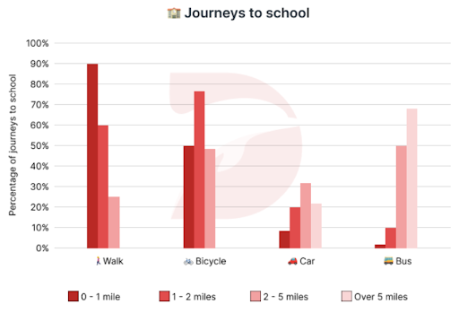
The bar chart delineates the commuting patterns of people aged 11 to 16 across various distances in the United Kingdom over the span of a year.
Overall, the majority of adolescents opted for pedestrian or cyclist modes of transportation for journeys spanning 2 miles or less, while buses emerged as the prevailing choice for longer distances over 5 miles.
For distances under 1 mile, pedestrian travel dominated, encompassing 90% of such journeys, outstripping cycling by a margin of 40%. Meanwhile, vehicular and bus transit constituted a minority , each representing less than 10% of total journeys. In the 1-2 mile range, cycling emerged as the favored mode, comprising roughly 75% of total journeys, closely followed by pedestrian travel at 60%, a figure triple that of car usage and six times higher than bus use.
For commutes spanning 2 to 5 miles, buses took precedence with a 50% share, marginally ahead of cycling at approximately 47%. Car and pedestrian modes followed at roughly 31% and 25% respectively. Finally, for journeys exceeding 5 miles, buses remained the dominant preference at around 70%, compared to 20% by car, while pedestrian and cyclist modes were not chosen for such extended distances.
Từ vựng tốt trong bài
- pedestrian (n): người đi bộ Giải thích: a person who is walking, especially in an area where vehicles go Ví dụ: A few pedestrians sheltered from the rain in doorways.
- emerge as the prevailing choice (v): trở thành lựa chọn phổ biến Giải thích: become the most commonly chosen option Ví dụ: The new smartphone model emerged as the prevailing choice among consumers due to its advanced features and affordable price.
- outstrip (v): bỏ xa, chạy vượt xa, chạy nhanh hơn Giải thích: to be or become greater in amount, degree, or success than something or someone Ví dụ: The demand for food in the war zone now far outstrips supply.
- a margin of (n): biên độ, xấp xỉ Giải thích: the difference or gap between two things, often used to indicate a range or extent Ví dụ: The margin of error in the survey was 3%, meaning that the actual results could vary by up to 3% from the reported figures.
- constitute a minority (v): chiếm ít số Giải thích: form a smaller portion or group compared to others. Ví dụ: Vegetarians constitute a minority of the population in this city, with only about 10% preferring a meat-free diet.
- take precedence (v): dẫn đầu, ưu tiên Giải thích: to be more important or to be dealt with before something else. Ví dụ: Safety concerns always take precedence over convenience when planning construction projects.
Lược dịch tiếng Việt
Biểu đồ thanh mô tả mô xu hướng đi lại của những người từ 11 đến 16 tuổi ở các khoảng cách khác nhau ở Vương quốc Anh trong khoảng thời gian một năm.
Nhìn chung, phần lớn thanh thiếu niên chọn phương tiện đi lại là trở thành người đi bộ hoặc người đi xe đạp cho những hành trình kéo dài 2 dặm hoặc ít hơn, trong khi xe buýt nổi lên là lựa chọn phổ biến cho những quãng đường dài hơn 5 dặm.
Đối với khoảng cách dưới 1 dặm, việc đi lại của người đi bộ chiếm ưu thế, chiếm 90% số hành trình như vậy, vượt xa xe đạp khoảng 40%. Trong khi đó, phương tiện giao thông cơ giới và xe buýt chỉ chiếm thiểu số, mỗi phương tiện chiếm chưa đến 10% tổng số hành trình. Trong phạm vi 1-2 dặm, đi xe đạp nổi lên là phương thức được ưa chuộng, chiếm khoảng 75% tổng số hành trình, theo sát là đi bộ với 60%, gấp ba lần so với việc sử dụng ô tô và cao gấp sáu lần so với sử dụng xe buýt.
Đối với các tuyến đường đi làm kéo dài từ 2 đến 5 dặm, xe buýt được ưu tiên với tỷ lệ 50%, nhỉnh hơn xe đạp khoảng 47%. Chế độ ô tô và đi bộ theo sau lần lượt là khoảng 31% và 25%. Cuối cùng, đối với những hành trình vượt quá 5 dặm, xe buýt vẫn được ưu tiên chiếm ưu thế ở mức khoảng 70%, so với 20% bằng ô tô, trong khi chế độ đi bộ và đi xe đạp không được chọn cho những quãng đường dài như vậy.
- Giải đề Writing Cambridge
- Giải Writing Task 1 năm 2023
- Giải Writing Task 2 năm 2023
- Giải Writing Task 1 năm 2024
- Giải Writing Task 2 năm 2024

IMAGES
VIDEO
COMMENTS
There are 5 steps to writing a good IELTS bar chart essay: 1) Analyse the question. 2) Identify the main features. 3) Write an introduction. 4) Write an overview. 5) Write the details paragraphs. Use this simple planning process as you practice writing IELTS bar chart essays and you'll have no problem remembering it in the exam.
Bar Charts for IELTS Writing. As we have seen, a bar chart is just another way of expressing data. For task 1 of the IELTS writing test, you may be asked to write about a bar chart. ... Write your essay carefully. Check your answer for mistakes. If you follow this basic routine, you will have a good chance of providing a strong answer to the ...
A Comprehensive Guide to Write IELTS Bar Chart Essay. If you wish to learn more about writing a high-scoring IELTS bar essay, here is a comprehensive process that will help you out. Evaluating the Question. The first and foremost step is to evaluate and analyze the question. In the question, you will get a brief description of the bar chart ...
Before writing an IELTS task 1 bar chart or line graph answer it is important that we analyse the question correctly. Taking a few minutes to do this will help us write a clear answer that fully responds to the question. Just what the examiner wants us to do. The first thing we need to do is decide if the bar chart is static or dynamic.
How to score high on a bar graph question in writing task 1. A horizontal or vertical bar chart could appear on your IELTS academic task 1. You may also get a stacked bar chart question which includes a lot more data than a vertical bar chart. The bar graph task 1 essay accounts for a third of your marks in the writing test so we recommend ...
How to Write About an IELTS Writing Task 1 Bar Chart. To effectively write about an IELTS Writing Task 1 bar chart, follow these tips. 1. Start by Reading the Title. First and foremost, you should read the title. Often, I have students report on the essay in an inverted order because they didn't read the bar chart title.
An IELTS writing bar chart, also known as a bar graph, is something you may encounter in writing task 1 of the IELTS academic exam. The writing section of the test lasts for 60 minutes in total, and you should dedicate. 20 minutes of your time to task 1. Writing task 1 is worth 40% of your overall score for the writing component.
MODEL ANSWER FOR THIS LESSON: BAR CHART MODEL ANSWER BAND 9; IELTS Bar Chart Tips Video Tutorial. This video lesson shows you how to tackle an IELTS bar chart for writing task 1 (academic paper). To see the full model answer for this video lesson, please click on the link above. Also read the summary of tips below the video.
Tips for an IELTS bar chart in writing task 1: finding key features, paragraph content: (introduction, overview and body paragraphs) and how to write complex...
Remember that it is not essential to write about each and every bar. You can just write it by mentioning the key features only. 2. Don't forget to mention the percentages which is an important variable of the graph here. 3. Take care of the years mentioned and write the correct one against the correct country name.
Follow this step-by-step lesson on IELTS Bar Chart essays. Discover how to plan, identify key features and structure a high-scoring essay. Work through a pra...
IELTS Writing Bar Graph Task 1: How to Answer. The bar graph task is part of the IELTS Writing Task 1. Ideally, you should spend only 20 minutes on this task. The task here is simple: analyse the given bar chart and summarise, highlight or compare the given features. The word limit for this task is a minimum of 150 words.
IELTS Writing Task 1: Bar Chart. by Liz 27 Comments. A free video lesson on an IELTS writing task 1 bar chart. ... IELTS Model Essay -Two Questions Essay Type; IELTS Bar Chart of Age Groups 2024; IELTS Topic: Urban Planning; IELTS Listening Transcripts: When and How To Use Them;
1. Introduction to IELTS Bar Chart Writing Task 1. Bar chart or Bar graph, in IELTS Writing Task 1, share several similar features with Line chart which has two axes (x-axe and y-axe). This feature helps people see how a trend has changed over time. On the other hand, instead of lines, IELTS Bar chart Writing Task 1 contains rectangular bars in ...
In this video, you are going to learn how to describe a bar chart that you'll find in the IELTS Academic Writing Task 1 questions.To watch all of our IELTS v...
These are bar charts and graphs that I've collected over the years from real past IELTS exams and other practice materials. Check out my EBoooks here on Patreon. Here are the IELTS bar charts and graphs! Dave. IELTS Task 1: Bar Charts and Graphs. Read my essay here. Read my essay here. Read my essay here. Read my essay here. Read my essay here.
IELTS TASK 1 Working correctly with numbers. IELTS TASK 1 Increase your band score with Adjectives/Adverbs. IELTS TASK 1 Using Compare and Contrast language. Bar charts usually have two main features that you need to notice - the comparison of two or more units or numbers in the same year, or charts that show changes over a period of time.
Below is a band score 9 sample answer for an IELTS bar chart in writing task 1. Below the model is a link to a video lesson about how to describe an IELTS bar chart. Watch the video to learn essential tips for each paragraph for a high score bar chart. The bar chart illustrates how many children, divided by gender, played six kinds of sports ...
Scorer Commentary (Bar Chart, Band 9) The score report below is based on the official IELTS Writing Task 1 rubric. This report also looks very similar to the Magoosh IELTS essay scoring service. Overall Band Score: 9. What was done well in the essay: This essay is borderline risky when it comes to word count.
An introduction and overview for an IELTS chart is given below. The introduction is the easiest paragraph to write and the overview is the most important paragraph in your report. Look at the sample paragraphs below for the IELTS chart given and fill in the gaps. This lesson will help you understand introduction and overview content as well as ...
1. Introduction. You should start your answer by writing an introduction. The introduction is 1 or 2 sentences, where you paraphrase the information from your question. You should mention two things in your introduction: what your graph shows. for what period of time.
You should spend about 20 minutes on this task. The bar chart shows the scores of teams A, B and C over four different seasons. Summarize the information by selecting and reporting the main features and make comparisons where relevant. Write at least 150 words. IELTS Bar Graph. The bar chart shows the scores of three teams, A, B and C, in four ...
This is an IELTS writing task 1 sample answer essay featuring two graphs, a pie chart and a bar chart, related to students in Singaport for 200 to 2010. ... IELTS Essay: Two Graphs (Pie and Bar Charts) The bar chart records how long students spent in school by gender in two year intervals from 2000 to 2010, while the pie charts break down where ...
In the IELTS Writing Task 1, you can be asked to describe a bar graph. You will need to describe the chart within 150 words. It is recommended to complete the task within 20 minutes. Structure of Bar Graph Essay. Walking by the right structure of answering the bar graph question improves your chances of scoring well.
On this page, we'll explore various strategies that can be used to solve IELTS Writing Pie Chart question types and provide you with samples for better understanding. 1. IELTS Writing Pie Chart Task 1: Sample Answer. You can quickly climb the learning curve by practising regularly and referring to sample answers! Read More.
IELTS Thanh Loan - Trung tâm luyện thi IELTS cung cấp các khóa học IELTS Online , sách IELTS: ĐT: 0974 824 724. Email: [email protected]. Địa chỉ: S103 Vinhomes Smart City, Tây Mỗ, Nam Từ Liêm, Hà Nội. The chart below gives information about the journeys to school by children aged 11 to 16 in the UK in a year.