
Great fonts for a PhD thesis – and terrible ones
There are thousands of fonts out there – which one should you choose for a great-looking PhD thesis? I will explain the differences between serif and sans-serif fonts, what ligatures are and why you shouldn’t use that fun free font you found on the internet.
Great fonts for a PhD thesis: Serif vs. sans-serif
As I explained in my Ultimate Guide to preparing a PhD thesis for printing , there are two basic kinds of fonts: Serif fonts and sans-serif fonts. Serif fonts have small lines – serifs – at the ends of all lines. Sans-serif fonts don’t have those lines. Compare these two, Palatino Linotype and Arial:

Serifs guide the reader’s eyes, making sure that they stay in the same line while reading a printed text. In turn, your reader’s brain won’t get tired so quickly and they can read for longer.
But there is another feature that many serif fonts have. Look at these three (which are all great fonts to use in your PhD thesis, btw):

If you look closely, you will see that serif fonts often have different stroke thicknesses within every letter. This is called “weight contrast”. A subtle weight contrast further improves legibility of a printed text. Hence, I recommend you use a serif font with a bit of a weight contrast for your main text.
Which serif font should you choose?
But whatever you do, this one thing is extremely important: Choose a font that offers all styles: regular, italics , bold , and bold italics . Since these four styles all need to be designed separately, many fonts don’t offer all of them. Especially bold italics is absent in most free internet fonts and even from many fonts that come with your operating system or word processor.
Also: In your bibliography and in-text citations (if you go with an author-year citation style) you will have to display author’s names from all over the world. Many of them will contain special letters. For example German umlauts (ä, ö, ü), accented letters used in lots of of languages, i.e. French or Spanish (à, é, ñ, etc.), and dozens of other special letters from all kinds of languages (ç, ı, ł, ø, etc.). Be aware that only a very limited number of fonts offer all of these!
If you have mathematical equations in your thesis that require more than +, – and =, your font choices are limited even further . After all, the vast majority of fonts do not offer special operators.
As you can see, these criteria severely limit your choice of font for the main text. Needless to say, they rule out free fonts you can download from dafont.com or 1001fonts.com . That is why I urge you to go with a classic font. To make things easier for you, here is a table with serif fonts that offer all the characters you could dream of:
Failsafe serif fonts for your PhD thesis
These fonts are heavily based on fonts that have been in use since the invention of the mechanical printing press in the 15th century. Hence, these types of fonts have been tried and tested for more than 500 years. Hard to argue with that!
But which of these fonts is The Best TM for a PhD thesis? That depends on how much text you have in your thesis vs. how many figures, tables, equations, etc. As I have noted in the table, fonts have different widths. Look at this image showing the same text in Times New Roman (TNR), Cambria, and Sitka Text; all at the same size:
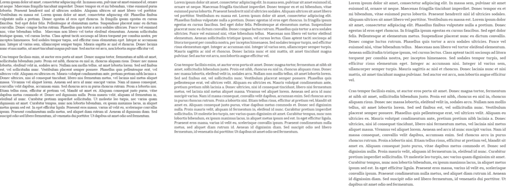
Hence, setting entire pages of text in TNR will make the page look quite dense and dark. So, a thesis with a lot of text and few figures is best set in a wider font like Sitka Text. On the other hand, if you have a lot of figures, tables, etc., TNR is a good choice because it keeps paragraphs of text compact and therefore the page from looking too empty. Medium-width fonts like Cambria are a good compromise between the two.
To see some of these fonts in action, check out this example PhD thesis where I show all sorts of font combinations and page layouts.
When to use a sans-serif font in your PhD thesis
This covers serif fonts. But which sans-serif fonts are great for your PhD thesis? And when do you use them?
As mentioned above, serif fonts are good for the main text of your thesis. But titles and headings are a different story. There, a sans-serif font will look very nice. Plus, using a different font in your headings than in the main text will help the reader recognize when a new section begins.
Here are some examples for good sans-serif fonts:

Each of these fonts – Futura, Franklin Gothic Book, and Gill Sans – are wonderful for headings in a PhD thesis. Why? Because they are easily readable, well-balanced and don’t call undue attention to themselves. Also, they have many options: regular, light, medium, bold, extra bold, including italics for all of them. And most operating systems or word processors have them pre-installed.
The criteria for heading fonts are not nearly as strict as those for main text fonts. If you have Latin species names in your headings, make sure the font offers (bold) italics. If you need to display Greek letters in your headings, make sure the font offers those. Done.
However, there are some criteria for headings. Just for fun, let’s have a look at some sans-serif fonts that would be a bad choice for a thesis:

I’d like to explicitly state that these are wonderful, well-designed fonts – you just shouldn’t use them in a scientific document. Heattenschweiler is too narrow, Broadway has too much weight contrast and Aspergit Light is too thin. All of these things impair readability and might make your opponents squint at your headings. Of course, you will want to do everything in your power to make the experience of reading your thesis as pleasant a possible for your opponents!
How are these fonts great for my PhD thesis? They are boring!
Why yes, they are, thanks for noticing!
Seriously though, the fonts not being interesting is the point. Your PhD thesis is a scientific document showing your expertise in your field and your ability to do independent research. The content of your thesis, the science, should be the sole focus. A PhD thesis is not the place to show off your quirky personality by way of an illegible font.
However, you can infuse your personality into your thesis cover and chapter start pages. There, you can use a fun font, since you probably don’t have to display any special characters.
Choosing the right font is too much pressure? Contact me for help with your layout!
Don’t use fonts made for non-Latin alphabets (Cyrillic, Hanzi, etc.)
Every computer nowadays comes pre-installed with a number of fonts made for displaying languages that don’t use the Latin alphabet (Latin alphabet = The alphabet in which this very article is displayed). Prominent examples for languages that don’t use the Latin alphabet are Asian languages such as Chinese, Japanese, Korean, Thai, etc. Other examples include the Arabic, Brahmic, and Cyrillic script. But there are many more fonts for a myriad of non-Latin alphabets. These fonts were optimized to make the characters of their languages easily readable.
However (and this is why I’ve written this entire section) they usually also contain Latin characters to be able to display the occasional foreign word.
Hence, you might want to honour your roots by using a font in your thesis that was made for your native language, by someone from your home country. It is tempting, because all the Latin characters are there, right? I completely understand this wish, but I strongly advise against it since there are some serious drawbacks.
Don’t get me wrong, I’m not throwing shade on these fonts, they are fantastic at what they were made for. Displaying long stretches of text in the Latin alphabet, however, is not one of those things. Let me explain why.
They don’t offer all necessary characters
Firstly, fonts made to display languages with a non-Latin alphabet contain the bare minimum of Latin characters. That is, the basic letters and the most important punctuation marks. Hence, they don’t have all those math operators and special characters I talked about in the section about serif fonts.
Also, the Latin characters in these fonts are usually sans-serif, so less suitable for long text.
But let’s say the non-Latin alphabet font you chose does offer all special characters and has serifs. Unfortunately, they are still not suitable to use in your PhD thesis, for the following reasons:
They are often too small or large for use with greek letters
Do you mention β-Mercaptoethanol or α-Histidin antibodies in your Materials and Methods? Or any other Greek letter? Since Latin characters are scaled differently in fonts made for non-Latin alphabets, Greek letters will not be the same size as the rest of the text anymore. For example, look at this text, where I rendered everything (I swear!) in the specified font size:

In the first panel (Cambria), the Greek letters are the same size and weight as the main text. As I have said, Cambria is one of the fonts explicitly recommended for your thesis. If you look closely at the enlarged line on the bottom of the panel, you can see that the alpha is the same height as the lower-case letters, whereas the beta is the same height as the upper-case letters. It looks neat and tidy.
However, by using a non-Latin font for your PhD thesis, you are asking for trouble.
In the second panel, I show Cordia New, a font for Thai script. At 12 pt, it is way smaller than the Latin font. The Greek letters – which are also at 12 pt! – stand out awkwardly. Also, Cordia New produces a line distance that is larger than it should be when using it for a text in the Latin alphabet.
In the last panel I show Microsoft YaHei for displaying Hanzi characters. Here, the Latin characters are larger. This leads to the Greek letters being too small. And, as you can see in the second and third lines of the paragraph of text, the line distance is quite narrow. However, the Greek letter β requires a regular line distance. So, it pushes the following line down, making the paragraph look uneven.
They don’t offer ligatures
Now, what on earth are ligatures? I could dive into the history of book printing here but I’ll spare you those details. In essence, Ligatures are two or more letters that are printed as one single glyph. Let me show you:

In the top line, you can see that the characters inside the boxes “melt” into each other. This single shape made out of several letter is called a ligature. They are mostly common with the small letter f. If you take a magnifying glass and look at the pages of a novel, you will quickly find these same ligatures. E-readers also display ligatures. Heck, even WhatsApp does it!
Ligatures also make the text easier to read. However, in order to display them, a font actually has to have the glyphs for the ligatures. And many fonts don’t. In order to find out whether a font you chose offers them, go to the character map of that font. (In Windows 10, simply click the windows logo in the corner of your screen and start typing the word “character”.) Pick a font in the drop-down menu. Now, search for the word “ligature” in the character map. If the map is empty after this, the font has no ligature glyphs.
All that being said, ligatures are not super important. I just wanted to mention them.
You can still use fonts made for non-Latin alphabets
If you want to honour your roots by way of a font, you can still do this. For example in your thesis title and/or for the chapter start pages.
In a word: Don’t go crazy with those fonts! Let your science do the talking. If you want to see what your thesis could look like with some of the fonts I recommended, check out the example PhD thesis .
Do you want to see a font combination that’s not in the example thesis? Contact me and I’ll set a few pages in your desired font, free of charge!
Click here for help with your PhD thesis layout!
Bedrijvsgegevens | About
Privacyverklaring | Privacy Policy
How To Choose The Thesis Font Type For Your Dissertation – Deatils Information
Writing a dissertation is one of the most significant academic achievements you will undertake. Choosing the right font type for your thesis is essential to presenting your research professionally and elegantly.
The type of font you choose can affect your research’s readability, clarity, and overall impression. With so many font options available, deciding which font type is best suited for your research can be challenging. We’ll guide you through choosing the perfect font type for your research.
We’ll discuss key factors to consider when choosing a font, such as legibility, readability, and aesthetics, and provide practical tips to help you make an informed decision. Additionally, we will explore different font types commonly used in academic writing, including serif, sans-serif, and monospace fonts, and highlight their unique characteristics and applications. Whether you are an experienced academic writer or a novice dissertation writer, this post will equip you with knowledge and skills.

Table of Contents
What Is A Thesis Font Type?

Choosing the right font type can be an important decision when writing a thesis. The most common font types used for academic writing, including theses, are Times New Roman and Arial. Both fonts are easily read and widely accepted as appropriate for academic writing.
However, some universities or departments may have specific requirements for font type, so it is important to check with your advisor or institution before making a final decision. Ultimately, the most important thing is to choose a font that is easy to read and does not distract from the content of your thesis.
Thesis Font Choosing The Right Typeface For Your Research
When choosing the right font for your thesis, it’s important to consider both readability and professionalism. While many options are available, some fonts may not be appropriate for academic work. Here are some tips for choosing the right typeface for your research:
- Stick with traditional fonts. Times New Roman, Arial, and Calibri are commonly used in academic papers and have a professional look.
- Avoid decorative or script fonts . While these may be aesthetically pleasing, they can be difficult to read and may not be taken seriously by your readers.
- Consider font size and spacing. Ensure that your chosen font is legible when printed at a small size and that there is enough spacing between lines to make reading comfortable.
Choosing the right font is an important part of presenting your research clearly and professionally. Take the time to choose a font that will enhance the readability of your work and reflect the level of professionalism expected in academic writing.
Factors To Consider When Choosing A Thesis Font
When choosing the perfect font for your thesis, there are various factors to consider. First and foremost, readability is a crucial aspect. Choosing a font that is easy on the eyes and doesn’t cause any strain is important. Additionally, professionalism is key in academic writing, so select a font that aligns with the formality required in your dissertation.
Consistency is also vital; use a single font throughout your thesis to maintain a cohesive look. Finally, accessibility should be considered to ensure that everyone can read and understand your work regardless of their visual abilities. Considering these factors, you can find the perfect thesis font type that complements your research topic and style while meeting academic requirements.
Readability

Ensuring that your dissertation is readable is crucial when selecting a font type for your thesis. A font that is too small or difficult to read can make your work less accessible and harder to understand, ultimately hindering its impact on readers.
Sans-serif fonts like Arial or Helvetica are often recommended for their clarity and legibility, while serif fonts like Times New Roman can add a more traditional touch. Additionally, it’s essential to consider the spacing between letters and lines and any special characters or symbols required in your thesis.
Legibility is a crucial factor to consider when selecting a font for your thesis. The last thing you want is to make your work less accessible and harder to comprehend by using a font that is illegible or too small in size. Stick with simple, clear fonts like Times New Roman or Arial, which are popular for academic writing due to their easy-to-read letters.
Avoid using overly intricate or decorative fonts that can detract from the legibility of your work. Be mindful of the font size and spacing between letters and lines as well, as these factors can also affect the legibility of your document.
Selecting the appropriate font size for your thesis is crucial to its readability and overall appearance. Most universities require a font size between 10 and 12 points, but it’s essential to check with your specific institution for their guidelines.
Choosing a font size that is too small can make your thesis difficult to read while selecting one that is too large can make it appear unprofessional. Consider the content of your thesis when deciding on a font size – if it contains detailed charts or diagrams, you may need a slightly larger font for optimal clarity.
Tips For Formatting Your Thesis Font

When formatting your thesis font, following a few tips can go a long way in creating a professional-looking and readable document. First, choose a font that is easy on the eyes and appropriate for academic writing. Stick to one or two fonts throughout your thesis to maintain consistency and avoid distracting your readers.
Additionally, attention to the font size, line spacing, margins, and indentation. Ensuring that these elements are consistent and properly formatted can make a significant difference in the overall appearance of your thesis. Finally, proofread your work before submission to ensure it meets all necessary guidelines and requirements.

Properly formatted margins can make or break the appearance of your thesis, so it’s essential to get them right. Margins are crucial in improving readability and ensuring that your thesis looks professional.
The standard margin size for academic papers is 1 inch on all sides, but it’s essential to check with your institution’s guidelines as some universities may require different sizes. Paying attention to the margins can help ensure that your thesis looks polished and well put together.
Line Spacing
Effective formatting of a thesis font includes appropriate line spacing to ensure readability. Line spacing is an essential factor that impacts your thesis’s overall appearance and readability. It is important to balance too much space or too little space between each line. Single-spacing can make the text appear cramped, while double-spacing creates too much white space, making reading challenging.
Most universities require a line spacing of 1.5 or 2.0 for academic papers, but it’s crucial to check with your department or advisor for specific guidelines in your academic discipline. Proper line spacing helps improve the document’s visual appeal and makes it easier for readers to engage with the content.
Indentation
Indentation is an essential factor to consider when formatting your thesis font. It helps create a clear and organized document by separating each paragraph from the previous one. The standard indentation for academic writing is 0.5 inches or five to seven spaces.
Consistent application of indentation throughout your document, including in block quotes and reference lists, can make your thesis look more professional and easier to read. Proper use of indentation gives your work a structured appearance, making it easy for readers to navigate your document easily.
The right font choice is essential when it comes to pagination in your thesis. You want to select a legible and distinguishable font for page numbers. Arial, Times New Roman, and Calibri are popular choices for pagination in academic documents.
Additionally, consider using bold or italic formatting for page numbers to make them stand out and avoid confusion. Remember that choosing the right pagination font is just one of many factors contributing to a professional-looking and well-organized thesis.
How To Change The Thesis Font Type In Adobe Indesign?

When it comes to changing the thesis font type in Adobe InDesign , there are a few things to consider. First and foremost, choosing a font that is easily readable and appropriate for academic writing is crucial. Consider the purpose of your thesis and the audience you are writing for when selecting a font.
Adobe InDesign offers a variety of font options, so take the time to explore different choices and find one that suits your needs. Once you’ve selected your font, test it on different devices and screen sizes to ensure readability. Following any specific guidelines or requirements set by your university or academic institution regarding font type and size is essential for achieving a professional-looking document.
Choosing the right font type for your dissertation can be a daunting task. However, there are some guidelines that you can follow to make the process easier. Choosing the right font for your thesis is an important aspect of your dissertation writing process. This can make or break the readability and clarity of your research paper.
Consider font size, readability, and legibility when choosing a typeface for your thesis. Ensure you maintain formatting consistency throughout the dissertation by following proper margins, line spacing, indentation, and page placement tips. Remember, the right font enhances the overall impact of your research paper.
Frequently Asked Questions
What is the best font for the thesis.
Regarding fonts for a thesis, serif fonts like Times New Roman, Georgia, and Garamond are typically the best choices as they tend to be more legible in print. It’s important to choose a font that is easy on the eyes and meets the guidelines of your academic institution. Ultimately, the font choice will depend on personal preference and the specific requirements of your thesis.
What Is The Standard Font Size For The Thesis?
The standard font size for a thesis is generally 12 points, but it’s always a good idea to check with your university or department for any specific requirements. It’s essential to maintain font size consistency throughout the document. However, selecting a legible and professional font that is easy to read is more important than the size of the font.
What Font Is Used For Phd Thesis?
No specific font is required for PhD thesis writing, but most universities have font size and style guidelines. Some popular fonts for academic writing include Times New Roman, Arial, and Calibri. It is important to choose a font that is easy to read and looks professional to ensure your thesis is well-received by readers.
Can I Use Calibri For My Thesis?
Yes, Calibri is an acceptable font for a thesis. However, it’s important to follow the guidelines provided by your academic institution or advisor regarding font type and size. Other popular fonts used in academic writing include Times New Roman and Arial. Regardless of the font you choose, proofread your thesis carefully to ensure the text is clear and legible.
How Can The Font Type Affect The Readability Of My Thesis?
The font type you choose can greatly impact the readability of your thesis. Traditional serif fonts like Times New Roman are often easier to read in printed documents. In contrast, sans-serif fonts like Arial or Calibri may be better suited for on-screen reading. Choosing a font that is easy to read and aesthetically pleasing is important, as this can make a big difference in the overall impression your thesis makes on readers.

David Egee, the visionary Founder of FontSaga, is renowned for his font expertise and mentorship in online communities. With over 12 years of formal font review experience and study of 400+ fonts, David blends reviews with educational content and scripting skills. Armed with a Bachelor’s Degree in Graphic Design and a Master’s in Typography and Type Design from California State University, David’s journey from freelance lettering artist to font Specialist and then the FontSaga’s inception reflects his commitment to typography excellence.
In the context of font reviews, David specializes in creative typography for logo design and lettering. He aims to provide a diverse range of content and resources to cater to a broad audience. His passion for typography shines through in every aspect of FontSaga, inspiring creativity and fostering a deeper appreciation for the art of lettering and calligraphy.
Related posts:
- How To Change Your iPhone Font: A Comprehensive Guide The iPhone’s default font is called San Francisco. It was designed by Apple and created by Apple’s in-house typography team, known as the Typeface team. The Typeface team is led by Jonathan Hoefler, a prominent type designer and the head...
- How To Change The Font In Latex – A Guide LaTeX is a popular document preparation system widely used in academic and scientific fields for its superior typesetting capabilities. While its default font is aesthetically pleasing and suitable for most applications, there are times when users may want to change...
- Mastering Latex Font Family With LATEX The Latex font family is a versatile tool that can create professional-looking documents with various font options. One of the key features of LaTex is the ability to use a wide range of fonts to create visually appealing documents. Here,...
- Creating A Memorable Birthday Experience With Customized Birthday Fonts Birthdays are special occasions that allow us to celebrate the life of our loved ones. From creating a perfect theme to selecting the right decor, every little detail matters when making a memorable birthday experience. One such small yet impactful...
Leave a Comment Cancel reply
Save my name, email, and website in this browser for the next time I comment.
- Superhero Fonts
- Gaming Fonts
- Brand Fonts
- Fonts from Movies
- Similar Fonts
- What’s That Font
- Photoshop Resources
- Slide Templates
- Fast Food Logos
- Superhero logos
- Tech company logos
- Shoe Brand Logos
- Motorcycle Logos
- Beer Brand Ads
- Car Brand Ads
- Fashion Brand Ads
- Fast Food Brand Ads
- Shoe Brand Ads
- Tech Company Ads
- Web and mobile design
- Digital art
- Motion graphics
- Infographics
- Photography
- Interior design
- Design Roles
- Tools and apps
- CSS & HTML
- Program interfaces
- Drawing tutorials

Lessons To Learn from Notable Rebranding

The Wegmans Logo History, Colors, Font,

Event Advertising: How to Make a

The Walmart Logo History, Colors, Font,
Design Your Way is a brand owned by SBC Design Net SRL Str. Caminului 30, Bl D3, Sc A Bucharest, Romania Registration number RO32743054 But you’ll also find us on Blvd. Ion Mihalache 15-17 at Mindspace Victoriei
Academic Appeal: The 11 Best Fonts for Academic Papers
- BY Bogdan Sandu
- 26 February 2024

Imagine settling into the rhythm of crafting your academic magnum opus—the words flow, ideas chime, yet it all hinges on how your prose meets the reader’s eye. You’re well aware that the best fonts for academic papers don’t just whisper to the intellect; they shout to the discerning critic in each evaluator. Here unfolds a narrative, not merely of typography but your academic saga’s silent ambassador.
In forging this guide, I’ve honed focus on one pivotal, often underestimated player in the academic arena: font selection .
Navigate through this roadmap and emerge with a treasure trove of legible typefaces and format tips that ensure your paper stands hallmark to clarity and professionalism.
Absorb insights—from the revered Times New Roman to the understated elegance of Arial —paired with indispensable formatting nuggets that transcend mere compliance with university guidelines .
Dive deep, and by article’s end, unlock a dossier of sage advice, setting your documents a class apart in the scrutinous world of academic scrutiny. Here’s to typography serving not just as a vessel but as your ally in the scholarly discourse.
The Best Fonts for Academic Papers
Traditional choices and their limitations, times new roman : ubiquity and readability vs. overuse.

Cambria : Designed for readability on screen, good for electronic submissions

The Pittsburgh Penguins Logo History, Colors, Font, And Meaning
The dallas stars logo history, colors, font, and meaning.

You may also like

Ad Impact: The 19 Best Fonts for Advertising
- Bogdan Sandu
- 20 December 2023

T-Shirt Typography: 30 Best Fonts for T-Shirts
- 21 December 2023
- Graduate School
- Current Students
- Dissertation & Thesis Preparation
Formatting Requirements
Choice of font.
For most theses, the font should be one that is appropriate for an academic paper. Generally, the same font should be used throughout the thesis (dedication page and scholarship-appropriate alterations excepted).
Normally the font should be equivalent to 10 to 12 point font in Times New Roman or Arial for main text, and at least 2mm high in tables and figures.
Font colour should normally be black throughout, except for web links which should be blue.
- Why Grad School at UBC?
- Graduate Degree Programs
- Application & Admission
- Info Sessions
- Research Supervisors
- Research Projects
- Indigenous Students
- International Students
- Tuition, Fees & Cost of Living
- Newly Admitted
- Student Status & Classification
- Student Responsibilities
- Supervision & Advising
- Managing your Program
- Health, Wellbeing and Safety
- Professional Development
- Final Doctoral Exam
- Final Dissertation & Thesis Submission
- Life in Vancouver
- Vancouver Campus
- Graduate Student Spaces
- Graduate Life Centre
- Life as a Grad Student
- Graduate Student Ambassadors
- Meet our Students
- Award Opportunities
- Award Guidelines
- Minimum Funding Policy for PhD Students
- Killam Awards & Fellowships
- Policies & Procedures
- Information for Supervisors
- Dean's Message
- Leadership Team
- Strategic Plan & Priorities
- Vision & Mission
- Equity, Diversity & Inclusion
- Initiatives, Plans & Reports
- Graduate Education Analysis & Research
- Media Enquiries
- Newsletters
- Giving to Graduate Studies
Strategic Priorities
- Strategic Plan 2019-2024
- Improving Student Funding
- Promoting Excellence in Graduate Programs
- Enhancing Graduate Supervision
- Advancing Indigenous Inclusion
- Supporting Student Development and Success
- Reimagining Graduate Education
- Enriching the Student Experience
Initiatives
- Public Scholars Initiative
- 3 Minute Thesis (3MT)
- PhD Career Outcomes
- Great Supervisor Week
Study at Cambridge
About the university, research at cambridge.
- Events and open days
- Fees and finance
- Student blogs and videos
- Why Cambridge
- Course directory
- How to apply
- Fees and funding
- Frequently asked questions
- International students
- Continuing education
- Executive and professional education
- Courses in education
- How the University and Colleges work
- Visiting the University
- Term dates and calendars
- Video and audio
- Find an expert
- Publications
- Global Cambridge
- Public engagement
- Give to Cambridge
- For current students
- For business
- Colleges & departments
- Libraries & facilities
- Museums & collections
- Email & phone search
- Computer Laboratory
- Internal information
Typographic resources
- Thesis formatting
Department of Computer Science and Technology
- Academic staff
- Support staff
- Contract researchers
- Fellows & affiliates
- PhD students
- Wednesday Seminar Series
- Wheeler Lectures
- women@cl 10th Anniversary
- Computer Laboratory 75th Anniversary
- Shopping and leisure
- Library induction
- Electronic resources
- Virtual journals shelf
- Local services
- Lab technical reports
- External technical reports
- Resource lists
- Reading lists
- Maps and directions
- Contact information
- Group Meetings
- Project ideas for current students
- Projects and research topics
- [no title found]
- Selected Publications
- Open source components
- Contact Details
- Applying to do a PhD
- Project suggestions
- Other information
- Reading Club
- Postgraduate opportunities
- Programming, Logic, Semantics
- Projects and topics
- Security Seminar Series
- Mailing lists
- Research Projects
- Student Projects
- Digital Technology Group
- Research Admin
- PhD applications
- Graduate Admissions Prospectus
- Funding deadlines
- MPhil in Advanced Computer Science
- Premium Research Studentship
- Student Administration
- Induction for M.Phil and Part III students
- Part III and ACS projects
- Part IA CST
- Part IB CST
- Part II CST
- Lecturer index
- Instructions for lecturers
- Examination dates
- Examination results
- Examiners' reports
- Plagiarism and collusion
- Purchase of calculators
- Data Retention Policy
- Past exam papers
- Guidance on deadlines
- Part III Assessment
- MPhil Assessment
- Student Complaint Procedure
- Short form timetable
- Part II supervisions overview
- Part II sign-up dates
- Notes on supervising
- Supervisor support
- Advice for students visiting Cambridge
- UROP internships
- Previous years
- Briefing document (Pink Book)
- Important dates
- Phase 1 report
- Back-up advice
- Resources Declaration
- Studies Involving Human Participants
- Failure to submit proposal
- Selection Tips
- Declaration of originality
- Submission of dissertation
- IP ownership
- Diploma model projects
- Older project suggestions
- Supervising Notes
- Overseer Briefing Notes
- Directors of Studies
- Managed Cluster Service
- Part III and MPhil machines
- Online services
- Installing Linux
- Microsoft Azure for Education Membership
- Neil Wiseman, 1934–1995
- Roger Needham, 1935–2003
- David Wheeler, 1927–2004
- Karen Spärck Jones, 1935–2007
- Judith Ann Bailey, 1934–2008
- Robin Milner, 1934–2010
- Sir Maurice Wilkes, 1913–2010
- Michael JC Gordon, 1948–2017
- Richard Gibbens, 1962–2018
- An introduction to our computing facilities
- Information for new PhD students
- Information for new staff
- Information for visitors
- Information for hosts of visitors
- General information
- Induction Guidelines
- Specialist resources
- Printing and scanning
- The CL network
- SSH access to the CL systems
- Supported platforms
- Generic Unix/Linux information
- Web servers and sites
- The RT ticketing system
- Lecture theatre AV
- Departmental policies
- Meeting rooms
- Personnel information
- Staff training
- Wiseman prize
- General health and safety
- Environment
- H&S policies & committees
- Risk assessment
- Laser safety
- Useful links
- Index of Health & Safety pages
- PhD supervisors
- Graduate Advisers
- First Year Report: PhD Proposal
- Second Year Report: Dissertation Schedule
- Third Year Report: Progress Statement
- Fourth Year Report: the last year
- Papers and conferences
- Submitting your dissertation
- Exemption from University Composition Fees
- Leave to work away, holidays and intermission
- Researcher Development
- Application deadlines
- List of PhD thesis
- Graduate Students' Forum
- PAT, recycling and Building Services
- Preparing Tripos exam questions in LaTeX
- Information for CST examiners
- Information for Directors of Studies
- ACS module definition
- Providing advice to incoming ACS students
- ACS interviewing and admissions
- Outreach material
- Faculty Board
- Degree Committee
- Graduate Education
- Tripos Management
- Health & Safety
- IT Strategy
- Equality and Diversity
- Research Staff
- Staff–Student
- Graduate Students
- Buildings and Environment
- Discontinued committees
- Building Services
- Access and security
- Care of the WGB
- Facilities in offices
- Energy & Environment
- West Cambridge Site
- Leaving the department
- New arrivals
- Specialist resources ➥
- System administration
- Roles and responsibilities
- Information for staff
- Health and safety
- PhD resources
- Teaching resources
- William Gates Building
PhD thesis formatting
There is no official pre-made departmental or University-wide style template for PhD theses. Some argue that learning (and advancing!) the art of beautifully typesetting a thesis is a crucial part of getting a PhD.
Here are some practical recommendations, examples, and useful starting points.
Most PhD authors in the Computer Laboratory prefer LaTeX as their typesetting system (under both Linux or Windows), mainly because of its
- excellent and yet unmatched support for mathematical formulae;
- good support for managing bibliographic references;
- good support for high-quality typography;
- easy integration with software-engineering tools (make, revision control, etc.);
- very safe and robust handling of large documents;
- long-term stability;
- comprehensive free tool support.
A common approach is to use the report style, with a suitable title page added, margins changed to make good use of the A4 format, and various other changes to suit submission requirements and individual tastes (e.g., other fonts).
For preparing publication-quality diagrams, some of the most powerful and popular tools used include:
- PGF/TikZ – the probably most sophisticated drawing package for LaTeX
- matplotlib – Matlab-style function plotting in Python
Official requirements
There used to be detailed Student Registry PhD format requirements , regarding font sizes and line spacing, but most Degree Committees have dropped these, recognizing that they were mainly motivated by past typewriter conventions. The rules left are now mainly about the word count .
In particular, it is no longer necessary for dissertations to be printed single sided or in “one-and-a-half spaced type”. If you still like to increase the line spacing, for easier proofreading, you can achieve this in LaTeX by placing into the preamble the line “ \usepackage{setspace}\onehalfspacing ”.
Recommendations
One Cambridge thesis-binding company, J.S. Wilson & Son , recommend on their web page to leave 30 mm margin on the spine and 20 mm on the other three sides of the A4 pages sent to them. About a centimetre of the left margin is lost when the binder stitches the pages together.
Write your thesis title and section headings in “sentence case”, that is use the same capitalization that you would have used in normal sentences (capitalize only the first word, proper nouns and abbreviations). Avoid the US-style “title case” that some conference-proceedings publishers require.
- Sentence case is normal typographic practice in the UK (see any UK-published newspaper, magazine, journals such as Nature , etc.).
- The catalogues of both the University Library thesis collection and our departmental Technical Report series record titles this way, and you don't want the cataloguers mess with your title capitalization when your thesis finally reaches them.
- It preserves useful information about the correct capitalization of any names or technical terms used.
Page numbers
Use a single page-number sequence for all pages in your thesis, i.e. do not use a separate sequence of Roman numerals for front-matter (title page, abstract, acknowledgements, table of contents, table of figure). In LaTeX that means using the report style, not the book style.
- PDF viewers number pages continuously starting from 1, and using anything else as printed page numbers causes confusion.
- This will save you some reformatting when submitting your thesis as a techreport .
Bibliographic references
If you use purely-numeric bibliographic references, do not forget to still mention authors’ surnames, as a courtesy to both the authors and your readers. Also, try to add the exact page number on which the quoted point is found in the reference; LaTeX supports this really well. (“suggested by Crowcroft and Kuhn [42,p107]”)
Technical Report submission
After a thesis has been approved by the examiners, the author normally submits it for publication as a Computer Laboratory Technical Report .
It is a good idea to read early on the submission guidelines for technical reports , as this may reduce the need to change the formatting later.
If you want to minimize any changes needed between your submitted thesis and the corresponding technical report version, then – in addition to applying all the above advice – you can
- make page 1 the title page,
- make page 2 the required declaration of originality,
- make page 3 the summary, and
- choose a layout suitable for double-sided printing (required for techreport, since 2010 also allowed for final PhD submission).
This way, there is a very high chance that turning your thesis into a techreport could be as simple as replacing pages 1 and 2 with the standard Technical Report title page (which the techreport editor can do for you).
More information
- The Computer Laboratory house style page explains where to find the University identifier that many put on the title page of their thesis.
- Markus Kuhn’s simple PhD thesis template ( snapshot ) is just one possible starting point.
- The cam-thesis LaTeX class is a collaborative effort to maintain a Cambridge PhD thesis template for Computer Laboratory research students, initiated by Jean Martina, Rok Strniša, and Matej Urbas.
- Effective scientific electronic publishing – Markus Kuhn’s notes on putting scientific publications onto the web, especially for LaTeX/LNCS users.
- International Standard ISO 7144 Presentation of theses and similar documents (1986) contains also some general guidelines for formatting dissertations that may be of use.
- University A-Z
- Contact the University
- Accessibility
- Freedom of information
- Terms and conditions
- Undergraduate
- Spotlight on...
- About research at Cambridge

- Langson Library
- Science Library
- Grunigen Medical Library
- Law Library
- Connect From Off-Campus
- Accessibility
- Gateway Study Center
Email this link
Thesis / dissertation formatting manual (2024).
- Filing Fees and Student Status
- Submission Process Overview
- Electronic Thesis Submission
- Paper Thesis Submission
- Formatting Overview
- Fonts/Typeface
- Pagination, Margins, Spacing
- Paper Thesis Formatting
- Preliminary Pages Overview
- Copyright Page
- Dedication Page
- Table of Contents
- List of Figures (etc.)
- Acknowledgements
- Text and References Overview
- Figures and Illustrations
- Using Your Own Previously Published Materials
- Using Copyrighted Materials by Another Author
- Open Access and Embargoes
- Copyright and Creative Commons
- Ordering Print (Bound) Copies
- Tutorials and Assistance
- FAQ This link opens in a new window
Selecting a Font (Typeface)
Be consistent in the use of font/typeface throughout your manuscript. All text material must be in the same font/typeface; all headings and figure/table titles/captions must be in a consistent typeface.
Please select a font and size that is highly legible and will reproduce clearly. Ornate or decorative fonts such as script, calligraphy, gothic, italics, or specialized art fonts are not acceptable. For electronic submissions, embedded fonts are required.
Any symbols, equations, figures, drawings, diacritical marks, or lines that cannot be typed, and therefore are drawn, must be added in permanent black ink.
Below are suggested fonts and sizes.

Establish and follow a consistent pattern for layout of all headings. All headings should use the same font size, font weight, typeface, etc.
For example: center all major headings; place secondary headings at least two lines below major headings.
Typeface/Printing Quality (Paper Submissions Only)
If you are submitting your manuscript on paper, printer quality is critical to produce a clean, clear image. You are strongly urged to use a laser printer, as ink jet and line printers generally do not produce fully clear, legible results. Dot matrix-type printers are not acceptable.
- << Previous: Formatting Overview
- Next: Pagination, Margins, Spacing >>
- Last Updated: Feb 20, 2024 2:09 PM
- URL: https://guides.lib.uci.edu/gradmanual
Off-campus? Please use the Software VPN and choose the group UCIFull to access licensed content. For more information, please Click here
Software VPN is not available for guests, so they may not have access to some content when connecting from off-campus.
IMAGES
VIDEO
COMMENTS
Look at these three (which are all great fonts to use in your PhD thesis, btw): In order: Palatino Linotype, Cambria, and Times New Roman, all in the same size. Blow-up shows the weight contrast within the font. Green arrows demarcate heavy strokes, magenta arrows demarcate light strokes.
Times New Roman is the standard choice for academic documents, and the thesis preparation guidelines of some universities stipulate its use. For many years, it was the default body text for Microsoft Word. With the release of Office 2007, the default became a sans serif typeface called Calibri. Lacking the little projecting bits (serifs) at the ...
No specific font is required for PhD thesis writing, but most universities have font size and style guidelines. Some popular fonts for academic writing include Times New Roman, Arial, and Calibri. It is important to choose a font that is easy to read and looks professional to ensure your thesis is well-received by readers.
Garamond and Palatino are like fine wine – they never go out of style. Ideal for lengthy prose, these fonts offer a timeless look while keeping your text clear and easy on the eyes. They bring that classic academic vibe, perfect for dissertations where you want to blend tradition with readability.
Georgia. Georgia font was designed in 1883, especially for Microsoft Corporation. This is the best font for the students who want to submit the document online. It is preferred for the elegant and small appearance for low-resolution screens. Serif. Serif is originated from Roman from a font written on a stone.
Colour. Font colour should normally be black throughout, except for web links which should be blue. Fonts Choice of Font For most theses, the font should be one that is appropriate for an academic paper. Generally, the same font should be used throughout the thesis (dedication page and scholarship-appropriate alterations excepted).
The cam-thesis LaTeX class is a collaborative effort to maintain a Cambridge PhD thesis template for Computer Laboratory research students, initiated by Jean Martina, Rok Strniša, and Matej Urbas. Effective scientific electronic publishing – Markus Kuhn’s notes on putting scientific publications onto the web, especially for LaTeX/LNCS users.
Next go to “Page layout” and then “Breaks”. Next, choose the submenu “Next page”. Switch to the side, where the numbering should begin (in this case, page 2). In the edit mode of the header or footer, choose “link to previous”, after that click on “Move to footer” and click on the “Link to previous” again.
Most of these fonts have a matching text font without Math in the name. Asana Math and Neo Euler are good matches for Palatino (and therefore its clone Pagella). Three of the font families I listed above have matching serif, sans serif and monospace fonts: Latin Modern Mono, DejaVu Sans Mono and Libertinus Mono.
All text material must be in the same font/typeface; all headings and figure/table titles/captions must be in a consistent typeface. Please select a font and size that is highly legible and will reproduce clearly. Ornate or decorative fonts such as script, calligraphy, gothic, italics, or specialized art fonts are not acceptable.