
How to Create an Outstanding Report Presentation!
A report presentation is a daily necessity for most companies. Employees are constantly working on compiling data and facts about their company and department and presenting them in PowerPoint presentations. But often, the presentation design fails to impress.
In this article, you’ll learn how to visualize hard data into an appealing and engaging report presentation for your audience.
What exactly is a report?
A business report is a formal document that communicates corporate information clearly and concisely .
In a report presentation, a company presents data, facts and information, quarterly balance sheets, turnover, HR developments , and so on.
Why report presentations are so important
Report presentations are essential to the success of your business . Why? It’s simple.
Report presentations provide a coherent overview of your company’s performance : What is the current status quo? Which strategic decisions need to be made in the future? How are resources being allocated?
This clear presentation forms the basis for future fact-based decisions . This means it must present facts transparently and answer any business-related questions .
What does a good report presentation look like?
A report presentation has to be clear and concise – after all, you want your audience to understand what you’re saying.
Reporting on data is often very dry. You need to present it in the most visually interesting way possible . An attractive report design will help your audience understand your key messages immediately, without having to delve into specific corporate figures . Keep reading for tips on how to do this.
How to create an engaging report presentation: 5 tips
Report presentations are usually time-limited, so focus on the essential information . The key is to communicate facts clearly and concisely .
Give your information visual interest. Microsoft PowerPoint offers numerous possibilities for enhancing the look of your presentation. Below we have compiled 5 tips for you on how to create an appealing report.
Tip 1: Prepare properly

Preparation lays the foundation for a successful report presentation. Think carefully about how you want to present specific facts and data. Know what you want to say and what your goals are – that’s key for a great report presentation layout. Each slide must have a specific purpose . Only include data that is essential to convey your message .
Give your slides variety but don’t overload them with information or graphics. Less is often more. Try out the unique features of PowerPoint and see which option best suits your presentation.
Focus on the most important key figures and avoid unnecessary details . A good report presentation should make your key statements understandable without your audience having to delve deeper into the company’s key figures.
For 11 helpful tips on preparing your presentations, check out our post, Preparing a PowerPoint Presentation .
Tip 2: Chose the right charts and diagrams
Charts and diagrams are the best way to visualize figures and data. Not only are they visually appealing, but they also summarize your statements in a way that is easy to understand .
PowerPoint offers a wide range of charts and diagrams . You can choose from pie charts, bar charts and area charts, as well as other customizable diagram options. We’ve summarized an overview of the best diagram styles and when to use them in our article, 10 Chart Types: Which One Is Right for My Data?
Some chart types are more suited to specific data . For example, a pie chart is a terrific way to show gender distribution in your company. Bar or column charts can be used to visualize sales, balance sheets and profits.
If you want to illustrate aspects that have happened over a longer period of time, area charts, line charts and of course timelines are ideal.
Feel free to combine several chart types . Let your creativity run free. You can also add icons to your diagrams. The possibilities are endless! Just keep it simple and don’t overload your slides. You can find professionally designed icons in our shop . Take a look at these:
Once you’ve found the right type of chart or diagram, it’s time to highlight the most vital information in it . This helps your audience understand your key messages and quickly identify the most important aspects of your report presentation. If you need to, you can further explain these aspects as you go along.
You’ll find professionally designed slide templates for various charts in our shop . For example, this template:

Tip 3: Reuse layouts
Certain topics often reappear in report presentations. A good example of this is quarterly figures or annual financial statements. With these kinds of topics, it makes sense to the invest time in creating an optimal layout that you can reuse .
If you want to compare quarterly figures or annual financial statements, using the same layout makes any differences clear and obvious to your audience.
You can find out how to create your own layouts and other tips & tricks here .
Tip 4: Other design elements
You can also use additional design elements to enhance your report presentation . There are unlimited, creative options to choose from. Think carefully about which elements will visually support your statements.
Try to include transparent images . These are more attractive than normal images and set visual accents when combined with text or graphics. Transparent images are also effective as customized backgrounds, like on title slides. We’ve put together more information on transparent images for you here .
Another design idea is icons . These small images help to break up blocks of text and reduce presentation content to a bare minimum. The simple messages behind icons are universally understood and save space on slides. More information can be found here .
Tip 5: Practice, practice, practice
Ideally, a report presentation should need little accompanying information – your slides should speak for themselves . But that doesn’t mean you don’t need to practice. Especially with diagrams, extra information can further support the infographics. Put particular focus on getting your key messages across.
Think about any questions that your audience may have. Even when your report presentation covers only key content, it’s still important to know and convey more in-depth background information on data, facts and figures in case of follow-up questions .
Of course, there’s so much more that goes into a convincing presentation. Here are some articles with helpful tips:
- 16 Ways to Kick-Start Your Presentation
- Body Language in PPT Presentations: 8 Tips & Tricks
- Rhetoric Skills: How to Speak and Present Effectively
- Presentation Hack: Always Focus on Your Audience’s Needs
- Because First Impressions Aren’t Everything: 20 Tips and Ideas to End Your Presentation in Style
You can find more helpful articles in our blog. ► To the blog
Create expert report presentations
Report presentations are a common part of day-to-day business. With their clear graphic elements, reports communicate unambiguous information that is essential for a company’s success.
No doubt your next report presentation is already in your business calendar. Take our tips to heart and try them in your next report.
Do you have questions about report presentations or general questions about PowerPoint? Feel free to contact us at [email protected] . We’re here to help!
Are you looking for professionally designed slide templates for your report presentation? Take a look around our shop. We have a wide variety of slide templates on numerous (business) topics. You’re sure to find the right slide set for your needs. For example, here’s one for your financial report:

You can find more templates here ► To the shop
These articles might also interest you:
- The Right Way to Use Pie Charts in PowerPoint
- PowerPoint Layout: Tips & Tricks Plus 6 Modern Ideas for Your Slide Layout!
- Make a PowerPoint Image Transparent: The Pro Guide
- Icons: An Amazing Way to Improve Your Content
- Preparing a PowerPoint Presentation: 11 Tips for Guaranteed Success!
- 10 Chart Types: Which One Is Right for My Data?
Share this post
- share
- save

Design Thinking: Problem Solving with a Difference

Why Corporate Mission Statements Are So Important

7 Tips & Learnings from the Apple Keynote
👀 Turn any prompt into captivating visuals in seconds with our AI-powered visual tool ✨ Try Piktochart AI!
- Piktochart Visual
- Video Editor
- Infographic Maker
- Banner Maker
- Brochure Maker
- Diagram Maker
- Flowchart Maker
- Flyer Maker
- Graph Maker
- Invitation Maker
- Pitch Deck Creator
- Poster Maker
- Presentation Maker
- Report Maker
- Resume Maker
- Social Media Graphic Maker
- Timeline Maker
- Venn Diagram Maker
- Screen Recorder
- Social Media Video Maker
- Video Cropper
- Video to Text Converter
- Video Views Calculator
- AI Flyer Generator
- AI Infographic
- AI Instagram Post Generator
- AI Newsletter Generator
- AI Report Generator
- AI Timeline Generator
- For Communications
- For Education
- For eLearning
- For Financial Services
- For Healthcare
- For Human Resources
- For Marketing
- For Nonprofits
- Brochure Templates
- Flyer Templates
- Infographic Templates
- Newsletter Templates
- Presentation Templates
- Resume Templates
- Business Infographics
- Business Proposals
- Education Templates
- Health Posters
- HR Templates
- Sales Presentations
- Community Template
- Explore all free templates on Piktochart
- The Business Storyteller Podcast
- User Stories
- Video Tutorials
- Visual Academy
- Need help? Check out our Help Center
- Earn money as a Piktochart Affiliate Partner
- Compare prices and features across Free, Pro, and Enterprise plans.
- For professionals and small teams looking for better brand management.
- For organizations seeking enterprise-grade onboarding, support, and SSO.
- Discounted plan for students, teachers, and education staff.
- Great causes deserve great pricing. Registered nonprofits pay less.
25 Powerful Report Presentations and How to Make Your Own
If we are what we repeatedly do, then consultants are report presentations. In the words of veteran consultant John Kim , “If you cannot put together a well-structured, persuasive, and visual presentation… you won’t be a management consultant for long.”
Unfortunately, over 90% of consultant report presentations fail to make an impact, either because they don’t have enough content, have too much content, are unstructured, lack persuasiveness or in all honesty, are just plain boring.

You can know your data inside and out, and you couldn’t have a firmer grasp on the industry, but no matter how prepared or well-researched you are – even one bad slide can ruin great content. Not to mention, a poorly designed presentation can literally cost your department and your organization over $100,000 per year (conversely, a well-design presentation earns you significant advantages).
The good news is that you don’t need a swanky suite of tools or a big design team to overhaul your reports – there are tons of free and online resources for creating interesting, compelling, and seriously persuasive reports. Just sign up for a free Piktochart account and use any of the available slides templates to start easily.
So while the pyramid principle remains one of the best ways for structuring your presentation content, in this article we provide other top tips and insights you can use to create powerful slides that speak to your audience through 25 best practice examples.
Make Your Data Digestible
1. achieving digital maturity: adapting your company to a changing world by deloitte.
Click to view SlideShare
This deck ticks a lot of boxes when it comes to giving tips for powerful presentations. This report consists of an absolutely brilliant use of data visualization , a subtle “progress bar” at the top that reminds the audience which part of the presentation they’re at, and concise summaries accompanying each infographic. Here at Piktochart, it’s certainly one of the best report presentations we’ve swooned over in a while.
2. Digital globalization: The new era of global flows by McKinsey
There is an overwhelming amount of data here, but McKinsey does a commendable job of keeping it engaging with clear summaries and good-looking infographics (slides 30 & 42). Some slides might feel a bit more cramped than others (slide 41–49), but when creating your own reports you should try to save these huge chunks of data for an article or whitepaper that a client can download and peruse at their own leisure. Your presentation should only contain the highlights.
3. KPCB Design in Tech Report 2015: Simplified and Redesigned by Stinson
You’ll appreciate the brilliance of this presentation even more when you see the original . Instead of just inserting data in its raw form as graphs or tables, Stinson transforms their findings into something more graphic and appealing. The rest of the report also takes on a less-is-more principle, distilling only the most important points that would matter to the client – not the presenter.
4. The 60 Greatest Mobile Marketing Strategies of All Time by Leanplum
Leanplum only presents one point per slide, making their presentation supremely easy to follow along with (despite having 105 slides!). While they do use traditional line graphs and bar charts, they also find unconventional ways to illustrate their data (slides 71–77) or slip in nuggets of data that don’t detract from the main point (slides 52–53) – they use data to back their insights, rather than make the data the focus of the slide.
Clean Up Your Report Presentation Slides
5. findings on health information technology and electronic health records by deloitte.
Make use of white space and clean graphics to get your point across more effectively. This consulting deck does what most report presentations neglect, which is to highlight key takeaways (and bolding the important points) to avoid cluttering the audience with too much information.
6. Getting ready for IFRS 16 by KPMG

Clean and simple, each slide in this presentation has a clear focus, enhanced by the use of one question per slide and accompanying minimalist-style icons . It’s one of the easiest styles to replicate, and can be used strategically at certain portions of your presentation where you want to remove distraction and place emphasis on certain messages.
Choose the Right Fonts For Your Report Presentation
7. global retail trends 2018 by kpmg.

Crisp and clear, the choice of sans serif fonts keeps your report looking sleek, modern, and supremely legible when presenting. While your choice of font may be constricted by brand guidelines or house style, regardless, a good rule of thumb in your report presentation is to use clear, minimally-styled fonts so your message doesn’t get lost in a web of visual distraction.
Make Use of Report Presentation Visuals
8. how to use weflive 2017 by kpmg.

This presentation has been viewed over 87,500 times, making it a great example of what works in an educational deck. The use of screengrabs gives both current and potential clients better recognition of your services or products. It’s also been proven that visual elements attract clients better.
9. Top Ten Customer Airport Complaints by McKinsey
Smart use of custom illustrations and images helps audiences to instantly identify with each pain point. Good, relevant visuals amplify your message because they elicit emotional responses, helping your audience retain key points.
10. Global Construction Survey 2016 by KPMG

The first half of the presentation has a strong storytelling quality bolstered by great illustrations to help set up the second half – where the important data is presented. Our brains process images faster than words, so this is a good hack to getting messages across more effectively.
Stay Organized
11. trends in people analytics by pwc.
Having a table of contents to display on the side of the slide helps prevent audience fatigue – often when a presentation is too long, the audience’s retention rate starts to slip. A “tracking” tool like this can serve as a visual cue so that your audience knows where they are, and what they can expect next.
12. The CMO Blueprint for Account-Based Marketing by Sangram Vajre
There is a clear flow to this presentation – it starts with introducing some key statistics, which eventually leads up to why these statistics matter, and ends with what the proposed solution is. It’s all very organized. Another great thing about this presentation is that it uses graphics to reinforce, not distract from, its key points (slides 22–29).
Speak to Your Audience, Not at Them
13. moving digital transformation forward: findings from the 2016 digital business global executive study and research report by mitsloan + deloitte digital.
This is an all-around stellar presentation, which makes use of an active voice (“we did this…”, “we found this…”, “my digital strategy is…”) to better connect with the audience. The use of conversational copy, straightforward messages, and a consistent aesthetic theme make this one of our favorite report presentations to share with our users.
14. TMT Outlook 2017: A new wave of advances offer opportunities and challenges by Deloitte
At strategic points in this long presentation, polls are taken to keep the audience engaged and give them a break from information overload. By asking them to reflect on their current status and thoughts, they are “primed” into receiving what the presenter next has to say.
15. Business Pulse – Dual perspectives on the top 10 risks and opportunities 2013 and beyond by Ernst & Young
This is another example of keeping your audience engaged through the use of questions (slides 2, 3 & 7). The questions’ tone and voice were also creatively and intelligently crafted because it uses FOMO (fear of missing out) to ensure customers want to listen.
Break Your Report Presentation Down
16. a step-by-step overview of a typical cybersecurity attack—and how companies can protect themselves by mckinsey.
The title speaks for itself – breaking down your solution step-by-step is one of the best ways to create an effective presentation . The smart use of “hit or myth?” in each of its slides also gets the audience to reflect on their own experiences and (potentially false) impressions of the industry.
17. 5 questions about the IoT (Internet of Things) by Deloitte
There is a lot to say in this presentation about the findings and impact of IoT on various industries, but Deloitte presents it in a way that keeps it relevant – by using a question-and-answer format that works to connect rather than alienate the audience.
18. How to be Sustainable by The Boston Consulting Group
This is a prime example of how you can capitalize on the “listicle” style of writing to present your main points with supreme clarity and persuasiveness. Notice that each of the 10 steps is supplemented by key statistics? That’s how you can add weight to what you’re saying without overloading the audience with too many graphs and data charts.
Give Actionable Insight in Your Report Presentation
19. putting digital technology and data to work for tech cmos by pwc.
What makes a great consultant is his or her ability to go beyond surface data to give customers real, actionable insight. Not only does this presentation by PwC provide step-by-step recommendations (slides 15–18), but it uses real case studies and testimonials to boost credibility and illustrate value.
20. Shutting down fraud, waste, and abuse: Moving from rhetoric to real solutions in government benefit programs by Deloitte
Identified an issue? Great. Worked out a solution? Even better. This presentation breaks down its proposed solution through one message per slide, punctuated by a relevant graphic that reinforces its key point. It’s clean, clear, and effective.
21. A labor market that works: Connecting talent and opportunity in the digital age by McKinsey
Personalization works in every industry. The next time you prepare a presentation , think about how you can give tailored advice to the unique stakeholders involved (slides 30–33).
Keep Your Report Presentation Short and Sweet
22. six behavioral economics lessons for the workplace by deloitte.
There’s a reason why TED talks are only 18 minutes or less – any longer and the speaker will lose the audience’s attention. Taking this advice, keep your report presentations short whenever possible. This example by Deloitte depicts a smart way to keep things bite-sized yet meaty, and also publicizes all your white papers and articles in one place.
23. Private Sector Opportunity to Improve Well-Being by The Boston Consulting Group
This compact presentation is a great example of how to summarize all your key findings in less than 10 slides. When you force yourself to reduce clutter, you start being more discerning about what you include. Remember, what you find interesting may not be the same as what the audience finds relevant. Don’t get too attached, and be prepared to edit down.
24. Four approaches to automate work using cognitive technologies by Deloitte
Try using a report presentation as a “preview” for your full suite of business services. This way, you summarize your best points to potential clients, and if what you’ve said interests them enough, they will be more invested in a follow-up meeting.
The key to doing this successfully, however, is that whatever few points you choose to present need to be accompanied by some form of tailored business solution or insight into their specific needs.
Don’t Forget to Take Credit
25. european family business trends: modern times by kpmg.
It seems obvious, but you would be surprised how many times consultants neglect to put their profile image and professional business contact information at the end of each report.
There are many reasons to do so, but most importantly, it helps your potential business client remember you better. The truth is, we remember faces better than names, and adding this information allows them to reach out if they’re interested in a follow-up oppurtunity.
“Simplified and impressive reporting in one landscape. Quick templates are present for impressive graphical visualizations! Ease of use, upload and export options.” – Derrick Keith, Associate Consultant at KPMG Easily create reports , infographics , posters , brochures , and more with Piktochart. Sign up for free .
Audience First
Clarity of thought translates directly into how succinct your presentation comes off. A key presentation design tip is that your slide deck should always be the last thing you tackle – structure and story come first. It may not be that surprising of a reveal if we were to tell you: The elements that make a business consultant’s report presentation great are almost the same that make any presentation great.
At the end of the day, keep your audience at the center, be creative and thoughtful of their needs; use design and visuals to your advantage and integrate them early on, not as an afterthought. And remember: Even with more options, sometimes, less is more.
Time to Make Your Own
Now that you’re thoroughly inspired and well-versed in report presentation creation, it’s time to make your own using the tips from this article. At Piktochart, we have a handful of slick and highly customizable templates to help you create impactful report presentations. Just search in our reports and presentation templates database and take a look at a few examples below.
1. Monthly Marketing Report Template

2. Social Media Report Template
3. monthly progress report template, 4. client research report template.

5. Monthly Sales Report Template

6. Social Media Audience Report Template
7. email campaign report template.

Create a professional visual without graphic design experience.
Watch this free demo to learn about Piktochart.

Other Posts

25 Green Color Palette Combinations (With Hexes and Name Codes)

How to Create a Professional Business Letterhead (With Tips, Templates and Examples)

How to Make Any Image Background Transparent
Do you want to be part of these success stories, join more than 11 million who already use piktochart to craft visual stories that stick..
We use essential cookies to make Venngage work. By clicking “Accept All Cookies”, you agree to the storing of cookies on your device to enhance site navigation, analyze site usage, and assist in our marketing efforts.
Manage Cookies
Cookies and similar technologies collect certain information about how you’re using our website. Some of them are essential, and without them you wouldn’t be able to use Venngage. But others are optional, and you get to choose whether we use them or not.
Strictly Necessary Cookies
These cookies are always on, as they’re essential for making Venngage work, and making it safe. Without these cookies, services you’ve asked for can’t be provided.
Show cookie providers
- Google Login
Functionality Cookies
These cookies help us provide enhanced functionality and personalisation, and remember your settings. They may be set by us or by third party providers.
Performance Cookies
These cookies help us analyze how many people are using Venngage, where they come from and how they're using it. If you opt out of these cookies, we can’t get feedback to make Venngage better for you and all our users.
- Google Analytics
Targeting Cookies
These cookies are set by our advertising partners to track your activity and show you relevant Venngage ads on other sites as you browse the internet.
- Google Tag Manager
- Infographics
- Daily Infographics
- Graphic Design
- Graphs and Charts
- Data Visualization
- Human Resources
- Training and Development
- Beginner Guides
Blog Beginner Guides
How To Make a Good Presentation [A Complete Guide]
By Krystle Wong , Jul 20, 2023

A top-notch presentation possesses the power to drive action. From winning stakeholders over and conveying a powerful message to securing funding — your secret weapon lies within the realm of creating an effective presentation .
Being an excellent presenter isn’t confined to the boardroom. Whether you’re delivering a presentation at work, pursuing an academic career, involved in a non-profit organization or even a student, nailing the presentation game is a game-changer.
In this article, I’ll cover the top qualities of compelling presentations and walk you through a step-by-step guide on how to give a good presentation. Here’s a little tip to kick things off: for a headstart, check out Venngage’s collection of free presentation templates . They are fully customizable, and the best part is you don’t need professional design skills to make them shine!
These valuable presentation tips cater to individuals from diverse professional backgrounds, encompassing business professionals, sales and marketing teams, educators, trainers, students, researchers, non-profit organizations, public speakers and presenters.
No matter your field or role, these tips for presenting will equip you with the skills to deliver effective presentations that leave a lasting impression on any audience.
Click to jump ahead:
What are the 10 qualities of a good presentation?
Step-by-step guide on how to prepare an effective presentation, 9 effective techniques to deliver a memorable presentation, faqs on making a good presentation, how to create a presentation with venngage in 5 steps.
When it comes to giving an engaging presentation that leaves a lasting impression, it’s not just about the content — it’s also about how you deliver it. Wondering what makes a good presentation? Well, the best presentations I’ve seen consistently exhibit these 10 qualities:
1. Clear structure
No one likes to get lost in a maze of information. Organize your thoughts into a logical flow, complete with an introduction, main points and a solid conclusion. A structured presentation helps your audience follow along effortlessly, leaving them with a sense of satisfaction at the end.
Regardless of your presentation style , a quality presentation starts with a clear roadmap. Browse through Venngage’s template library and select a presentation template that aligns with your content and presentation goals. Here’s a good presentation example template with a logical layout that includes sections for the introduction, main points, supporting information and a conclusion:

2. Engaging opening
Hook your audience right from the start with an attention-grabbing statement, a fascinating question or maybe even a captivating anecdote. Set the stage for a killer presentation!
The opening moments of your presentation hold immense power – check out these 15 ways to start a presentation to set the stage and captivate your audience.
3. Relevant content
Make sure your content aligns with their interests and needs. Your audience is there for a reason, and that’s to get valuable insights. Avoid fluff and get straight to the point, your audience will be genuinely excited.
4. Effective visual aids
Picture this: a slide with walls of text and tiny charts, yawn! Visual aids should be just that—aiding your presentation. Opt for clear and visually appealing slides, engaging images and informative charts that add value and help reinforce your message.
With Venngage, visualizing data takes no effort at all. You can import data from CSV or Google Sheets seamlessly and create stunning charts, graphs and icon stories effortlessly to showcase your data in a captivating and impactful way.

5. Clear and concise communication
Keep your language simple, and avoid jargon or complicated terms. Communicate your ideas clearly, so your audience can easily grasp and retain the information being conveyed. This can prevent confusion and enhance the overall effectiveness of the message.
6. Engaging delivery
Spice up your presentation with a sprinkle of enthusiasm! Maintain eye contact, use expressive gestures and vary your tone of voice to keep your audience glued to the edge of their seats. A touch of charisma goes a long way!
7. Interaction and audience engagement
Turn your presentation into an interactive experience — encourage questions, foster discussions and maybe even throw in a fun activity. Engaged audiences are more likely to remember and embrace your message.
Transform your slides into an interactive presentation with Venngage’s dynamic features like pop-ups, clickable icons and animated elements. Engage your audience with interactive content that lets them explore and interact with your presentation for a truly immersive experience.

8. Effective storytelling
Who doesn’t love a good story? Weaving relevant anecdotes, case studies or even a personal story into your presentation can captivate your audience and create a lasting impact. Stories build connections and make your message memorable.
A great presentation background is also essential as it sets the tone, creates visual interest and reinforces your message. Enhance the overall aesthetics of your presentation with these 15 presentation background examples and captivate your audience’s attention.
9. Well-timed pacing
Pace your presentation thoughtfully with well-designed presentation slides, neither rushing through nor dragging it out. Respect your audience’s time and ensure you cover all the essential points without losing their interest.
10. Strong conclusion
Last impressions linger! Summarize your main points and leave your audience with a clear takeaway. End your presentation with a bang , a call to action or an inspiring thought that resonates long after the conclusion.
In-person presentations aside, acing a virtual presentation is of paramount importance in today’s digital world. Check out this guide to learn how you can adapt your in-person presentations into virtual presentations .

Preparing an effective presentation starts with laying a strong foundation that goes beyond just creating slides and notes. One of the quickest and best ways to make a presentation would be with the help of a good presentation software .
Otherwise, let me walk you to how to prepare for a presentation step by step and unlock the secrets of crafting a professional presentation that sets you apart.
1. Understand the audience and their needs
Before you dive into preparing your masterpiece, take a moment to get to know your target audience. Tailor your presentation to meet their needs and expectations , and you’ll have them hooked from the start!
2. Conduct thorough research on the topic
Time to hit the books (or the internet)! Don’t skimp on the research with your presentation materials — dive deep into the subject matter and gather valuable insights . The more you know, the more confident you’ll feel in delivering your presentation.
3. Organize the content with a clear structure
No one wants to stumble through a chaotic mess of information. Outline your presentation with a clear and logical flow. Start with a captivating introduction, follow up with main points that build on each other and wrap it up with a powerful conclusion that leaves a lasting impression.
Delivering an effective business presentation hinges on captivating your audience, and Venngage’s professionally designed business presentation templates are tailor-made for this purpose. With thoughtfully structured layouts, these templates enhance your message’s clarity and coherence, ensuring a memorable and engaging experience for your audience members.
Don’t want to build your presentation layout from scratch? pick from these 5 foolproof presentation layout ideas that won’t go wrong.

4. Develop visually appealing and supportive visual aids
Spice up your presentation with eye-catching visuals! Create slides that complement your message, not overshadow it. Remember, a picture is worth a thousand words, but that doesn’t mean you need to overload your slides with text.
Well-chosen designs create a cohesive and professional look, capturing your audience’s attention and enhancing the overall effectiveness of your message. Here’s a list of carefully curated PowerPoint presentation templates and great background graphics that will significantly influence the visual appeal and engagement of your presentation.
5. Practice, practice and practice
Practice makes perfect — rehearse your presentation and arrive early to your presentation to help overcome stage fright. Familiarity with your material will boost your presentation skills and help you handle curveballs with ease.
6. Seek feedback and make necessary adjustments
Don’t be afraid to ask for help and seek feedback from friends and colleagues. Constructive criticism can help you identify blind spots and fine-tune your presentation to perfection.
With Venngage’s real-time collaboration feature , receiving feedback and editing your presentation is a seamless process. Group members can access and work on the presentation simultaneously and edit content side by side in real-time. Changes will be reflected immediately to the entire team, promoting seamless teamwork.

7. Prepare for potential technical or logistical issues
Prepare for the unexpected by checking your equipment, internet connection and any other potential hiccups. If you’re worried that you’ll miss out on any important points, you could always have note cards prepared. Remember to remain focused and rehearse potential answers to anticipated questions.
8. Fine-tune and polish your presentation
As the big day approaches, give your presentation one last shine. Review your talking points, practice how to present a presentation and make any final tweaks. Deep breaths — you’re on the brink of delivering a successful presentation!
In competitive environments, persuasive presentations set individuals and organizations apart. To brush up on your presentation skills, read these guides on how to make a persuasive presentation and tips to presenting effectively .

Whether you’re an experienced presenter or a novice, the right techniques will let your presentation skills soar to new heights!
From public speaking hacks to interactive elements and storytelling prowess, these 9 effective presentation techniques will empower you to leave a lasting impression on your audience and make your presentations unforgettable.
1. Confidence and positive body language
Positive body language instantly captivates your audience, making them believe in your message as much as you do. Strengthen your stage presence and own that stage like it’s your second home! Stand tall, shoulders back and exude confidence.
2. Eye contact with the audience
Break down that invisible barrier and connect with your audience through their eyes. Maintaining eye contact when giving a presentation builds trust and shows that you’re present and engaged with them.
3. Effective use of hand gestures and movement
A little movement goes a long way! Emphasize key points with purposeful gestures and don’t be afraid to walk around the stage. Your energy will be contagious!
4. Utilize storytelling techniques
Weave the magic of storytelling into your presentation. Share relatable anecdotes, inspiring success stories or even personal experiences that tug at the heartstrings of your audience. Adjust your pitch, pace and volume to match the emotions and intensity of the story. Varying your speaking voice adds depth and enhances your stage presence.

5. Incorporate multimedia elements
Spice up your presentation with a dash of visual pizzazz! Use slides, images and video clips to add depth and clarity to your message. Just remember, less is more—don’t overwhelm them with information overload.
Turn your presentations into an interactive party! Involve your audience with questions, polls or group activities. When they actively participate, they become invested in your presentation’s success. Bring your design to life with animated elements. Venngage allows you to apply animations to icons, images and text to create dynamic and engaging visual content.
6. Utilize humor strategically
Laughter is the best medicine—and a fantastic presentation enhancer! A well-placed joke or lighthearted moment can break the ice and create a warm atmosphere , making your audience more receptive to your message.
7. Practice active listening and respond to feedback
Be attentive to your audience’s reactions and feedback. If they have questions or concerns, address them with genuine interest and respect. Your responsiveness builds rapport and shows that you genuinely care about their experience.

8. Apply the 10-20-30 rule
Apply the 10-20-30 presentation rule and keep it short, sweet and impactful! Stick to ten slides, deliver your presentation within 20 minutes and use a 30-point font to ensure clarity and focus. Less is more, and your audience will thank you for it!
9. Implement the 5-5-5 rule
Simplicity is key. Limit each slide to five bullet points, with only five words per bullet point and allow each slide to remain visible for about five seconds. This rule keeps your presentation concise and prevents information overload.
Simple presentations are more engaging because they are easier to follow. Summarize your presentations and keep them simple with Venngage’s gallery of simple presentation templates and ensure that your message is delivered effectively across your audience.

1. How to start a presentation?
To kick off your presentation effectively, begin with an attention-grabbing statement or a powerful quote. Introduce yourself, establish credibility and clearly state the purpose and relevance of your presentation.
2. How to end a presentation?
For a strong conclusion, summarize your talking points and key takeaways. End with a compelling call to action or a thought-provoking question and remember to thank your audience and invite any final questions or interactions.
3. How to make a presentation interactive?
To make your presentation interactive, encourage questions and discussion throughout your talk. Utilize multimedia elements like videos or images and consider including polls, quizzes or group activities to actively involve your audience.
In need of inspiration for your next presentation? I’ve got your back! Pick from these 120+ presentation ideas, topics and examples to get started.
Creating a stunning presentation with Venngage is a breeze with our user-friendly drag-and-drop editor and professionally designed templates for all your communication needs.
Here’s how to make a presentation in just 5 simple steps with the help of Venngage:
Step 1: Sign up for Venngage for free using your email, Gmail or Facebook account or simply log in to access your account.
Step 2: Pick a design from our selection of free presentation templates (they’re all created by our expert in-house designers).
Step 3: Make the template your own by customizing it to fit your content and branding. With Venngage’s intuitive drag-and-drop editor, you can easily modify text, change colors and adjust the layout to create a unique and eye-catching design.
Step 4: Elevate your presentation by incorporating captivating visuals. You can upload your images or choose from Venngage’s vast library of high-quality photos, icons and illustrations.
Step 5: Upgrade to a premium or business account to export your presentation in PDF and print it for in-person presentations or share it digitally for free!
By following these five simple steps, you’ll have a professionally designed and visually engaging presentation ready in no time. With Venngage’s user-friendly platform, your presentation is sure to make a lasting impression. So, let your creativity flow and get ready to shine in your next presentation!

How To Write A Presentation 101: A Step-by-Step Guide with Best Examples
Jane Ng • 02 Nov 2023 • 8 min read
Is it difficult to start of presentation? You’re standing before a room full of eager listeners, ready to share your knowledge and captivate their attention. But where do you begin? How do you structure your ideas and convey them effectively?
Take a deep breath, and fear not! In this article, we’ll provide a road map on how to write a presentation covering everything from crafting a script to creating an engaging introduction.
So, let’s dive in!
Table of Contents
What is a presentation , what should be in a powerful presentation.
- How To Write A Presentation Script
- How to Write A Presentation Introduction
Key Takeaways
Tips for better presentation.
- How to start a presentation
- How to introduce yourself

Start in seconds.
Get free templates for your next interactive presentation. Sign up for free and take what you want from the template library!
Presentations are all about connecting with your audience.
Presenting is a fantastic way to share information, ideas, or arguments with your audience. Think of it as a structured approach to effectively convey your message. And you’ve got options such as slideshows, speeches, demos, videos, and even multimedia presentations!
The purpose of a presentation can vary depending on the situation and what the presenter wants to achieve.
- In the business world, presentations are commonly used to pitch proposals, share reports, or make sales pitches.
- In educational settings, presentations are a go-to for teaching or delivering engaging lectures.
- For conferences, seminars, and public events—presentations are perfect for dishing out information, inspiring folks, or even persuading the audience.
That sounds brilliant. But, how to write a presentation?

How To Write A Presentation? What should be in a powerful presentation? A great presentation encompasses several key elements to captivate your audience and effectively convey your message. Here’s what you should consider including in a winning presentation:
- Clear and Engaging Introduction: Start your presentation with a bang! Hook your audience’s attention right from the beginning by using a captivating story, a surprising fact, a thought-provoking question, or a powerful quote. Clearly state the purpose of your presentation and establish a connection with your listeners.
- Well-Structured Content: Organize your content logically and coherently. Divide your presentation into sections or main points and provide smooth transitions between them. Each section should flow seamlessly into the next, creating a cohesive narrative. Use clear headings and subheadings to guide your audience through the presentation.
- Compelling Visuals: Incorporate visual aids, such as images, graphs, or videos, to enhance your presentation. Make sure your visuals are visually appealing, relevant, and easy to understand. Use a clean and uncluttered design with legible fonts and appropriate color schemes.
- Engaging Delivery: Pay attention to your delivery style and body language. You should maintain eye contact with your audience, use gestures to emphasize key points, and vary your tone of voice to keep the presentation dynamic.
- Clear and Memorable Conclusion: Leave your audience with a lasting impression by providing a strong closing statement, a call to action, or a thought-provoking question. Make sure your conclusion ties back to your introduction and reinforces the core message of your presentation.

How To Write A Presentation Script (With Examples)
To successfully convey your message to your audience, you must carefully craft and organize your presentation script. Here are steps on how to write a presentation script:
1/ Understand Your Purpose and Audience:
- Clarify the purpose of your presentation. Are you informing, persuading, or entertaining?
- Identify your target audience and their knowledge level, interests, and expectations.
- Define what presentation format you want to use
2/ Outline the Structure of Your Presentation:
Strong opening: .
Start with an engaging opening that grabs the audience’s attention and introduces your topic. Some types of openings you can use are:
- Start with a Thought-Provoking Question: “Have you ever…?”
- Begin with a Surprising Fact or Statistic: “Did you know that….?”
- Use a Powerful Quote: “As Maya Angelou once said,….”
- Tell a Compelling Story : “Picture this: You’re standing at….”
- Start with a Bold Statement: “In the fast-paced digital age….”
Main Points:
Clearly state your main points or key ideas that you will discuss throughout the presentation.
- Clearly State the Purpose and Main Points: Example: “In this presentation, we will delve into three key areas. First,… Next,… Finally,…. we’ll discuss….”
- Provide Background and Context: Example: “Before we dive into the details, let’s understand the basics of…..”
- Present Supporting Information and Examples: Example: “To illustrate…., let’s look at an example. In,…..”
- Address Counterarguments or Potential Concerns: Example: “While…, we must also consider… .”
- Recap Key Points and Transition to the Next Section: Example: “To summarize, we’ve… Now, let’s shift our focus to…”
Remember to organize your content logically and coherently, ensuring smooth transitions between sections.
Ending:
You can conclude with a strong closing statement summarizing your main points and leaving a lasting impression. Example: “As we conclude our presentation, it’s clear that… By…., we can….”
3/ Craft Clear and Concise Sentences:
Once you’ve outlined your presentation, you need to edit your sentences. Use clear and straightforward language to ensure your message is easily understood.
Alternatively, you can break down complex ideas into simpler concepts and provide clear explanations or examples to aid comprehension.
4/ Use Visual Aids and Supporting Materials:
Use supporting materials such as statistics, research findings, or real-life examples to back up your points and make them more compelling.
- Example: “As you can see from this graph,… This demonstrates….”
5/ Include Engagement Techniques:
Incorporate interactive elements to engage your audience, such as Q&A sessions , conducting live polls , or encouraging participation.
6/ Rehearse and Revise:
- Practice delivering your presentation script to familiarize yourself with the content and improve your delivery.
- Revise and edit your script as needed, removing any unnecessary information or repetitions.
7/ Seek Feedback:
You can share your script or deliver a practice presentation to a trusted friend, colleague, or mentor to gather feedback on your script and make adjustments accordingly.
More on Script Presentation

How to Write A Presentation Introduction with Examples
How to write presentations that are engaging and visually appealing? Looking for introduction ideas for the presentation? As mentioned earlier, once you have completed your script, it’s crucial to focus on editing and refining the most critical element—the opening of your presentation – the section that determines whether you can captivate and retain your audience’s attention right from the start.
Here is a guide on how to craft an opening that grabs your audience’s attention from the very first minute:
1/ Start with a Hook
To begin, you can choose from five different openings mentioned in the script based on your desired purpose and content. Alternatively, you can opt for the approach that resonates with you the most, and instills your confidence. Remember, the key is to choose a starting point that aligns with your objectives and allows you to deliver your message effectively.
2/ Establish Relevance and Context:
Then you should establish the topic of your presentation and explain why it is important or relevant to your audience. Connect the topic to their interests, challenges, or aspirations to create a sense of relevance.
3/ State the Purpose
Clearly articulate the purpose or goal of your presentation. Let the audience know what they can expect to gain or achieve by listening to your presentation.
4/ Preview Your Main Points
Give a brief overview of the main points or sections you will cover in your presentation. It helps the audience understand the structure and flow of your presentation and creates anticipation.
5/ Establish Credibility
Share your expertise or credentials related to the topic to build trust with the audience, such as a brief personal story, relevant experience, or mentioning your professional background.
6/ Engage Emotionally
Connect emotional levels with your audience by appealing to their aspirations, fears, desires, or values. They help create a deeper connection and engagement from the very beginning.
Make sure your introduction is concise and to the point. Avoid unnecessary details or lengthy explanations. Aim for clarity and brevity to maintain the audience’s attention.
For example, Topic: Work-life balance
“Good morning, everyone! Can you imagine waking up each day feeling energized and ready to conquer both your personal and professional pursuits? Well, that’s exactly what we’ll explore today – the wonderful world of work-life balance. In a fast-paced society where work seems to consume every waking hour, it’s vital to find that spot where our careers and personal lives harmoniously coexist. Throughout this presentation, we’ll dive into practical strategies that help us achieve that coveted balance, boost productivity, and nurture our overall well-being.
But before we dive in, let me share a bit about my journey. As a working professional and a passionate advocate for work-life balance, I have spent years researching and implementing strategies that have transformed my own life. I am excited to share my knowledge and experiences with all of you today, with the hope of inspiring positive change and creating a more fulfilling work-life balance for everyone in this room. So, let’s get started!”
Check out: How to Start a Presentation?

Whether you’re a seasoned speaker or new to the stage, understanding how to write a presentation that conveys your message effectively is a valuable skill. By following the steps in this guide, you can become a captivating presenter and make your mark in every presentation you deliver.
Additionally, AhaSlides can significantly enhance your presentation’s impact. With AhaSlides, you can use live polls, quizzes, and word cloud to turn your presentation into an engaging and interactive experience. Let’s take a moment to explore our vast template library !
Frequently Asked Questions
1/ how to write a presentation step by step .
You can refer to our step-by-step guide on How To Write A Presentation Script:
- Understand Your Purpose and Audience
- Outline the Structure of Your Presentation
- Craft Clear and Concise Sentences
- Use Visual Aids and Supporting Material
- Include Engagement Techniques
- Rehearse and Revise
- Seek Feedback
2/ How do you start a presentation?
You can start with an engaging opening that grabs the audience’s attention and introduces your topic. Consider using one of the following approaches:
3/ What are the five parts of a presentation?
When it comes to presentation writing, a typical presentation consists of the following five parts:
- Introduction: Capturing the audience’s attention, introducing yourself, stating the purpose, and providing an overview.
- Main Body: Presenting main points, evidence, examples, and arguments.
- Visual Aids: Using visuals to enhance understanding and engage the audience.
- Conclusion: Summarizing main points, restating key message, and leaving a memorable takeaway or call to action.
- Q&A or Discussion: Optional part for addressing questions and encouraging audience participation.

A writer who wants to create practical and valuable content for the audience
More from AhaSlides

- SUGGESTED TOPICS
- The Magazine
- Newsletters
- Managing Yourself
- Managing Teams
- Work-life Balance
- The Big Idea
- Data & Visuals
- Reading Lists
- Case Selections
- HBR Learning
- Topic Feeds
- Account Settings
- Email Preferences
What It Takes to Give a Great Presentation
- Carmine Gallo

Five tips to set yourself apart.
Never underestimate the power of great communication. It can help you land the job of your dreams, attract investors to back your idea, or elevate your stature within your organization. But while there are plenty of good speakers in the world, you can set yourself apart out by being the person who can deliver something great over and over. Here are a few tips for business professionals who want to move from being good speakers to great ones: be concise (the fewer words, the better); never use bullet points (photos and images paired together are more memorable); don’t underestimate the power of your voice (raise and lower it for emphasis); give your audience something extra (unexpected moments will grab their attention); rehearse (the best speakers are the best because they practice — a lot).
I was sitting across the table from a Silicon Valley CEO who had pioneered a technology that touches many of our lives — the flash memory that stores data on smartphones, digital cameras, and computers. He was a frequent guest on CNBC and had been delivering business presentations for at least 20 years before we met. And yet, the CEO wanted to sharpen his public speaking skills.
- Carmine Gallo is a Harvard University instructor, keynote speaker, and author of 10 books translated into 40 languages. Gallo is the author of The Bezos Blueprint: Communication Secrets of the World’s Greatest Salesman (St. Martin’s Press).
Partner Center
Presentation Guru
What makes a great business report presentation.

A large number of consultant report presentations fail to make an impact but it is fair to say, as Daniel Tay does in his very comprehensive guide, 25 Powerful Report Presentations And How To Make Your Own :
The elements that make a consultant’s report presentation great are almost the same that make any presentation great. At the end of the day, keep your audience at the centre, be creative and thoughtful of their needs; use design and visuals to your advantage and integrate them early on, not as an afterthought. And remember: Sometimes, less is more.
He has compiled 25 great examples from some of the world’s leading business consultancies to illustrate how to make an impact. What is particularly useful, is the way he has broken them down to demonstrate the key tips:
Make your Data Digestible
The less is more principle – use data to back your insights, rather than make the data the focus of the slide.
Clean Up Your Slides
Clean and simple slides remove distraction and place emphasis on your message.
Choose the Right Fonts
A good rule of thumb in your report presentation is to use clear, minimally-styled fonts so your message doesn’t get lost in a web of visual distraction.
Make Use of Visuals
Good, relevant visuals amplify your message because they elicit emotional responses, helping your audience retain key points.
Stay organized
A clear flow to the presentation – perhaps even with a tracking tool on each slide to follow progress – will help the audience’s retention rate.
Speak TO Your Audience – Not AT Your Audience
Using an active voice connects better with the audience. And the use of poll questions keeps your audience engaged. For some suggestions on useful tools to use, go to 5 More Ways to Get Instant Feedback from your Audience
Break it Down
Breaking down your solution step-by-step is the best way to increase the effectiveness of your presentation.
Give Actionable Insight
Personalise it to give tailored advice to the stakeholders. What makes a great consultant is his or her ability to go beyond surface data to give clients real, actionable insight.
Keep it Short and Sweet
Bitesize can still be meaty. Remember, quality over quantity.
Don’t Forget to Take Credit
Your photo will help them remember who you are.
You can check out all the great examples at 25 Powerful Report Presentations And How To Make Your Own.
- Latest Posts
Rosie Hoyland
Latest posts by rosie hoyland ( see all ).
- Now Is the Time to Look at Webinars - 13th March 2020
- The Only PowerPoint Templates You’ll Ever Need - 26th March 2019
- 12 Tips for the Technologically Challenged Speaker - 25th March 2019
- The Best Way to Protect Yourself from Misleading Graphs - 17th January 2019
- 3 Tips to Boost Your Confidence - 13th September 2018
Your email address will not be published. Required fields are marked *
Follow The Guru

Join our Mailing List
Join our mailing list to get monthly updates and your FREE copy of A Guide for Everyday Business Presentations

The Only PowerPoint Templates You’ll Ever Need
Anyone who has a story to tell follows the same three-act story structure to...
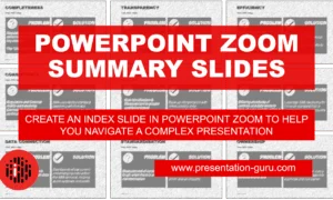
Powerpoint Zoom Summary for interactive presentations – everything you need to know
In this article I’ll be showing you how you can use Powerpoint Zoom to...

How to get over ‘Impostor Syndrome’ when you’re presenting
Everybody with a soul feels like an impostor sometimes. Even really confident and experienced...
Home Blog Presentation Ideas How to Create and Deliver a Research Presentation
How to Create and Deliver a Research Presentation

Every research endeavor ends up with the communication of its findings. Graduate-level research culminates in a thesis defense , while many academic and scientific disciplines are published in peer-reviewed journals. In a business context, PowerPoint research presentation is the default format for reporting the findings to stakeholders.
Condensing months of work into a few slides can prove to be challenging. It requires particular skills to create and deliver a research presentation that promotes informed decisions and drives long-term projects forward.
Table of Contents
What is a Research Presentation
Key slides for creating a research presentation, tips when delivering a research presentation, how to present sources in a research presentation, recommended templates to create a research presentation.
A research presentation is the communication of research findings, typically delivered to an audience of peers, colleagues, students, or professionals. In the academe, it is meant to showcase the importance of the research paper , state the findings and the analysis of those findings, and seek feedback that could further the research.
The presentation of research becomes even more critical in the business world as the insights derived from it are the basis of strategic decisions of organizations. Information from this type of report can aid companies in maximizing the sales and profit of their business. Major projects such as research and development (R&D) in a new field, the launch of a new product or service, or even corporate social responsibility (CSR) initiatives will require the presentation of research findings to prove their feasibility.
Market research and technical research are examples of business-type research presentations you will commonly encounter.
In this article, we’ve compiled all the essential tips, including some examples and templates, to get you started with creating and delivering a stellar research presentation tailored specifically for the business context.
Various research suggests that the average attention span of adults during presentations is around 20 minutes, with a notable drop in an engagement at the 10-minute mark . Beyond that, you might see your audience doing other things.
How can you avoid such a mistake? The answer lies in the adage “keep it simple, stupid” or KISS. We don’t mean dumbing down your content but rather presenting it in a way that is easily digestible and accessible to your audience. One way you can do this is by organizing your research presentation using a clear structure.
Here are the slides you should prioritize when creating your research presentation PowerPoint.
1. Title Page
The title page is the first thing your audience will see during your presentation, so put extra effort into it to make an impression. Of course, writing presentation titles and title pages will vary depending on the type of presentation you are to deliver. In the case of a research presentation, you want a formal and academic-sounding one. It should include:
- The full title of the report
- The date of the report
- The name of the researchers or department in charge of the report
- The name of the organization for which the presentation is intended
When writing the title of your research presentation, it should reflect the topic and objective of the report. Focus only on the subject and avoid adding redundant phrases like “A research on” or “A study on.” However, you may use phrases like “Market Analysis” or “Feasibility Study” because they help identify the purpose of the presentation. Doing so also serves a long-term purpose for the filing and later retrieving of the document.
Here’s a sample title page for a hypothetical market research presentation from Gillette .

2. Executive Summary Slide
The executive summary marks the beginning of the body of the presentation, briefly summarizing the key discussion points of the research. Specifically, the summary may state the following:
- The purpose of the investigation and its significance within the organization’s goals
- The methods used for the investigation
- The major findings of the investigation
- The conclusions and recommendations after the investigation
Although the executive summary encompasses the entry of the research presentation, it should not dive into all the details of the work on which the findings, conclusions, and recommendations were based. Creating the executive summary requires a focus on clarity and brevity, especially when translating it to a PowerPoint document where space is limited.
Each point should be presented in a clear and visually engaging manner to capture the audience’s attention and set the stage for the rest of the presentation. Use visuals, bullet points, and minimal text to convey information efficiently.

3. Introduction/ Project Description Slides
In this section, your goal is to provide your audience with the information that will help them understand the details of the presentation. Provide a detailed description of the project, including its goals, objectives, scope, and methods for gathering and analyzing data.
You want to answer these fundamental questions:
- What specific questions are you trying to answer, problems you aim to solve, or opportunities you seek to explore?
- Why is this project important, and what prompted it?
- What are the boundaries of your research or initiative?
- How were the data gathered?
Important: The introduction should exclude specific findings, conclusions, and recommendations.

4. Data Presentation and Analyses Slides
This is the longest section of a research presentation, as you’ll present the data you’ve gathered and provide a thorough analysis of that data to draw meaningful conclusions. The format and components of this section can vary widely, tailored to the specific nature of your research.
For example, if you are doing market research, you may include the market potential estimate, competitor analysis, and pricing analysis. These elements will help your organization determine the actual viability of a market opportunity.
Visual aids like charts, graphs, tables, and diagrams are potent tools to convey your key findings effectively. These materials may be numbered and sequenced (Figure 1, Figure 2, and so forth), accompanied by text to make sense of the insights.

5. Conclusions
The conclusion of a research presentation is where you pull together the ideas derived from your data presentation and analyses in light of the purpose of the research. For example, if the objective is to assess the market of a new product, the conclusion should determine the requirements of the market in question and tell whether there is a product-market fit.
Designing your conclusion slide should be straightforward and focused on conveying the key takeaways from your research. Keep the text concise and to the point. Present it in bullet points or numbered lists to make the content easily scannable.

6. Recommendations
The findings of your research might reveal elements that may not align with your initial vision or expectations. These deviations are addressed in the recommendations section of your presentation, which outlines the best course of action based on the result of the research.
What emerging markets should we target next? Do we need to rethink our pricing strategies? Which professionals should we hire for this special project? — these are some of the questions that may arise when coming up with this part of the research.
Recommendations may be combined with the conclusion, but presenting them separately to reinforce their urgency. In the end, the decision-makers in the organization or your clients will make the final call on whether to accept or decline the recommendations.

7. Questions Slide
Members of your audience are not involved in carrying out your research activity, which means there’s a lot they don’t know about its details. By offering an opportunity for questions, you can invite them to bridge that gap, seek clarification, and engage in a dialogue that enhances their understanding.
If your research is more business-oriented, facilitating a question and answer after your presentation becomes imperative as it’s your final appeal to encourage buy-in for your recommendations.
A simple “Ask us anything” slide can indicate that you are ready to accept questions.
1. Focus on the Most Important Findings
The truth about presenting research findings is that your audience doesn’t need to know everything. Instead, they should receive a distilled, clear, and meaningful overview that focuses on the most critical aspects.
You will likely have to squeeze in the oral presentation of your research into a 10 to 20-minute presentation, so you have to make the most out of the time given to you. In the presentation, don’t soak in the less important elements like historical backgrounds. Decision-makers might even ask you to skip these portions and focus on sharing the findings.
2. Do Not Read Word-per-word
Reading word-for-word from your presentation slides intensifies the danger of losing your audience’s interest. Its effect can be detrimental, especially if the purpose of your research presentation is to gain approval from the audience. So, how can you avoid this mistake?
- Make a conscious design decision to keep the text on your slides minimal. Your slides should serve as visual cues to guide your presentation.
- Structure your presentation as a narrative or story. Stories are more engaging and memorable than dry, factual information.
- Prepare speaker notes with the key points of your research. Glance at it when needed.
- Engage with the audience by maintaining eye contact and asking rhetorical questions.
3. Don’t Go Without Handouts
Handouts are paper copies of your presentation slides that you distribute to your audience. They typically contain the summary of your key points, but they may also provide supplementary information supporting data presented through tables and graphs.
The purpose of distributing presentation handouts is to easily retain the key points you presented as they become good references in the future. Distributing handouts in advance allows your audience to review the material and come prepared with questions or points for discussion during the presentation.
4. Actively Listen
An equally important skill that a presenter must possess aside from speaking is the ability to listen. We are not just talking about listening to what the audience is saying but also considering their reactions and nonverbal cues. If you sense disinterest or confusion, you can adapt your approach on the fly to re-engage them.
For example, if some members of your audience are exchanging glances, they may be skeptical of the research findings you are presenting. This is the best time to reassure them of the validity of your data and provide a concise overview of how it came to be. You may also encourage them to seek clarification.
5. Be Confident
Anxiety can strike before a presentation – it’s a common reaction whenever someone has to speak in front of others. If you can’t eliminate your stress, try to manage it.
People hate public speaking not because they simply hate it. Most of the time, it arises from one’s belief in themselves. You don’t have to take our word for it. Take Maslow’s theory that says a threat to one’s self-esteem is a source of distress among an individual.
Now, how can you master this feeling? You’ve spent a lot of time on your research, so there is no question about your topic knowledge. Perhaps you just need to rehearse your research presentation. If you know what you will say and how to say it, you will gain confidence in presenting your work.
All sources you use in creating your research presentation should be given proper credit. The APA Style is the most widely used citation style in formal research.
In-text citation
Add references within the text of your presentation slide by giving the author’s last name, year of publication, and page number (if applicable) in parentheses after direct quotations or paraphrased materials. As in:
The alarming rate at which global temperatures rise directly impacts biodiversity (Smith, 2020, p. 27).
If the author’s name and year of publication are mentioned in the text, add only the page number in parentheses after the quotations or paraphrased materials. As in:
According to Smith (2020), the alarming rate at which global temperatures rise directly impacts biodiversity (p. 27).
Image citation
All images from the web, including photos, graphs, and tables, used in your slides should be credited using the format below.
Creator’s Last Name, First Name. “Title of Image.” Website Name, Day Mo. Year, URL. Accessed Day Mo. Year.
Work cited page
A work cited page or reference list should follow after the last slide of your presentation. The list should be alphabetized by the author’s last name and initials followed by the year of publication, the title of the book or article, the place of publication, and the publisher. As in:
Smith, J. A. (2020). Climate Change and Biodiversity: A Comprehensive Study. New York, NY: ABC Publications.
When citing a document from a website, add the source URL after the title of the book or article instead of the place of publication and the publisher. As in:
Smith, J. A. (2020). Climate Change and Biodiversity: A Comprehensive Study. Retrieved from https://www.smith.com/climate-change-and-biodiversity.
1. Research Project Presentation PowerPoint Template

A slide deck containing 18 different slides intended to take off the weight of how to make a research presentation. With tons of visual aids, presenters can reference existing research on similar projects to this one – or link another research presentation example – provide an accurate data analysis, disclose the methodology used, and much more.
Use This Template
2. Research Presentation Scientific Method Diagram PowerPoint Template

Whenever you intend to raise questions, expose the methodology you used for your research, or even suggest a scientific method approach for future analysis, this circular wheel diagram is a perfect fit for any presentation study.
Customize all of its elements to suit the demands of your presentation in just minutes.
3. Thesis Research Presentation PowerPoint Template

If your research presentation project belongs to academia, then this is the slide deck to pair that presentation. With a formal aesthetic and minimalistic style, this research presentation template focuses only on exposing your information as clearly as possible.
Use its included bar charts and graphs to introduce data, change the background of each slide to suit the topic of your presentation, and customize each of its elements to meet the requirements of your project with ease.
4. Animated Research Cards PowerPoint Template

Visualize ideas and their connection points with the help of this research card template for PowerPoint. This slide deck, for example, can help speakers talk about alternative concepts to what they are currently managing and its possible outcomes, among different other usages this versatile PPT template has. Zoom Animation effects make a smooth transition between cards (or ideas).
5. Research Presentation Slide Deck for PowerPoint

With a distinctive professional style, this research presentation PPT template helps business professionals and academics alike to introduce the findings of their work to team members or investors.
By accessing this template, you get the following slides:
- Introduction
- Problem Statement
- Research Questions
- Conceptual Research Framework (Concepts, Theories, Actors, & Constructs)
- Study design and methods
- Population & Sampling
- Data Collection
- Data Analysis
Check it out today and craft a powerful research presentation out of it!
A successful research presentation in business is not just about presenting data; it’s about persuasion to take meaningful action. It’s the bridge that connects your research efforts to the strategic initiatives of your organization. To embark on this journey successfully, planning your presentation thoroughly is paramount, from designing your PowerPoint to the delivery.
Take a look and get inspiration from the sample research presentation slides above, put our tips to heart, and transform your research findings into a compelling call to action.

Like this article? Please share
Academics, Presentation Approaches, Research & Development Filed under Presentation Ideas
Related Articles

Filed under Design • March 27th, 2024
How to Make a Presentation Graph
Detailed step-by-step instructions to master the art of how to make a presentation graph in PowerPoint and Google Slides. Check it out!

Filed under Presentation Ideas • February 29th, 2024
How to Make a Fundraising Presentation (with Thermometer Templates & Slides)
Meet a new framework to design fundraising presentations by harnessing the power of fundraising thermometer templates. Detailed guide with examples.

Filed under Presentation Ideas • February 15th, 2024
How to Create a 5 Minutes Presentation
Master the art of short-format speeches like the 5 minutes presentation with this article. Insights on content structure, audience engagement and more.
Leave a Reply
Improve your practice.
Enhance your soft skills with a range of award-winning courses.
How to Structure your Presentation, with Examples
August 3, 2018 - Dom Barnard
For many people the thought of delivering a presentation is a daunting task and brings about a great deal of nerves . However, if you take some time to understand how effective presentations are structured and then apply this structure to your own presentation, you’ll appear much more confident and relaxed.
Here is our complete guide for structuring your presentation, with examples at the end of the article to demonstrate these points.
Why is structuring a presentation so important?
If you’ve ever sat through a great presentation, you’ll have left feeling either inspired or informed on a given topic. This isn’t because the speaker was the most knowledgeable or motivating person in the world. Instead, it’s because they know how to structure presentations – they have crafted their message in a logical and simple way that has allowed the audience can keep up with them and take away key messages.
Research has supported this, with studies showing that audiences retain structured information 40% more accurately than unstructured information.
In fact, not only is structuring a presentation important for the benefit of the audience’s understanding, it’s also important for you as the speaker. A good structure helps you remain calm, stay on topic, and avoid any awkward silences.
What will affect your presentation structure?
Generally speaking, there is a natural flow that any decent presentation will follow which we will go into shortly. However, you should be aware that all presentation structures will be different in their own unique way and this will be due to a number of factors, including:
- Whether you need to deliver any demonstrations
- How knowledgeable the audience already is on the given subject
- How much interaction you want from the audience
- Any time constraints there are for your talk
- What setting you are in
- Your ability to use any kinds of visual assistance
Before choosing the presentation’s structure answer these questions first:
- What is your presentation’s aim?
- Who are the audience?
- What are the main points your audience should remember afterwards?
When reading the points below, think critically about what things may cause your presentation structure to be slightly different. You can add in certain elements and add more focus to certain moments if that works better for your speech.

What is the typical presentation structure?
This is the usual flow of a presentation, which covers all the vital sections and is a good starting point for yours. It allows your audience to easily follow along and sets out a solid structure you can add your content to.
1. Greet the audience and introduce yourself
Before you start delivering your talk, introduce yourself to the audience and clarify who you are and your relevant expertise. This does not need to be long or incredibly detailed, but will help build an immediate relationship between you and the audience. It gives you the chance to briefly clarify your expertise and why you are worth listening to. This will help establish your ethos so the audience will trust you more and think you’re credible.
Read our tips on How to Start a Presentation Effectively
2. Introduction
In the introduction you need to explain the subject and purpose of your presentation whilst gaining the audience’s interest and confidence. It’s sometimes helpful to think of your introduction as funnel-shaped to help filter down your topic:
- Introduce your general topic
- Explain your topic area
- State the issues/challenges in this area you will be exploring
- State your presentation’s purpose – this is the basis of your presentation so ensure that you provide a statement explaining how the topic will be treated, for example, “I will argue that…” or maybe you will “compare”, “analyse”, “evaluate”, “describe” etc.
- Provide a statement of what you’re hoping the outcome of the presentation will be, for example, “I’m hoping this will be provide you with…”
- Show a preview of the organisation of your presentation
In this section also explain:
- The length of the talk.
- Signal whether you want audience interaction – some presenters prefer the audience to ask questions throughout whereas others allocate a specific section for this.
- If it applies, inform the audience whether to take notes or whether you will be providing handouts.
The way you structure your introduction can depend on the amount of time you have been given to present: a sales pitch may consist of a quick presentation so you may begin with your conclusion and then provide the evidence. Conversely, a speaker presenting their idea for change in the world would be better suited to start with the evidence and then conclude what this means for the audience.
Keep in mind that the main aim of the introduction is to grab the audience’s attention and connect with them.
3. The main body of your talk
The main body of your talk needs to meet the promises you made in the introduction. Depending on the nature of your presentation, clearly segment the different topics you will be discussing, and then work your way through them one at a time – it’s important for everything to be organised logically for the audience to fully understand. There are many different ways to organise your main points, such as, by priority, theme, chronologically etc.
- Main points should be addressed one by one with supporting evidence and examples.
- Before moving on to the next point you should provide a mini-summary.
- Links should be clearly stated between ideas and you must make it clear when you’re moving onto the next point.
- Allow time for people to take relevant notes and stick to the topics you have prepared beforehand rather than straying too far off topic.
When planning your presentation write a list of main points you want to make and ask yourself “What I am telling the audience? What should they understand from this?” refining your answers this way will help you produce clear messages.
4. Conclusion
In presentations the conclusion is frequently underdeveloped and lacks purpose which is a shame as it’s the best place to reinforce your messages. Typically, your presentation has a specific goal – that could be to convert a number of the audience members into customers, lead to a certain number of enquiries to make people knowledgeable on specific key points, or to motivate them towards a shared goal.
Regardless of what that goal is, be sure to summarise your main points and their implications. This clarifies the overall purpose of your talk and reinforces your reason for being there.
Follow these steps:
- Signal that it’s nearly the end of your presentation, for example, “As we wrap up/as we wind down the talk…”
- Restate the topic and purpose of your presentation – “In this speech I wanted to compare…”
- Summarise the main points, including their implications and conclusions
- Indicate what is next/a call to action/a thought-provoking takeaway
- Move on to the last section
5. Thank the audience and invite questions
Conclude your talk by thanking the audience for their time and invite them to ask any questions they may have. As mentioned earlier, personal circumstances will affect the structure of your presentation.
Many presenters prefer to make the Q&A session the key part of their talk and try to speed through the main body of the presentation. This is totally fine, but it is still best to focus on delivering some sort of initial presentation to set the tone and topics for discussion in the Q&A.

Other common presentation structures
The above was a description of a basic presentation, here are some more specific presentation layouts:
Demonstration
Use the demonstration structure when you have something useful to show. This is usually used when you want to show how a product works. Steve Jobs frequently used this technique in his presentations.
- Explain why the product is valuable.
- Describe why the product is necessary.
- Explain what problems it can solve for the audience.
- Demonstrate the product to support what you’ve been saying.
- Make suggestions of other things it can do to make the audience curious.
Problem-solution
This structure is particularly useful in persuading the audience.
- Briefly frame the issue.
- Go into the issue in detail showing why it ‘s such a problem. Use logos and pathos for this – the logical and emotional appeals.
- Provide the solution and explain why this would also help the audience.
- Call to action – something you want the audience to do which is straightforward and pertinent to the solution.
Storytelling
As well as incorporating stories in your presentation , you can organise your whole presentation as a story. There are lots of different type of story structures you can use – a popular choice is the monomyth – the hero’s journey. In a monomyth, a hero goes on a difficult journey or takes on a challenge – they move from the familiar into the unknown. After facing obstacles and ultimately succeeding the hero returns home, transformed and with newfound wisdom.
Storytelling for Business Success webinar , where well-know storyteller Javier Bernad shares strategies for crafting compelling narratives.
Another popular choice for using a story to structure your presentation is in media ras (in the middle of thing). In this type of story you launch right into the action by providing a snippet/teaser of what’s happening and then you start explaining the events that led to that event. This is engaging because you’re starting your story at the most exciting part which will make the audience curious – they’ll want to know how you got there.
- Great storytelling: Examples from Alibaba Founder, Jack Ma
Remaining method
The remaining method structure is good for situations where you’re presenting your perspective on a controversial topic which has split people’s opinions.
- Go into the issue in detail showing why it’s such a problem – use logos and pathos.
- Rebut your opponents’ solutions – explain why their solutions could be useful because the audience will see this as fair and will therefore think you’re trustworthy, and then explain why you think these solutions are not valid.
- After you’ve presented all the alternatives provide your solution, the remaining solution. This is very persuasive because it looks like the winning idea, especially with the audience believing that you’re fair and trustworthy.
Transitions
When delivering presentations it’s important for your words and ideas to flow so your audience can understand how everything links together and why it’s all relevant. This can be done using speech transitions which are words and phrases that allow you to smoothly move from one point to another so that your speech flows and your presentation is unified.
Transitions can be one word, a phrase or a full sentence – there are many different forms, here are some examples:
Moving from the introduction to the first point
Signify to the audience that you will now begin discussing the first main point:
- Now that you’re aware of the overview, let’s begin with…
- First, let’s begin with…
- I will first cover…
- My first point covers…
- To get started, let’s look at…
Shifting between similar points
Move from one point to a similar one:
- In the same way…
- Likewise…
- Equally…
- This is similar to…
- Similarly…
Internal summaries
Internal summarising consists of summarising before moving on to the next point. You must inform the audience:
- What part of the presentation you covered – “In the first part of this speech we’ve covered…”
- What the key points were – “Precisely how…”
- How this links in with the overall presentation – “So that’s the context…”
- What you’re moving on to – “Now I’d like to move on to the second part of presentation which looks at…”
Physical movement
You can move your body and your standing location when you transition to another point. The audience find it easier to follow your presentation and movement will increase their interest.
A common technique for incorporating movement into your presentation is to:
- Start your introduction by standing in the centre of the stage.
- For your first point you stand on the left side of the stage.
- You discuss your second point from the centre again.
- You stand on the right side of the stage for your third point.
- The conclusion occurs in the centre.
Key slides for your presentation
Slides are a useful tool for most presentations: they can greatly assist in the delivery of your message and help the audience follow along with what you are saying. Key slides include:
- An intro slide outlining your ideas
- A summary slide with core points to remember
- High quality image slides to supplement what you are saying
There are some presenters who choose not to use slides at all, though this is more of a rarity. Slides can be a powerful tool if used properly, but the problem is that many fail to do just that. Here are some golden rules to follow when using slides in a presentation:
- Don’t over fill them – your slides are there to assist your speech, rather than be the focal point. They should have as little information as possible, to avoid distracting people from your talk.
- A picture says a thousand words – instead of filling a slide with text, instead, focus on one or two images or diagrams to help support and explain the point you are discussing at that time.
- Make them readable – depending on the size of your audience, some may not be able to see small text or images, so make everything large enough to fill the space.
- Don’t rush through slides – give the audience enough time to digest each slide.
Guy Kawasaki, an entrepreneur and author, suggests that slideshows should follow a 10-20-30 rule :
- There should be a maximum of 10 slides – people rarely remember more than one concept afterwards so there’s no point overwhelming them with unnecessary information.
- The presentation should last no longer than 20 minutes as this will leave time for questions and discussion.
- The font size should be a minimum of 30pt because the audience reads faster than you talk so less information on the slides means that there is less chance of the audience being distracted.
Here are some additional resources for slide design:
- 7 design tips for effective, beautiful PowerPoint presentations
- 11 design tips for beautiful presentations
- 10 tips on how to make slides that communicate your idea
Group Presentations
Group presentations are structured in the same way as presentations with one speaker but usually require more rehearsal and practices. Clean transitioning between speakers is very important in producing a presentation that flows well. One way of doing this consists of:
- Briefly recap on what you covered in your section: “So that was a brief introduction on what health anxiety is and how it can affect somebody”
- Introduce the next speaker in the team and explain what they will discuss: “Now Elnaz will talk about the prevalence of health anxiety.”
- Then end by looking at the next speaker, gesturing towards them and saying their name: “Elnaz”.
- The next speaker should acknowledge this with a quick: “Thank you Joe.”
From this example you can see how the different sections of the presentations link which makes it easier for the audience to follow and remain engaged.
Example of great presentation structure and delivery
Having examples of great presentations will help inspire your own structures, here are a few such examples, each unique and inspiring in their own way.
How Google Works – by Eric Schmidt
This presentation by ex-Google CEO Eric Schmidt demonstrates some of the most important lessons he and his team have learnt with regards to working with some of the most talented individuals they hired. The simplistic yet cohesive style of all of the slides is something to be appreciated. They are relatively straightforward, yet add power and clarity to the narrative of the presentation.
Start with why – by Simon Sinek
Since being released in 2009, this presentation has been viewed almost four million times all around the world. The message itself is very powerful, however, it’s not an idea that hasn’t been heard before. What makes this presentation so powerful is the simple message he is getting across, and the straightforward and understandable manner in which he delivers it. Also note that he doesn’t use any slides, just a whiteboard where he creates a simple diagram of his opinion.
The Wisdom of a Third Grade Dropout – by Rick Rigsby
Here’s an example of a presentation given by a relatively unknown individual looking to inspire the next generation of graduates. Rick’s presentation is unique in many ways compared to the two above. Notably, he uses no visual prompts and includes a great deal of humour.
However, what is similar is the structure he uses. He first introduces his message that the wisest man he knew was a third-grade dropout. He then proceeds to deliver his main body of argument, and in the end, concludes with his message. This powerful speech keeps the viewer engaged throughout, through a mixture of heart-warming sentiment, powerful life advice and engaging humour.
As you can see from the examples above, and as it has been expressed throughout, a great presentation structure means analysing the core message of your presentation. Decide on a key message you want to impart the audience with, and then craft an engaging way of delivering it.
By preparing a solid structure, and practising your talk beforehand, you can walk into the presentation with confidence and deliver a meaningful message to an interested audience.
It’s important for a presentation to be well-structured so it can have the most impact on your audience. An unstructured presentation can be difficult to follow and even frustrating to listen to. The heart of your speech are your main points supported by evidence and your transitions should assist the movement between points and clarify how everything is linked.
Research suggests that the audience remember the first and last things you say so your introduction and conclusion are vital for reinforcing your points. Essentially, ensure you spend the time structuring your presentation and addressing all of the sections.
- April 2024: Great Graphs
- May 2024: Great Graphs in Excel
- October 2024: Report Redesign
- November 2024: Powerful Presentations
- December 2024: Dashboard Design
- March 2025: Simple Spreadsheets
- Self-Paced: Soar Beyond the Dusty Shelf Report
- Chart Templates
- Shirts & Hoodies
27 Comments
This was a great tutorial. Thank you for providing! I am designing my next report in PPT right now! Shhhh! ~Jessica, Child Advocates of Fort Bend
Your secret’s safe with us. 🙂
Woohoo! I’m glad this list has inspired you Jessica! Your secret is safe 🙂 Happy PowerPoint-ing!
wow, what a beautiful report in PP! Can you share it with us please? Thanks in advance
Hi Hossat, This report’s not available for download, sorry! It’s an internal report that Nick designed specifically for his audience. One of these days, “in all my spare time,” I’ll design some sort of template for these reports. Until then, I hope you find the behind-the-scenes screenshots to be useful.
Great post! I plan to use tip #3 right away. I use Nancy Duarte’s slidedoc format for reports and like this 8.5″ x 11″ option too.
Learning about “Align” a few years ago has already saved hours of my precious time! It’s the little things.
This tip was probably the simplest game changer for me. This works for everything (and in most MS Office applications ) for things like conference posters, handouts, reports, ACTUAL powerpoint slide decks… It’s really nice once you realize you’ll never have to nudge objects click by click anymore!
Nick — I literally used to zoom waaaaaaay to 400% or 500% on my screen, hold up a ruler, and eyeball all my text boxes to “align” them. Oops.
Does anyone know of any templates that already exist with it rotated and filled in content
Hi Jeremy, Check out https://www.duarte.com/slidedocs/ . THE trailblazer in “slidedocs” is Nancy Duarte and the dozens of staff at her company. I believe they have free templates to get you started. Like any templates, you’ll want to adjust the colors and fonts, at a bare minimum, so that it doesn’t look so default. Let me know if you encounter any other helpful templates.
Thanks for sharing this, great idea! Formatting on Word has always been a challenge for me
Hello, This is great! Do the reports created in Powerpoint meet accessibility standards for folks who use screen readers, etc.?
Great question. Someone asked this question on Twitter too. Here’s what I said: “I don’t see why it wouldn’t. Reports can be written in any software program (Word, PowerPoint, InDesign, Publisher, etc etc etc) and then PDF’d. I believe you can tag tables and images in any program.” And here’s what Nick said: “Using Accessibility Checker in PPT (as in Word) is important when creating… then when publishing to PDF, there a couple more clicks I think to make sure it exports as an accessible doc – found this in my search: http://lpc1.clpccd.cc.ca.us/lpc/blackboard/accessible_ppt/convert_ppt.htm ” Let us know what you learn in your search, too.
Definitely can Marissa, you just need to create the document in a way that’s accessible (as you probably normally would in Word) can use accessibility checker in PowerPoint when creating the report to see whch elements need alt text, etc and then follow these instructions when exporting to PDF: https://t.co/OrMkFSxihM
Hi Ann and Nick: a) Another way to get matching colors in different objects (point 5 of your post) without too much concern over if its well done, is to play with Saturation: 1- Shape Fill 2 – More Fill Colors 3 – Custom tab 4 – Color Model HSL 5 – And play with different levels of Saturation b) If we want to print the report directely from the PPT we must take in consideratin that the printer always put a white margin that we can’t see even at the Print Preview. Thanks for the post Miguel
This is a great point Miguel. I often click between my edit view and print preview when I’m making reports to see how it will print if I were to do so directly from ppt so I can check what that white border looks like and if it impacts anything I have on the page, especially important when bleeding images or objects over the page edges. This is one reason you want to be sure to custom format your page layout too, manually enter 8.5 width and 11 length instead of relying on the default “letter” size option that ppt gives you, which actually defaults the slide to 7.5 X 10. Thanks for the color tip too, I’ll try that out!
This is very interesting post on report creation in PowerPoint.
[…] How to Write Your Reports in PowerPoint Instead of Word: 9 Tips for Getting Started […]
Finally, it becomes easier to use MS powerpoint in terms of writing reports as my MS word was showing errors.
Great post, thank you. As a consultant I write reports for a living. I grew up on Word and was trained to write word-heavy, long form reports. Whilst I (think I) do that very well, I’m conscious that these days many people prefer shorter, more visual reports so I’m exploring how I might transition to that. Two issue I’ve always had with ppt are (1) the way it resizes text when I don’t want it to and (2) the way it works one page at a time, i.e. text doesn’t flow from one page to the next. Is there a way to address either of these? Might Publisher (which I’ve never really used; does it even still exist?) be a good alternative tool for the job?
Hi Patch, Argh yes, I have the same frustrations with PowerPoint.
Rather than using the built-in text boxes, which automatically re-size the text, I delete those and add my own. Then I have full control over the text formatting.
I don’t know how to adjust the page breaks/page flow; don’t think this is possible actually (?). I plan the content carefully in advance (by spending time developing a detailed outline). Then, I make sure that each topic simply fits on its own page.
You’re certainly welcome to continue using Word! Or, Publisher. But PowerPoint does tend to be easiest to use as you add more visuals to your reports.
Good luck! Ann
Thanks. When do u prefer portrait or landscape orientation?
I’m trying to use landscape as much as possible these days — since so many people are reading the reports from their computers.
Interesting but I fail to see the benefit. Why not just use Word with PowerPoint inserts for powerful reports (or for that matter insert PowerBI).
I just find PowerPoint to be more artistic since it requires so much careful manipulation of content – an issue I simply don’t have in Word.
Word’s great for text-heavy reports. PowerPoint’s great for visual-heavy reports. They each have their own value.
Leave a Reply Cancel reply
Your email address will not be published. Required fields are marked *
Save my name, email, and website in this browser for the next time I comment.
How to Write Your Reports in PowerPoint Instead of Word: Nine Tips for Getting Started

Hi! My name is Nick Visscher, I’m an internal evaluator with Denver Zoo. Our data work spans the gamut from collecting guest satisfaction insights to observing preschool kids in our nature play programming. With everything our team does we aim to help our staff improve their programs and our guest’s experience. It’s important for us to disseminate our findings in ways that make our stakeholders (mainly internal staff) to dig in and explore. Clear, concise, and well visualized reporting is super important and something we are passionate about.

There are so many options when it comes to reporting software, but one familiar face I often find myself turning to is Microsoft PowerPoint. You might not immediately think of PowerPoint when it comes to creating formal reports, but I love using it in lieu of more common applications like Word. Positioning new images and text boxes into a document is just easier in PowerPoint. You don’t need to worry about anchoring items or how inserting new text might change the position of items you’ve already included on a page. It’s a blank canvas without many limitations.
Here are some screenshots from a report that I wrote in PowerPoint. These pages come from our Lorikeet Adventure: Guest Experience Research Brief.

Here are a few tips I keep in mind when using PowerPoint to design my evaluation reports. Note: I’m working in MS Office 2016.
- Changing slide orientation : I like a traditional page layout for a report I know my readers will likely print, not the default slide size (16:9 aspect ratio). To change it, I go to the Design pane and create a custom slide size, change the settings to 8.5” by 11”, and select a Portrait orientation.
- Making use of the page ruler, gridlines, and guides : In the View pane I always select Ruler and Guides (and sometime Gridlines) so I can make sure key text and objects are in the same position on each page. I also know my readers will likely print and use a staple in the upper left corner so I make sure to keep one guide line at a half inch from the left. This lets me position headers and text where I know a staple won’t get in the way.
- Using built in arrangement options for multiple text boxes or images : Don’t spend too much time clicking that left arrow or right arrow to “nudge” objects into just the right place on a page. Select all the objects you wish to align, go to the Home pane, select Arrange, and then select Align. There are built in arrangement options there which perfectly align or evenly distribute everything at once. This is one feature that consistently saves me time and makes everything look better.
- Inserting shapes and lines as design elements : I love using basic shapes and lines in different variations on a page to give the design of a report a sleek and professional feel. I avoid predefined slide design templates at all costs, they don’t often follow the principles of good design.
- Using fill color and transparency : I’m not always confident in knowing which colors compliment each other so to avoid having to pick different colors, but still give some visual variation, I increase the degree of fill color transparency on key shapes or objects. I also like doing this on cover pages when most often the entire slide background is a photograph. Inserting overlapping shapes with 50% transparency creates a sophisticated visual effect and also adds some darker space on the page perfect for a title or text header to stand out.
- Copying page design for the whole report : Most of the time I like my background design and title text to be consistent on each page. Once I’ve created a page layout I like I simply copy and paste that slide for the remainder of the report pages. This is a quick solution to having to re-create the most common design elements in your report over and over again. I’ve used a more elegant solution lately by editing the slide master in the View pane and editing the default fonts and colors in the Design pane.
- Editing dataviz directly in PowerPoint : I used to spend a lot of time editing charts directly in Excel, then copy/pasting them into PowerPoint. This would sometimes cause size and formatting issues so I’d have to do a few edits there too. PowerPoint has the same chart editing and layout features as Excel does so now I create a basic default chart in Excel using my data, copy/paste that right away into PowerPoint, and do all of my editing there.
- Letting your copy editor do their thing : I always need a copy editor when I finish a report. PowerPoint provides similar review and comment features as Word does. It’s not quite as extensive but it does the trick. Under the Review pane you can select text, add comments, and select “start inking” to highlight areas is the report that need further attention.
- Saving your report : Save your report as a PDF or XPS document when you’re ready to send to your readers. They’ll be dazzled by the beauty of your work and be none the wiser that you used trusty ole PowerPoint to design it.
Here’s another report that I designed within PowerPoint. These pages come from our Zoo Lights: Guest Experience Survey Report .

Have you tried writing your reports in PowerPoint instead of in Word? If so, please share your tips in the comments section below.
You Might Like
Soar beyond the dusty shelf report, redesigning a thesis chapter, report redesign.
- First Name *
Report templates
Customize these free report templates in no time and create stunning financial presentations, SEO reports, status updates, and board decks.

Presentation vs Report Writing: What’s the Difference?
By: Author Shrot Katewa

I was sitting at my desk today while I stumbled upon a question by one of our patrons. It got me thinking if there was ever a difference between a Presentation and Report Writing? So, I did some research, and here’s what I found out!
The main difference between a Presentation and Report Writing is that a report is usually fairly extensive and gives a detailed account of the information on a particular topic. Whereas, a presentation is mostly a synopsis which highlights the key points that are important for the audience.
Since one of the key objectives of both – a presentation and a report is to give information to its intended audience, people often tend to confuse between the two. So, let’s understand the nuances in further detail.
Key Differences between Presentation and Report Writing
In order to make sure that we don’t end up creating an incorrect document the next we are tasked with an assignment, it is important for us to understand the differences between a presentation and report writing.
As I mentioned earlier, one of the purposes of both a presentation and a report is typically to provide insights or useful information about a certain topic.
However, the purpose of creating a presentation is to share information in a short period of time; usually not more than 15-20 minutes. Thus, it ends up being a synopsis of a topic rather than giving a detailed account on a particular topic.
Report Writing on the other hand goes into the intricacies involved within a particular topic.
For a research oriented report writing, the purpose of the report is often to capture the detailed account for the research conducted including (but not limited to) purpose of the research, methodology adopted for conducting research, observations and findings, discrepancies (if any), and the conclusion.
Writing a report often scientific approach and requires a technical understand of the subject.
2. Depth of Information
Another difference between a report and a presentation is the depth of information that is shared in the two types of documents.
As mentioned in the previous point, a report goes in great depth capturing the thought behind almost every single action taken by the researcher; thereby giving an in-depth understanding on the topic.
A presentation on the other hand picks up key pieces of information and aims to provide very specific details usually in the interest of the available time of the audience.
A typical example of a report would be a corporate annual report which explains the details of actions taken by the organisation and how it performed. This information is shared across multiple paragraphs usually accompanied by a table giving the performance details. Whereas, a presentation of the annual report only summarizes the key points on the performance of the company throughout the year.
3. Information Delivery

Another major difference between a presentation and report writing is the mode of information delivery.
Since a presentation is a piece of summarized information, it requires a person to share additional information while delivering the presentation. A presentation mostly contains visual cues along with a few points on each slide, which is accompanied with a talk given by an individual giving the presentation.
A presentation can be given in-person to a small group of people or even to a few hundred individuals in a large auditorium. Alternatively, a presentation can also be delivered online to several thousands of people across the globe using different softwares.
A report on the other hand doesn’t necessarily require to be presented. Since it contains detailed information, it can be independently read by people at their comfort.
Reading a report can take time as it is often spread across several hundreds of pages.
4. Method of Engaging the Audience
Yet another difference between a presentation and report writing is the manner in which it engages its audience.
A presentation depends upon the skill of the presenter to engage the audience. A person giving a presentation not only needs to make the presentation visually appealing, it also requires the presenter to entertain the audience by means of story-telling and humor (as deemed necessary) while delivering the presentation.
A report on the other hand depends on the capability of an individual to command a language to engage its readers. It needs the person writing a report to have a good grasp of the language in order to describe the information accurately and as briefly as possible while holding the interest of the audience.
In a research study done in order to compare the understanding capability of science students based information consumed in the two formats – Presentation versus Report format , it was observed that students understood the topic better when it was explained through a presentation rather than a report.
Perhaps, one can conclude that presentation is usually more engaging than a detailed report.
5. Skills Needed

Lastly, another difference between a presentation and report writing is the skills needed for each of the two activities.
Creating an effective presentation requires not only design skills, but also mastering the art of giving presentations! While the task of designing a presentation can often be outsourced, the knack of picking the correct topics to be covered in the presentation can’t be outsourced and is dependent on the presenter.
As a presenter, you don’t necessarily need to have great writing skills, but you surely need to know the art of story-telling, and leverage this for giving a presentation.
On the other hand, report writing requires creative (sometimes technical) writing skills. One also needs to be analytical.
How to Choose between a Presentation and a Report? Which is Better?
Choosing between creating a presentation or writing a report can be a difficult task for some. But, not being able to do so correctly can often lead to drastic (sometimes even embarrassing) circumstances.
Here are a few questions that you should ask yourself before starting creating a presentation or writing a report –
- How much time do I have with my audience? If you have only about 20 to 30 minutes with you audience to share the required information, it is perhaps better to give a presentation than to write a report. A report (unless written in less than 10 pages), will usually take more than this much time to be completely understood.
- Does your intended audience prefer to read or to hear/watch? People have their own preferences when it comes to consuming information. Some people like to read, while others prefer hearing or visual comprehension to gain knowledge. Be sure to ask them their preference, and make your decision accordingly.
- What are you good at – Presentation or Report Writing? If the above two questions are not important or if your audience doesn’t have a preference, a good way to start would be to focus on your strengths. Ask yourself – what are you more comfortable with? Is a creating and delivering a presentation? Or, is it writing a report? Make a decision based on your capability. A little introspection can definitely go a long way in helping you choose the right direction.
How to Create an Attractive Presentation?
If you end up deciding to go down the presentation route, then we’ve got you covered.
The main objective of this site is to help you create better presentations!
Thus, be sure to check out a few other posts on this website that provide little ninja tips on how you can make your presentations attractive in a few easy steps!
A good place to start would be by reading this post –
7 EASY tips that ALWAYS make your PPT presentation attractive (even for beginners)
Don’t hesitate to reach out to us if you have any specific questions. We would love to help you create better presentations!
Final Thoughts
As we understood in this article, even though delivering a presentation and report writing have a similar objective of sharing interesting information, they both have their differences.
Knowing what mode of information sharing to choose can often be critical. Thus, I hope this post has helped you understand some of the key differences between the two and how to choose whether to create a presentation or write a report.
Weekly Report Presentation
Just as an annual report reviews the past year’s goals, projects, and progress, a weekly report presentation examines the past week completely. Your weekly report should quickly recap what was completed in the past week, what you’re working on now, and plans for the week ahead.
Your weekly report also needs to be concise and comprehensive. A reporting presentation template can keep your accomplishments, tasks, and strategies organized for your next meeting.
Use our weekly report presentation template to:
- Share progress on an ongoing project
- Demonstrate how challenges were handled
- Show weekly sales and revenue performance
Customize your Weekly Report Presentation
Keep your projects and tasks moving along efficiently with a weekly report presentation. Make each slide informative and eye-catching by adding flowcharts, timelines, images, bullet lists, and any other graphic that will transform your text. Consider including these slides in your reporting presentation template:

Pro Tips for a Reporting Presentation Template
Consider these tips when creating a weekly report presentation.
Long blocks of text are tough to read. Use bullet lists, headings, and short paragraphs to make your report readable.
A weekly report presentation template saves you time on design, but don’t forget to proofread! You don’t want to present outdated information from last week’s report.
Make your presentation easy to read by including plenty of white space. When used thoughtfully, color can draw attention to text or elements on your slides.
End your weekly report with actionable takeaways or next steps for your team members.
More Popular Templates

Sales Battlecard Presentation Template
Learn how Beautiful.ai’s sales battlecard presentation template can help sales teams position themselves against competitors in the sales cycle.

Tinder Pitch Deck
Valued at over $3 billion, dating app Tinder is one of the most popular apps today. Check out our makeover of the original Tinder pitch deck.

Public Relations Pitch Example
Use this public relations pitch example to create your own PR pitch template for your next meeting with a potential client.

Mood Board Presentation Template
A mood board presentation is a compilation of images and words to represent ideas for a project or business. Put your inspiration in one place with our mood board presentation template.

Creative Portfolio Template
First impressions matter. This Creative Portfolio template was crafted especially for creatives, to simplify the prep work involved and present your qualifications in a clear and visually stunning framework.

Sales Strategy Presentation Template
Learn how Beautiful.ai’s sales strategy template can help your team achieve your sales goals and close more deals..
How to Write a Presentation Report
Jennifer vanbaren.
People use presentations to present or suggest a project, idea or thought. A presentation report is designed to offer details about a subject and is given to a person or group of people in the form of a presentation. Presentations often include visuals, such as charts or slide shows, although they are not required for every type of presentation. To present something using this type of report, choose an appropriate subject and research it thoroughly.
Collect information. The first step in writing a presentation report is to obtain data about the subject. It is vital for the person writing the report to obtain as much information about the subject as possible, including statistics and important facts.
Organize the information. After you find a sufficient amount of information, organize it into categories. A presentation speech must be well-organized in order to present the idea or project in a way that the audience can understand.
Determine your objective. Look through the information you have collected and determine the goals for the report. Determine what you would like to accomplish through the report and focus on the main objective. Be very clear when you reveal this in the report.
Consider your audience. Remember who will be reading or listening to the presentation report. Before you begin writing your paper, you must focus on the audience and their expectations and preconceived notions.
Develop an outline. Using all of the considerations described so far, write an outline. Focus on the main messages and objectives of the subject and list each point in an order that is logical.
Write an introduction. A presentation report should have a strong introduction. Take the main idea of the subject and create an interesting and captivating introduction to capture the audience’s attention. This might be a claim or a statement; or it might be a legend or a conclusion. Choose something catchy to say and avoid anything that might be long and drawn out or tedious.
Complete the report. Continue by writing the body of the report and wrap it all up with a strong conclusion that ties the together the introduction and the main points of the report.
Use visuals. If you will be presenting the report to an audience, choose some visuals that would assist in getting your message across.
About the Author
Jennifer VanBaren started her professional online writing career in 2010. She taught college-level accounting, math and business classes for five years. Her writing highlights include publishing articles about music, business, gardening and home organization. She holds a Bachelor of Science in accounting and finance from St. Joseph's College in Rensselaer, Ind.
Related Articles
How to Prepare & Write an Informational Report
The Difference Between Discursive & Argumentative Essays
The Qualities of Writing a Good Report
Instructions for How to Write a Report
How to Write a Suitable Objective Report
Steps in Writing a Report
How to Write a Report in High School
Tips for High School Students on Creating Introductions...
Steps to Writing Research Paper Abstracts
How to Write an Introduction of a Report
Tips on Writing a Middle School Book Report
How to Write Limitations in a Report
Three Persuasive Writing Techniques
Purpose of Writing an Essay
How to Write Acknowledgments in a Report
How to Make a Good Presentation Using a Trifold Board
Data Collection Ideas for School Projects
How to Write a Title Page for a Report
How to Write a Research Design
How to Write a Hypothesis to an Analytical Essay
Regardless of how old we are, we never stop learning. Classroom is the educational resource for people of all ages. Whether you’re studying times tables or applying to college, Classroom has the answers.
- Accessibility
- Terms of Use
- Privacy Policy
- Copyright Policy
- Manage Preferences
© 2020 Leaf Group Ltd. / Leaf Group Media, All Rights Reserved. Based on the Word Net lexical database for the English Language. See disclaimer .
Got any suggestions?
We want to hear from you! Send us a message and help improve Slidesgo
Top searches
Trending searches

solar eclipse
25 templates

autism awareness
28 templates

26 templates

16 templates

6 templates

32 templates
Report Presentation templates
Let everyone in your company know about the status of a project, the balance sheets or a summary of the annual performance with these templates for reports. their infographics and graphs included will help you a lot.

Premium template
Unlock this template and gain unlimited access
Download the CSR Report presentation for PowerPoint or Google Slides. The world of business encompasses a lot of things! From reports to customer profiles, from brainstorming sessions to sales—there's always something to do or something to analyze. This customizable design, available for Google Slides and PowerPoint, is what you were...

Colorful Book Report
Teach your students to create good book reports thanks to these colorful slides. They have a light background and on it we have created cards with orange, purple, blue, etc. colors. We have included different structures, and in them they can include the title of the book, the author, the...

Marketing Project Progress Report
Download the Marketing Project Progress Report presentation for PowerPoint or Google Slides and take your marketing projects to the next level. This template is the perfect ally for your advertising strategies, launch campaigns or report presentations. Customize your content with ease, highlight your ideas and captivate your audience with a...

Business 2023 Annual Report Infographics
How did you company do during this year? Annalise your spendings, liabilities, earnings, profits, investments, etc. with this set of business infographics made for people who want to increase their productivity! They’re very easy to use and will help your company understand its achievements and its mistakes, to learn from...

Business Final Report
Download the Business Final Report presentation for PowerPoint or Google Slides. The world of business encompasses a lot of things! From reports to customer profiles, from brainstorming sessions to sales—there's always something to do or something to analyze. This customizable design, available for Google Slides and PowerPoint, is what you...

SEO Monthly Report
Bring your SEO reports to life with this Slidesgo template. It is 100% editable and with it you can show the most relevant data of your SEO strategy. The graphs and tables will help you convey the information to your bosses or clients easily and quickly. It has a simple...

Social Media Report with Cycle Diagrams
Download the Social Media Report with Cycle Diagrams presentation for PowerPoint or Google Slides. How do you use social media platforms to achieve your business goals? If you need a thorough and professional tool to plan and keep track of your social media strategy, this fully customizable template is your...

In Vitro Fertilization Case Study
Download the In Vitro Fertilization Case Study presentation for PowerPoint or Google Slides. A clinical case is more than just a set of symptoms and a diagnosis. It is a unique story of a patient, their experiences, and their journey towards healing. Each case is an opportunity for healthcare professionals...

Internship Report
Download the Internship Report presentation for PowerPoint or Google Slides. The world of business encompasses a lot of things! From reports to customer profiles, from brainstorming sessions to sales—there's always something to do or something to analyze. This customizable design, available for Google Slides and PowerPoint, is what you were...

Report Card for Elementary School
Download the Report Card for Elementary School presentation for PowerPoint or Google Slides. The education sector constantly demands dynamic and effective ways to present information. This template is created with that very purpose in mind. Offering the best resources, it allows educators or students to efficiently manage their presentations and...

Annual Report Infographics
Download the Annual Report Infographics template for PowerPoint or Google Slides and discover the power of infographics. An infographic resource gives you the ability to showcase your content in a more visual way, which will make it easier for your audience to understand your topic. Slidesgo infographics like this set...

Business Annual Report
Download the Business Annual Report presentation for PowerPoint or Google Slides. The world of business encompasses a lot of things! From reports to customer profiles, from brainstorming sessions to sales—there's always something to do or something to analyze. This customizable design, available for Google Slides and PowerPoint, is what you...

Modern Annual Report
All kinds of businesses depend on annual reports to quickly review what has been achieved during the year. Download this template and start editing the layouts so that you add the necessary data. Its minimalist design means you can go straight to the point. Graphs, infographics and mockups are also...

KPI Report Deck Infographics
With this set of infographics, you'll find it super easy to keep track of the KPI (or key performance indicators), at least in a visual manner. Boost your presentations with these resources and take advantage of their multiple colors and representations: we've got maps, timelines, calendars, bar graphs, radial charts,...

Companies are essential for a region’s economy, culture and society, and as such they should always contribute to the principles of sustainable development. Do you need to give a presentation about your CSR and want to do it with style? Let us help you.

Chronic Obstructive Pulmonary Disease (COPD) Case Study
Download the Chronic Obstructive Pulmonary Disease (COPD) Case Study presentation for PowerPoint or Google Slides. A clinical case is more than just a set of symptoms and a diagnosis. It is a unique story of a patient, their experiences, and their journey towards healing. Each case is an opportunity for...

Soft Marketing Report
Simplicity is sometimes the key to efficiency. With this marketing report template you will convey the phases of your campaign in an easy way and with a formal and professional tone. It's simple, interspersed with green and blue backgrounds, and geometric shapes that give it a modern touch. Use the...

TV News Report: Digital Newsletter
Breaking news! A famous artist from Spain has declared to the press: The rumors are right; I can't take this anymore. All viewers need to know about this! Thankfully, you work for a TV network, so it's going to appear in the next edition of the news. Oh, by the...
- Page 1 of 6
New! Make quick presentations with AI
Slidesgo AI presentation maker puts the power of design and creativity in your hands, so you can effortlessly craft stunning slideshows in minutes.

Register for free and start editing online
- Create a presentation Article
- Add and format Article
- Design a presentation Article
- Share and collaborate Article
- Give a presentation Article
- Set up your mobile apps Article
- Learn more Article

Create a presentation
Create a presentation in powerpoint for the web.

With PowerPoint for the web running in your web browser, you can:
Create presentations that include images, videos, transitions, and animations.
Get to your presentations from your computer, tablet, or phone.
Share and work with others, wherever they are.
If you're using the desktop version of PowerPoint on a Windows PC, see the PowerPoint Quick Start .
If you're using the desktop version of PowerPoint on a Mac, see Office for Mac Quick Start Guides and PowerPoint for Mac Help .
Create, open, and name a presentation
Go to powerpoint.office.com .

Select New blank presentation , open a Recent file, select one of the themes , or start with a presentation template .
To name the presentation, select the title at the top and type a name.
If you need to rename the presentation, select the title and retype the name.

Add a slide
Select the slide you want your new slide to follow.
Select Home > New Slide .
Select Layout and the you type want from the drop-down.

When working in PowerPoint for the web, your work is saved every few seconds. You can select File > Save a Copy to create a duplicate copy in another location.
Or choose File > Download As to save a copy to your device.

When you're online, AutoSave is always on and saves your changes as you work. If at any time you lose your Internet connection or turn it off, any pending changes will sync as soon as you’re back online.

Need more help?
Want more options.
Explore subscription benefits, browse training courses, learn how to secure your device, and more.

Microsoft 365 subscription benefits

Microsoft 365 training

Microsoft security

Accessibility center
Communities help you ask and answer questions, give feedback, and hear from experts with rich knowledge.

Ask the Microsoft Community

Microsoft Tech Community

Windows Insiders
Microsoft 365 Insiders
Was this information helpful?
Thank you for your feedback.
We've detected unusual activity from your computer network
To continue, please click the box below to let us know you're not a robot.
Why did this happen?
Please make sure your browser supports JavaScript and cookies and that you are not blocking them from loading. For more information you can review our Terms of Service and Cookie Policy .
For inquiries related to this message please contact our support team and provide the reference ID below.
- Global (EN)
- Albania (en)
- Algeria (fr)
- Argentina (es)
- Armenia (en)
- Australia (en)
- Austria (de)
- Austria (en)
- Azerbaijan (en)
- Bahamas (en)
- Bahrain (en)
- Bangladesh (en)
- Barbados (en)
- Belgium (en)
- Belgium (nl)
- Bermuda (en)
- Bosnia and Herzegovina (en)
- Brasil (pt)
- Brazil (en)
- British Virgin Islands (en)
- Bulgaria (en)
- Cambodia (en)
- Cameroon (fr)
- Canada (en)
- Canada (fr)
- Cayman Islands (en)
- Channel Islands (en)
- Colombia (es)
- Costa Rica (es)
- Croatia (en)
- Cyprus (en)
- Czech Republic (cs)
- Czech Republic (en)
- DR Congo (fr)
- Denmark (da)
- Denmark (en)
- Ecuador (es)
- Estonia (en)
- Estonia (et)
- Finland (fi)
- France (fr)
- Georgia (en)
- Germany (de)
- Germany (en)
- Gibraltar (en)
- Greece (el)
- Greece (en)
- Hong Kong SAR (en)
- Hungary (en)
- Hungary (hu)
- Iceland (is)
- Indonesia (en)
- Ireland (en)
- Isle of Man (en)
- Israel (en)
- Ivory Coast (fr)
- Jamaica (en)
- Jordan (en)
- Kazakhstan (en)
- Kazakhstan (kk)
- Kazakhstan (ru)
- Kuwait (en)
- Latvia (en)
- Latvia (lv)
- Lebanon (en)
- Lithuania (en)
- Lithuania (lt)
- Luxembourg (en)
- Macau SAR (en)
- Malaysia (en)
- Mauritius (en)
- Mexico (es)
- Moldova (en)
- Monaco (en)
- Monaco (fr)
- Mongolia (en)
- Montenegro (en)
- Mozambique (en)
- Myanmar (en)
- Namibia (en)
- Netherlands (en)
- Netherlands (nl)
- New Zealand (en)
- Nigeria (en)
- North Macedonia (en)
- Norway (nb)
- Pakistan (en)
- Panama (es)
- Philippines (en)
- Poland (en)
- Poland (pl)
- Portugal (en)
- Portugal (pt)
- Romania (en)
- Romania (ro)
- Saudi Arabia (en)
- Serbia (en)
- Singapore (en)
- Slovakia (en)
- Slovakia (sk)
- Slovenia (en)
- South Africa (en)
- Sri Lanka (en)
- Sweden (sv)
- Switzerland (de)
- Switzerland (en)
- Switzerland (fr)
- Taiwan (en)
- Taiwan (zh)
- Thailand (en)
- Trinidad and Tobago (en)
- Tunisia (en)
- Tunisia (fr)
- Turkey (en)
- Turkey (tr)
- Ukraine (en)
- Ukraine (ru)
- Ukraine (uk)
- United Arab Emirates (en)
- United Kingdom (en)
- United States (en)
- Uruguay (es)
- Uzbekistan (en)
- Uzbekistan (ru)
- Venezuela (es)
- Vietnam (en)
- Vietnam (vi)
- Zambia (en)
- Zimbabwe (en)
- Financial Reporting View
- Women's Leadership
- Corporate Finance
- Board Leadership
- Executive Education
Fresh thinking and actionable insights that address critical issues your organization faces.
- Insights by Industry
- Insights by Topic
KPMG's multi-disciplinary approach and deep, practical industry knowledge help clients meet challenges and respond to opportunities.
- Advisory Services
- Audit Services
- Tax Services
Services to meet your business goals
Technology Alliances
KPMG has market-leading alliances with many of the world's leading software and services vendors.
Helping clients meet their business challenges begins with an in-depth understanding of the industries in which they work. That’s why KPMG LLP established its industry-driven structure. In fact, KPMG LLP was the first of the Big Four firms to organize itself along the same industry lines as clients.
- Our Industries
How We Work
We bring together passionate problem-solvers, innovative technologies, and full-service capabilities to create opportunity with every insight.
- What sets us apart
Careers & Culture
What is culture? Culture is how we do things around here. It is the combination of a predominant mindset, actions (both big and small) that we all commit to every day, and the underlying processes, programs and systems supporting how work gets done.
Relevant Results
Sorry, there are no results matching your search..
- Topic Areas
- Reference Library
Handbook: GHG emissions reporting
Handbooks | March 2024
Our guide explains the measurement and reporting of GHG emissions through the lens of the Greenhouse Gas Protocol.

This handbook provides an introductory explanation of GHG emissions reporting and is written for finance professionals who are more familiar with financial reporting and generally accepted accounting principles. As such, we explain concepts in a way that we think will be the most understandable for you, our audience.
This March 2024 edition includes newly added Q&As on certain aspects of GHG emissions reporting – particularly carbon offsets – and updated comparisons between the GHGP and the SEC climate rule, European Sustainability Reporting Standards, and the standards released by the International Sustainability Standards Board.
Applicability
Standards and guidance of the Greenhouse Gas Protocol
- All entities
A consistent, transparent, comparable, reliable and timely GHG inventory is at the heart of good climate reporting. I have this handbook dog-eared and highlighted because it's such a valuable resource every time I review GHG calculations and disclosures.

Maura Hodge
KPMG US Audit ESG Leader
GHG 101: The fundamentals
The world of finance is expanding. Beyond numbers and into nature.
We increasingly find familiar concepts – accounting, reporting – with unfamiliar elements – greenhouse gases, renewable energy. This merging of worlds has made one thing clear: nature isn’t just for the scientists anymore; finance professionals are living in this ecosystem too.
Climate-related disclosure requirements are now a reality in standards issued by the International Sustainability Standards Board and the European Commission; and in the US, the SEC has issued its final climate rule and the State of California has mandated climate-related disclosures for thousands of companies. These requirements are likely to shape the global climate reporting landscape. And although different in a number of ways, these requirements share a common anchor: greenhouse gas emissions .
More companies than ever before face regulatory requirements to report the direct and indirect emissions associated with their operations. And this reporting will be heavily informed by the Greenhouse Gas Protocol.
The Protocol has emerged as a nexus in the climate reporting ecosystem. It provides the underlying principles, concepts and methods to develop a greenhouse gas emissions inventory that can be used for various voluntary or mandatory reporting purposes.
Finance professionals play a valuable role in bridging between scientific data and investor-quality information. And because of its influence on the future of emissions reporting, it is becoming more important for finance professionals to understand the Protocol and the fundamentals of greenhouse gas emissions reporting – GHG 101.
We hope this handbook helps to provide that foundational understanding. Anchored in the Protocol. Translated to the language of Finance.
Report contents
- Foundational concepts
- Organizational boundary
- Operational boundary
- Emissions calculations
- Scope 1 emissions
- Scope 2 emissions
- Scope 3 emissions
- Tracking emissions and setting targets
- Offset credits
Download the document:
GHG emissions reporting
Explore more

GHG emissions reporting for finance professionals
KPMG professionals explain the accounting for GHG emissions through the lens of the Greenhouse Gas Protocol.

SEC mandates climate reporting and assurance
With its final climate rule, the SEC has responded to concerns while crafting meaningful disclosures for investors.

Handbook: Climate risk in the financial statements
Our in-depth guide comprises a collection of questions, issues and examples that we believe are relevant for companies thinking about the ways in which climate risk can affect their financial statements.
Meet our team

Subscribe to stay informed
Receive the latest financial reporting and accounting updates with our newsletters and more delivered to your inbox.
Choose your subscription (select all that apply)
By submitting, you agree that KPMG LLP may process any personal information you provide pursuant to KPMG LLP's Privacy Statement .
Accounting Research Online
Access our accounting research website for additional resources for your financial reporting needs.
Thank you for contacting KPMG. We will respond to you as soon as possible.
Contact KPMG
Job seekers
Visit our careers section or search our jobs database.
Use the RFP submission form to detail the services KPMG can help assist you with.
Office locations
International hotline
You can confidentially report concerns to the KPMG International hotline
Press contacts
Do you need to speak with our Press Office? Here's how to get in touch.
We couldn’t find any results matching your search.
Please try using other words for your search or explore other sections of the website for relevant information.
We’re sorry, we are currently experiencing some issues, please try again later.
Our team is working diligently to resolve the issue. Thank you for your patience and understanding.
Invitation: Presentation of Sandvik's report of the first quarter 2024
STOCKHOLM , March 28, 2024 /PRNewswire/ -- Sandvik will publish its first quarter results on Monday, April 22, 2024 , at approximately 11:30 AM CEST.
A combined webcast and conference call for investors, analysts and financial media will be held at 1:00 PM CEST . The report will be presented by Stefan Widing , President and CEO as well as by Cecilia Felton , CFO.
The presentation will be broadcasted live on our website home.sandvik
Dial-in details for the conference call:
SE: +46 (0) 8 505 100 31
UK : +44 (0) 207 107 06 13
US: +1 (1) 631 570 56 13
From about 12:30 PM CEST presentation slides will be available on our website home.sandvik
Stockholm , March 28, 2024 Sandvik AB
For further information, contact Louise Tjeder , VP Investor relations, phone: +46 (0) 707 826 374 or Johannes Hellström , Press and Media Relations Manager, phone: +46 (0) 707 211 008.
This information was brought to you by Cision http://news.cision.com
https://news.cision.com/sandvik/r/invitation--presentation-of-sandvik-s-report-of-the-first-quarter-2024,c3953575
The following files are available for download:
SOURCE Sandvik
In This Story
To add symbols:
- Type a symbol or company name. When the symbol you want to add appears, add it to My Quotes by selecting it and pressing Enter/Return.
- Copy and paste multiple symbols separated by spaces.
These symbols will be available throughout the site during your session.
Your symbols have been updated
Edit watchlist.
- Type a symbol or company name. When the symbol you want to add appears, add it to Watchlist by selecting it and pressing Enter/Return.
Opt in to Smart Portfolio
Smart Portfolio is supported by our partner TipRanks. By connecting my portfolio to TipRanks Smart Portfolio I agree to their Terms of Use .
IMAGES
VIDEO
COMMENTS
Tip 1: Prepare properly. Preparation lays the foundation for a successful report presentation. Think carefully about how you want to present specific facts and data. Know what you want to say and what your goals are - that's key for a great report presentation layout. Each slide must have a specific purpose.
Make use of white space and clean graphics to get your point across more effectively. This consulting deck does what most report presentations neglect, which is to highlight key takeaways (and bolding the important points) to avoid cluttering the audience with too much information. 6. Getting ready for IFRS 16 by KPMG.
How to add text to your presentation report slide. Click on the Text Box button. Draw a box on the slide where you want the new text box to appear. You'll know if you've created a new text box by the handles that appear around the box. After you've drawn the box, add new text to your slide. 5.
Apply the 10-20-30 rule. Apply the 10-20-30 presentation rule and keep it short, sweet and impactful! Stick to ten slides, deliver your presentation within 20 minutes and use a 30-point font to ensure clarity and focus. Less is more, and your audience will thank you for it! 9. Implement the 5-5-5 rule. Simplicity is key.
6/ Engage Emotionally. Connect emotional levels with your audience by appealing to their aspirations, fears, desires, or values. They help create a deeper connection and engagement from the very beginning. Make sure your introduction is concise and to the point. Avoid unnecessary details or lengthy explanations.
Here are a few tips for business professionals who want to move from being good speakers to great ones: be concise (the fewer words, the better); never use bullet points (photos and images paired ...
4 How to Write a Report Cover Page. Now we're ready to get started on your report cover page! When you're first working on your cover page, it's a good idea to start with a template.. This helps you to spice up your report design and make it more than a black and white word document. It can also help you design your title page in an aesthetically pleasing way so it stands out to your ...
A large number of consultant report presentations fail to make an impact but it is fair to say, as Daniel Tay does in his very comprehensive guide, 25 Powerful Report Presentations And How To Make Your Own: The elements that make a consultant's report presentation great are almost the same that make any presentation great. At […]
Writing a Research Report: Presentation. Tables, Diagrams, Photos, and Maps. - Use when relevant and refer to them in the text. - Redraw diagrams rather than copying them directly. - Place at appropriate points in the text. - Select the most appropriate device. - List in contents at beginning of the report.
Annual reports come in all shapes and sizes. Like printed books, as slide presentations, as scrollable infographics or even entire websites. With Visme, you can create many different types of annual reports easily. The sample annual report template below is a slide presentation.
In the case of a research presentation, you want a formal and academic-sounding one. It should include: The full title of the report. The date of the report. The name of the researchers or department in charge of the report. The name of the organization for which the presentation is intended.
This clarifies the overall purpose of your talk and reinforces your reason for being there. Follow these steps: Signal that it's nearly the end of your presentation, for example, "As we wrap up/as we wind down the talk…". Restate the topic and purpose of your presentation - "In this speech I wanted to compare…". 5.
Here's another report that I designed within PowerPoint. These pages come from our Zoo Lights: Guest Experience Survey Report. Have you tried writing your reports in PowerPoint instead of in Word? If so, please share your tips in the comments section below.
This report format follows a formal writing style and dives into a topic related to the student's academic studies. Customize this presentation template and make it your own! Edit and Download. For more report examples you can learn from, check out our guide on Report Examples With Sample Templates.
About to report on progress or share insights and findings? Use our professionally designed report presentation templates for financial reports, investor updates, marketing decks, and more.
The main difference between a Presentation and Report Writing is that a report is usually fairly extensive and gives a detailed account of the information on a particular topic. Whereas, a presentation is mostly a synopsis which highlights the key points that are important for the audience. Since one of the key objectives of both - a ...
Weekly Report Presentation. Use This Template. Just as an annual report reviews the past year's goals, projects, and progress, a weekly report presentation examines the past week completely. Your weekly report should quickly recap what was completed in the past week, what you're working on now, and plans for the week ahead.
Begin the presentation with a wise quote or statement from a famous person to add an appeal and a special style. However, all wise words should relate exclusively to the topic of the report. Show ...
People use presentations to present or suggest a project, idea or thought. A presentation report is designed to offer details about a subject and is given to a person or group of people in the form of a presentation. Presentations often include visuals, such as charts or slide shows, although they are not required for ...
Download the Marketing Project Progress Report presentation for PowerPoint or Google Slides and take your marketing projects to the next level. This template is the perfect ally for your advertising strategies, launch campaigns or report presentations. Customize your content with ease, highlight your ideas and captivate your audience with a...
Design Eye-Catching Reports Online with Canva. Start Designing a Report. Easy to create and customize. Thousands of free templates and layouts. Professionally designed and formatted. Styles for every industry. Wow your workmates and boss with reports that are easy on the eye and crying out to be read.
Select New blank presentation, open a Recent file, select one of the themes, or start with a presentation template. To name the presentation, select the title at the top and type a name. If you need to rename the presentation, select the title and retype the name.
March 26, 2024 at 10:26 AM PDT. Listen. 1:41. Apple Inc. plans to kick off its annual Worldwide Developers Conference on June 10, when the company is expected to unveil its long-anticipated ...
Create beautiful and engaging custom reports for business or personal purposes using our free online report maker. Get started for free. ... Presentations 1000+ layouts and themes. Chart & Maps Get data visualization ideas. Social Media Graphics Browse templates for every platform.
This handbook provides an introductory explanation of GHG emissions reporting and is written for finance professionals who are more familiar with financial reporting and generally accepted accounting principles. As such, we explain concepts in a way that we think will be the most understandable for you, our audience.
Results and Presentations Strategic presentations by General Management as well as webcasts of the financial results and sales, Annual General Meeting and Investor Analyst Conferences. ... Through our 2023 Annual Report take a deep dive into beauty - our vocation and sole focus for the past 115 years. ...
2021-2023 Combined Annual report - continued. The report highlights a lot of the amazing work each of our units has done. It includes a general overview of the history of oversight in Philadelphia, and the legislative change that created CPOC. Additionally, the report includes data the agency collected in recent years.
The report will be presented by Stefan Widing, President and CEO as well as by Cecilia Felton, CFO. UK: +44 207 107 06 13. Stockholm, March 28, 2024 Sandvik AB.